-1

I have a problem. I am trying to make the following footer: enter image description here

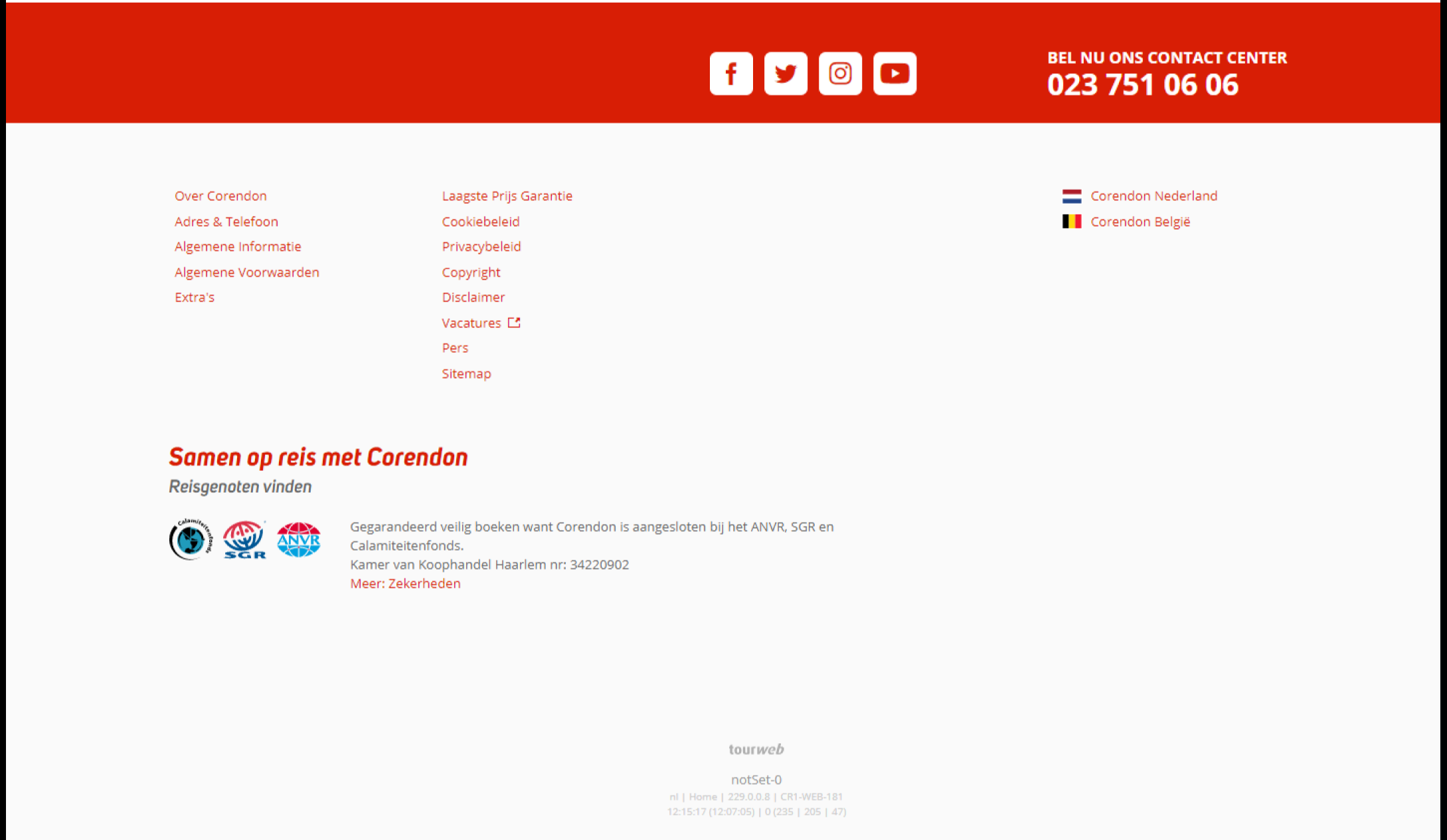
Here are the specification that I am trying to get:

  • The red bar of the footer is full width of the screen
  • The content of the whole page is in a page wrapper (container)
  • All the content of the footer is inside the page wrapper
  • The content inside the red bar is aligned to the right side of the page wrapper

Now I am pretty far because of all your help, but I only have 1 problem left:

  • The content of the red bar is aligned in the center, but when I try to align it to the right, it gets aligned to the full right and not the right side of the page wrapper

Here is my updated code now:

body {
    float: center;
    justify-content: center;
    display: flex;
}

.container {
  width: 100%;
  max-width: 1440px;
  background-color: #0000FF;
  height: 500px;
}

.footer {
    position: absolute;
    width: 100%;
    left: 0px;
    right: 0px;
}

.footer-red-bar {
    position: relative;
    background: #d81e05;
    height: 120px;
    display: flex;
    align-items: center;
    justify-content: center;
}

.footer-red-bar-content {
    width: 1440px;
    float: center;
    align-items: center;
    display: flex;
    justify-content: right;
}

.footer-socialmedia-helper {
    display: inline-block;
    height: 100%;
    vertical-align: middle;
}

.footer-socialmedia-frame {
    border-radius: 7px;
    width: 40px;
    height: 40px;
    background-color: #FFFFFF;
    margin: 5px;
}

.footer-socialmedia-icon {
    position: relative;
    width: 70%;
    vertical-align: middle;
}

.footer-red-bar-phonenumber {
    color: #FFFFFF;
    font-family: Verdana;
    font-size: 20px;
    display: flex;
}
<div class="container">
    <footer class="footer">
        <div class="footer-red-bar">
            <div class="footer-red-bar-content">
                <div class="footer-socialmedia-frame">
                    <span class="footer-socialmedia-helper"></span>
                    <img class="footer-socialmedia-icon" src="images/SocialMedia_twitter.png" />
                </div>
                <div class="footer-socialmedia-frame">
                    <span class="footer-socialmedia-helper"></span>
                    <img class="footer-socialmedia-icon" src="images/SocialMedia_twitter.png" />
                </div>
                <div class="footer-socialmedia-frame">
                    <span class="footer-socialmedia-helper"></span>
                    <img class="footer-socialmedia-icon" src="images/SocialMedia_twitter.png" />
                </div>
                <div class="footer-socialmedia-frame">
                    <span class="footer-socialmedia-helper"></span>
                    <img class="footer-socialmedia-icon" src="images/SocialMedia_twitter.png" />
                </div>
                
                <div class="footer-red-bar-phonenumber">
                    <p> Bel nu ons contact center </br> <b>023 751 06 06</b> </p>
                </div>
            </div>
        </div>
    </footer>
</div>

How can I get what I want?

A. Vreeswijk
  • 822
  • 1
  • 19
  • 57
  • Does this answer your question? [How do you get the footer to stay at the bottom of a Web page?](https://stackoverflow.com/questions/42294/how-do-you-get-the-footer-to-stay-at-the-bottom-of-a-web-page) – JKD Oct 05 '20 at 09:39

4 Answers4

1

First of all, I don't see any reason on why you are assign position: absolute; to the red bar. You can avoid it but add max-width to your container and make its own width: 100%;.

.container {
  width: 100%;
  max-width: 1440px;
}

Then justify-content: right; won't work in this case and you have to use justify-content: flex-end;. Also since you assign specific height to your container there is no need to assign a specific (and much larger) height to your footer.

body {
  float: center;
  justify-content: center;
  display: flex;
}

.container {
  width: 100%;
  max-width: 1440px;
  background-color: #ff0000;
  height: 500px;
}

.footer {
  width: 100%;
}

.footer-red-bar {
  position: relative;
  background: #d81e05;
  height: 120px;
  display: flex;
  justify-content: flex-end;
  align-items: center;
}

.footer-red-bar-content {
  display: flex;
  align-items: center;
}

.footer-socialmedia-helper {
  display: inline-block;
  height: 100%;
  vertical-align: middle;
}

.footer-socialmedia-frame {
  border-radius: 7px;
  width: 40px;
  height: 40px;
  background-color: #ffffff;
  margin: 5px;
}

.footer-socialmedia-icon {
  position: relative;
  width: 70%;
}

.footer-red-bar-phonenumber {
  color: #ffffff;
  font-family: Verdana;
  font-size: 20px;
}
<body>
  <div class="container">
    <footer class="footer">
      <div class="footer-red-bar">
        <div class="footer-red-bar-content">
          <div class="footer-socialmedia-frame">
            <span class="footer-socialmedia-helper"></span>
            <img class="footer-socialmedia-icon" src="images/SocialMedia_twitter.png" />
          </div>
          <div class="footer-socialmedia-frame">
            <span class="footer-socialmedia-helper"></span>
            <img class="footer-socialmedia-icon" src="images/SocialMedia_twitter.png" />
          </div>
          <div class="footer-socialmedia-frame">
            <span class="footer-socialmedia-helper"></span>
            <img class="footer-socialmedia-icon" src="images/SocialMedia_twitter.png" />
          </div>
          <div class="footer-socialmedia-frame">
            <span class="footer-socialmedia-helper"></span>
            <img class="footer-socialmedia-icon" src="images/SocialMedia_twitter.png" />
          </div>

          <div class="footer-red-bar-phonenumber">
            <p> Bel nu ons contact center <br> <b>023 751 06 06</b> </p>
          </div>
        </div>
      </div>
    </footer>
  </div>
</body>

Update

According to your latest comment, you wish to have a full-width red bar and its content should just have a max-width: 1440px.According to that I just tried to rewrite your code almost fully.

To achieve the above thing, we need to implement a container for each of our section and only just wrap their element within those containers and let the main wrapping element (Parent) to grow according to screen size. So this is how its work, a red-bar to grow according to screen size and its content just wrapped within a div with a max-width: 1440px; same goes for blue-area, but since it has no background (Background is blue just for illustration) and it's just some content we should wrap the whole of it within a container.

footer {
  width: 100%;
}

footer .container {
  width: 100%;
  max-width: 1440px;
  
  margin: 0 auto;
}

footer .red-bar {
  display: flex;
  align-items: center;
  
  background: #d81e05;

  height: 120px;
}

footer .red-bar .content {
  display: flex;
  align-items: center;
  justify-content: flex-end;
}

footer .red-bar .content .footer-socialmedia-helper {
  display: inline-block;
  vertical-align: middle;

  height: 100%;
}

footer .red-bar .content .footer-socialmedia-frame {
  width: 40px;
  height: 40px;

  background-color: #ffffff;

  margin: 5px;

  border-radius: 7px;
}

footer .red-bar .content .footer-socialmedia-icon {
  position: relative;

  width: 70%;
}

footer .red-bar .content .footer-red-bar-phonenumber {
  font-family: Verdana;
  font-size: 20px;

  color: #ffffff;
}

footer .blue-area {
  background-color: #0000FF;
  
  height: 500px;
}
<footer>
  <div class="red-bar">
    <div class="container content">
      <div class="footer-socialmedia-frame">
        <span class="footer-socialmedia-helper"></span>
        <img class="footer-socialmedia-icon" src="images/SocialMedia_twitter.png" />
      </div>
      <div class="footer-socialmedia-frame">
        <span class="footer-socialmedia-helper"></span>
        <img class="footer-socialmedia-icon" src="images/SocialMedia_twitter.png" />
      </div>
      <div class="footer-socialmedia-frame">
        <span class="footer-socialmedia-helper"></span>
        <img class="footer-socialmedia-icon" src="images/SocialMedia_twitter.png" />
      </div>
      <div class="footer-socialmedia-frame">
        <span class="footer-socialmedia-helper"></span>
        <img class="footer-socialmedia-icon" src="images/SocialMedia_twitter.png" />
      </div>

      <div class="footer-red-bar-phonenumber">
        <p> Bel nu ons contact center <br> <b>023 751 06 06</b> </p>
      </div>
    </div>
  </div>
  <div class="blue-area container" />
</footer>
SMAKSS
  • 9,606
  • 3
  • 19
  • 34
  • And vertical alignment inside the redbar? – A. Vreeswijk Oct 05 '20 at 09:28
  • @A.Vreeswijk `vertical-align` property won't work on flex properties *(It will only work on `inline`, `inline-block`, or `table-cell`)* if you want them to align in the centre vertically you can simply use `align-items: center;`. I just update the answer too. – SMAKSS Oct 05 '20 at 09:30
  • Okay, the situation now: - The red bar is great - The container goes trough the footer, which is not allowed to happen - The content inside the red bar is aligned in the middle, but I want that aligned to the right side of the container, so not the right side of the red bar How can I do this then? – A. Vreeswijk Oct 05 '20 at 09:34
  • @A.Vreeswijk What do you mean by *The container goes trough the footer*? `footer` is a child for `container` so the `footer` is part of `container`. Also, *The content inside the red bar is aligned in the middle* Its content is aligned horizontally to the right and vertically to the centre. Please check it in full screen *(By Full page link)*. – SMAKSS Oct 05 '20 at 09:38
  • I updated my code in my question, there you can see the result. I want the content of the red bar to be alligned with the right side of the blue frame and not the right side of the red bar – A. Vreeswijk Oct 05 '20 at 09:46
  • @A.Vreeswijk Well, you did not update it correctly *(Also updating original question is not a good way for demonstrating the actual result of answers)*. And anyway the right side of the container is the right side of the red bar and also a blue bar, so once the content of red bar aligned to its right side it will aligned to the right side of the blue area too. If you want to continue with your own layout *(Blue area is smaller than the red bar)* you just need to apply right padding to the red bar and everything else is correct. – SMAKSS Oct 05 '20 at 09:54
  • Yeah, but the red bar at the top has to be full width, not the container width! The content of the red bar has to be aligned to the right side of the container – A. Vreeswijk Oct 05 '20 at 10:08
  • Just 1 very small thing: The image in the socialmedia frame isn't centred? – A. Vreeswijk Oct 05 '20 at 11:22
  • @A.Vreeswijk Actually they should be centred. Because `vertical-align` will work on `display: inline-block;` but if in any case they were not. You can simply align them with flex properties like this: `footer .red-bar .content .footer-socialmedia-helper { display: flex; align-items: center; justify-content: center; }`. – SMAKSS Oct 05 '20 at 11:27
  • That doesn't do the trick for me? It ends up in the left top corner – A. Vreeswijk Oct 05 '20 at 12:43
  • @A.Vreeswijk You need to add either of them to the parent. I just copied your code, did not notice it is a `span` class. You need to add them to `footer-socialmedia-frame` class. – SMAKSS Oct 05 '20 at 12:54
  • Yes, Thanks for all your help! I'm a good programmer in things like PHP and C#, but I have never understand CSS xD – A. Vreeswijk Oct 05 '20 at 13:09
1

First off you don't need positioning and also defining height in multiple child elements is not a good way to go about. Rather than specifying a height try to use padding instead. This way if the content is more or less it will not affect the layout.

I've made few adjustments to your css, try this.

body {
  float: center;
  justify-content: center;
  display: flex;
}

.container {
  width: 1440px;
}

.footer {
  display: flex;
  justify-content: center;
  width: 100%;
  background-color: #FF0000;
  padding: 40px 0;
}

.footer-red-bar {
  background: #d81e05;
}

.footer-red-bar-content {
  display: flex;
  justify-content: flex-end;
  flex-flow: row wrap;
}

.footer-socialmedia-helper {
  display: inline-block;
  height: 100%;
  vertical-align: middle;
}

.footer-socialmedia-frame {
  border-radius: 7px;
  width: 40px;
  height: 40px;
  background-color: #FFFFFF;
  margin: 5px;
}

.footer-socialmedia-icon {
  width: 70%;
  vertical-align: middle;
}

.footer-red-bar-phonenumber {
  color: #FFFFFF;
  font-family: Verdana;
  font-size: 20px;
}
<footer class="footer">
  <div class="container">
    <div class="footer-red-bar">
      <div class="footer-red-bar-content">
        <div class="footer-socialmedia-frame">
          <span class="footer-socialmedia-helper"></span>
          <img class="footer-socialmedia-icon" src="images/SocialMedia_twitter.png" />
        </div>
        <div class="footer-socialmedia-frame">
          <span class="footer-socialmedia-helper"></span>
          <img class="footer-socialmedia-icon" src="images/SocialMedia_twitter.png" />
        </div>
        <div class="footer-socialmedia-frame">
          <span class="footer-socialmedia-helper"></span>
          <img class="footer-socialmedia-icon" src="images/SocialMedia_twitter.png" />
        </div>
        <div class="footer-socialmedia-frame">
          <span class="footer-socialmedia-helper"></span>
          <img class="footer-socialmedia-icon" src="images/SocialMedia_twitter.png" />
        </div>
        <div class="footer-red-bar-phonenumber">
          <p> Bel nu ons contact center </br> <b>023 751 06 06</b> </p>
        </div>
      </div>
    </div>
  </div>
</footer>
Becky
  • 5,467
  • 9
  • 40
  • 73
  • Still not quite, what I want. I want the red bar inside the footer to be full width, but the content of the footer (text and images) to be aligned inside the container – A. Vreeswijk Oct 05 '20 at 09:48
  • red bar is full width. Note: if you're not using the `container` style why don't you move your footer outside it? check the markup in my answer. you should avoid overriding styles so you keep your code clean as possible. – Becky Oct 05 '20 at 09:50
0

I added this to keep content center but align block to the right with margin

.footer-red-bar-content {
  text-align: center;
  justify-content: center;
  margin: auto 0 auto auto;
}

to center text.

And also adjust margin auto:

.footer-socialmedia-frame {
  margin: auto 5px;
}
.footer-red-bar-phonenumber p{
  margin: auto 5px;
}

Do not forget to add display: flex; on class : .footer-red-bar-phonenumber that is important if you want that margin auto works.

Demo 2 with footer out of container

body {
  float: center;
  justify-content: center;
  display: flex;
}

.container-footer{
  /*position: relative;*/
  width: 1440px;
  background-color: #FF0000;
  height: 500px;
}

.footer {
  position: absolute;
  width: 100%;
  height: 864px;
  left: 0px;
  right: 0px;
}

.footer-red-bar {
  position: relative;
  background: #d81e05;
  height: 120px;
  display: flex;
  vertical-align: middle;
  justify-content: right;
}

.footer-red-bar-content {
  width: 1440px;
  float: center;
  vertical-align: center;
  display: flex;
  text-align: center;
  justify-content: center;
      margin: auto 0 auto auto;
}

.footer-socialmedia-helper {
  display: inline-block;
  height: 100%;
  vertical-align: middle;
}

.footer-socialmedia-frame {
  border-radius: 7px;
  width: 40px;
  height: 40px;
  background-color: #FFFFFF;
  margin: auto 5px;
}

.footer-socialmedia-icon {
  position: relative;
  width: 70%;
  vertical-align: middle;
}

.footer-red-bar-phonenumber {
  display:flex;
  color: #FFFFFF;
  font-family: Verdana;
  font-size: 20px;
}
.footer-red-bar-phonenumber p{
  margin: auto 5px;
}
<div class="container container-footer">
  <footer class="footer">
    <div class="footer-red-bar">
      <div class="footer-red-bar-content">
        <div class="footer-socialmedia-frame">
          <span class="footer-socialmedia-helper"></span>
          <img class="footer-socialmedia-icon" src="images/SocialMedia_twitter.png" />
        </div>
        <div class="footer-socialmedia-frame">
          <span class="footer-socialmedia-helper"></span>
          <img class="footer-socialmedia-icon" src="images/SocialMedia_twitter.png" />
        </div>
        <div class="footer-socialmedia-frame">
          <span class="footer-socialmedia-helper"></span>
          <img class="footer-socialmedia-icon" src="images/SocialMedia_twitter.png" />
        </div>
        <div class="footer-socialmedia-frame">
          <span class="footer-socialmedia-helper"></span>
          <img class="footer-socialmedia-icon" src="images/SocialMedia_twitter.png" />
        </div>

        <div class="footer-red-bar-phonenumber">
          <p> Bel nu ons contact center </br> <b>023 751 06 06</b> </p>
        </div>
      </div>
    </div>
  </footer>
</div>
MaxiGui
  • 6,190
  • 4
  • 16
  • 33
  • I updated my question to my last problem that I have right now – A. Vreeswijk Oct 05 '20 at 09:44
  • @A.Vreeswijk check it now, I just adjust ` margin: auto 0 auto auto;` into .footer-red-bar-content to make it as you wish – MaxiGui Oct 05 '20 at 09:48
  • Snippet 2 still goes outside the container on my screen? I have 4k monitor, dont know if that is causing it, but has to work on mine as well – A. Vreeswijk Oct 05 '20 at 09:55
  • It is because I remove the poistion: relative from container, if you want to keep it in just uncomment it – MaxiGui Oct 05 '20 at 09:56
  • If I do that, the red bar isn't full width anymore and the content is in the center again!? – A. Vreeswijk Oct 05 '20 at 10:00
  • Sure because .container and .footer-red-bar-content have the same width. Make the `.footer-red-bar-content have` width smaller to make it go on the right. But as you said you want "The red bar of the footer is full width of the screen" So snippet 2 is fine. with your wishes – MaxiGui Oct 05 '20 at 10:04
  • Let us [continue this discussion in chat](https://chat.stackoverflow.com/rooms/222522/discussion-between-maxigui-and-a-vreeswijk). Based on what is left from your wish as I said, you just need to set: @A.Vreeswijk check it now, I just adjust `margin: auto 0 auto auto;` into `.footer-red-bar-content` to make it as you wish – MaxiGui Oct 05 '20 at 10:07
-1

body {
    float: center;
    justify-content: center;
    display: flex;
    margin: 0;
}

.container {
    width: 1440px;
   //background-color: #FF0000;
    height: 500px;
}

.footer {
    width: 100%;
    height: 864px;
    left: 0px;
    right: 0px;
    background: #e1e1e1;
}

.footer-red-bar {
    position: relative;
    background: #d81e05;
    height: 120px;
    display: flex;
    vertical-align: middle;
}

.footer-red-bar-content {
    width: 1440px;
    float: center;
    vertical-align: center;
    display: flex;
    justify-content: flex-end;
    align-items: center;
}

.footer-socialmedia-helper {
    display: inline-block;
    height: 100%;
    vertical-align: middle;
}

.footer-socialmedia-frame {
    border-radius: 7px;
    width: 40px;
    height: 40px;
    background-color: #FFFFFF;
    margin: 5px;
}

.footer-socialmedia-icon {
    position: relative;
    width: 70%;
    vertical-align: middle;
}

.footer-red-bar-phonenumber {
    color: #FFFFFF;
    font-family: Verdana;
    font-size: 20px;
    padding: 30px 0;
    margin: 0 0 0 50px;
}

.footer-red-bar-phonenumber p {
margin: 0;
}
<div class="container">
        <footer class="footer">
            <div class="footer-red-bar">
                <div class="footer-red-bar-content">
                    <div class="footer-socialmedia-frame">
                        <span class="footer-socialmedia-helper"></span>
                        <img class="footer-socialmedia-icon" src="images/SocialMedia_twitter.png" />
                    </div>
                    <div class="footer-socialmedia-frame">
                        <span class="footer-socialmedia-helper"></span>
                        <img class="footer-socialmedia-icon" src="images/SocialMedia_twitter.png" />
                    </div>
                    <div class="footer-socialmedia-frame">
                        <span class="footer-socialmedia-helper"></span>
                        <img class="footer-socialmedia-icon" src="images/SocialMedia_twitter.png" />
                    </div>
                    <div class="footer-socialmedia-frame">
                        <span class="footer-socialmedia-helper"></span>
                        <img class="footer-socialmedia-icon" src="images/SocialMedia_twitter.png" />
                    </div>
                    
                    <div class="footer-red-bar-phonenumber">
                        <p> Bel nu ons contact center </br> <b>023 751 06 06</b> </p>
                    </div>
                </div>
            </div>
        </footer>
    </div>

I change position absolute to fixed or you can remove it if you want. I add justify-content: flex-end for right align.

Ishita Ray
  • 672
  • 3
  • 8
  • 1
    Please add Explication of what you did – MaxiGui Oct 05 '20 at 09:23
  • I change position absolute to fixed or you can remove it if you want. I add justify-content: flex-end for right align. – Ishita Ray Oct 05 '20 at 09:24
  • This is not exactly what I want. I want the content of the footer to be in a page wrapper. So the content isn't over the whole screen. I was trying to align the content of the red-bar with the right side of the page wrapper. But that didn't work. You centered it. So the container is using like 70% of the screen or something – A. Vreeswijk Oct 05 '20 at 09:25
  • @IshitaRay Add this comment into your answer not in comment, Try to think about people who will read your answer later – MaxiGui Oct 05 '20 at 09:37