I have a flex container that has items set in a row and when it reaches the end of the viewport width I want it to overflow-x: scroll. Instead it shrinks all items with more items added to fit the screen.
How can I allow it to overflow and still scroll in the x direction while keeping the items from shrinking?
.footer-container {
  width: 100%;
  height: 12rem;
  background-color: #fff;
  position: fixed;
  bottom: 0;
  display: flex;
  overflow-x: scroll;
  padding: 1rem;
  animation: slide-up;
  animation-duration: 1s;
  visibility: hidden;
  opacity: 0;
}

.footer-items {
  background-color: rgb(214, 218, 219);
  width: 17rem;
  list-style-type: none;
  border-radius: 4px;
  margin-right: 1.5rem;
  padding: 1rem;
  font-size: 1.5rem;
  position: relative;
  animation: fade-in;
  animation-duration: 2s;
  display: flex;
}

.side-col {
  display: flex;
  flex-direction: column;
}

.cart-image {
  min-width: 10rem;
  height: 6rem;
}

.cart-price {
  position: absolute;
  top: 50%;
  right: 1rem;
  transform: translateY(-50%);
  font-weight: 600;
}
<footer class="footer">
<ul class="footer-container">
<li class="footer-items">
<div class="side-col">
<p>Bike<p/>
<img class="cart-image" src="bike.png"/>
</div>
<span class="cart-price">$2345</span>
</li>
</ul>
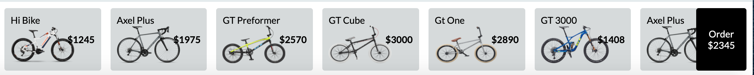
</footer>Here is how it looks without overflowing items https://i.stack.imgur.com/ZUrZS.png
and with overflowing items https://i.stack.imgur.com/18obq.png