So basically i need to keep gaps in between my columns, the below code shows the page without gaps:
    <head>
        <link rel="stylesheet" type="text/css"
              href="<c:url value="/resources/css/bootstrap-3.3.7-dist/css/bootstrap.css"/>">
        <link rel="stylesheet" href="<c:url value="/resources/fonts/font-awesome-4.6.3/css/font-awesome.css"/>">
    </head>

    <body>
    <div class="container-fluid">
                <c:forEach items="${categories}" var="category" varStatus="itemIdx">
                    <div class="row" style="padding: 20px">
                        <h2>${category.name}</h2>

                            <c:forEach items="${category.menuProductBeanList}" var="product" varStatus="itemIdx">
                                    <div class="col-xs-6" style="border: 2px solid darkgrey; ">
                                            <div class="col-xs-5" style="float: left; padding: 5px;">
                                                <h3 style="font-weight: bold">${product.name}</h3>
                                                    ${product.description}
                                                <p>${currency} ${product.price}</p>
                                            </div>
                                            <div class="col-xs-4" style="float: right">
                                                <div style="width: 150px; height: 150px; overflow: hidden">
                                                    <img src="https://i2.wp.com/www.foodrepublic.com/wp-content/uploads/2012/03/033_FR11785.jpg?fit=1000%2C665&ssl=1" alt="pic" class="img-thumbnail" style="width: 100%; height: 100%; border: none">
                                                </div>
                                            </div>
                                    </div>
                            </c:forEach>

                    </div>
                </c:forEach>
    </div>
    </body>
</html>
Basically in the above code i send a list of products and categories as model attributes and display in columns.
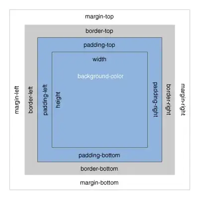
I need to have gaps between the columns, so i thought of adding a margin to each of the columns, which is the column after the loop
<div class="col-xs-6" style="border: 2px solid darkgrey; margin:5px">
But it just results every column been in one whole row rather than being side by side (2x2) with a gap as shown in the pic:
Please help me and it would be better if i could get a solution in code.
For your info i must only use Bootstrap 3.3.7

