So I'm trying to work on a more responsive design for my HTML document and the first thing I wanna get sorted is scaling of font size depending on the height and width of the container. Right now i have the following:
I researched a bit and found the unit "vw" in css which allows the font to scale based on the container but i just noticed that it only works when i resize my browser width wise which gets something like:

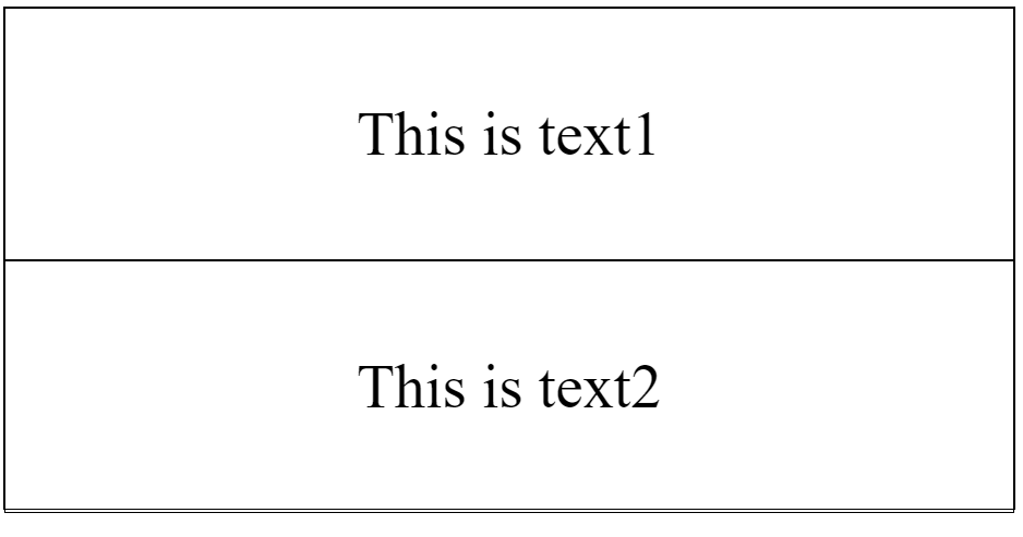
As shown the text are indeed scaling if i resize the browser width wise however, i realized that when i adjust the height of the browser, it doesn't scale at all.

How do i ensure that the text is scaled based on the width and height of the container?
html,body {
    height: 100%;
}

.outer {
    height: 50%;
    border: 1px solid black;
    width: 50%;
}

#cat1 {
    height: 50%;
    border: 1px solid black;
    font-size: 3vw;
    display: flex;
    justify-content: center;
    align-items: center;
    text-align: center;

}

#cat2 {
    height: 50%;
    border: 1px solid black;
    font-size: 3vw;
    display: flex;
    justify-content: center;
    align-items: center;
    text-align: center;
}
<!DOCTYPE html>
<html lang="en">
<head>
<meta charset="UTF-8">
<meta name="viewport" content="width=device-width, initial-scale=1.0">
<link rel="stylesheet" href = "style.css">
<title>Document</title>
</head>
<body>
<div class = "outer">
<div id = "cat1">
This is text1
</div>
<div id = "cat2">
This is text2
</div>
</div>
</body>
</html>