Most of these things can only be changed by modifying the source, as others have said before.
You can change the header background color by applying an appBarTheme in the builder callback of showDateRangePicker.
The text colors and the selection color can also be set via applying a theme, you need to use a ColorScheme to set them.
This example sets the header background to blue, the close icon to white, the header texts + the selected date texts to white, and the selection color to red:
final themeData = Theme.of(context);
showDateRangePicker(
      context: context,
      initialDateRange: initialDateRange,
      firstDate: firstDate,
      lastDate: lastDate,
      currentDate: currentDate,
      initialEntryMode: initialEntryMode,
      helpText: helpText,
      cancelText: cancelText,
      confirmText: confirmText,
      saveText: saveText,
      errorFormatText: errorFormatText,
      errorInvalidText: errorInvalidText,
      errorInvalidRangeText: errorInvalidRangeText,
      fieldStartHintText: fieldStartHintText,
      fieldEndHintText: fieldEndHintText,
      fieldStartLabelText: fieldStartLabelText,
      fieldEndLabelText: fieldEndLabelText,
      locale: locale,
      useRootNavigator: useRootNavigator,
      routeSettings: routeSettings,
      textDirection: textDirection,
      builder: (context, Widget? child) => Theme(
            data: themeData.copyWith(
                appBarTheme: themeData.appBarTheme.copyWith(
                    backgroundColor: Colors.blue,
                    iconTheme: themeData.appBarTheme.iconTheme!.copyWith(color: Colors.white)),
                colorScheme: ColorScheme.light(
                  onPrimary: Colors.white,
                  primary: Colors.red
                )),
            child: child!,
          ));
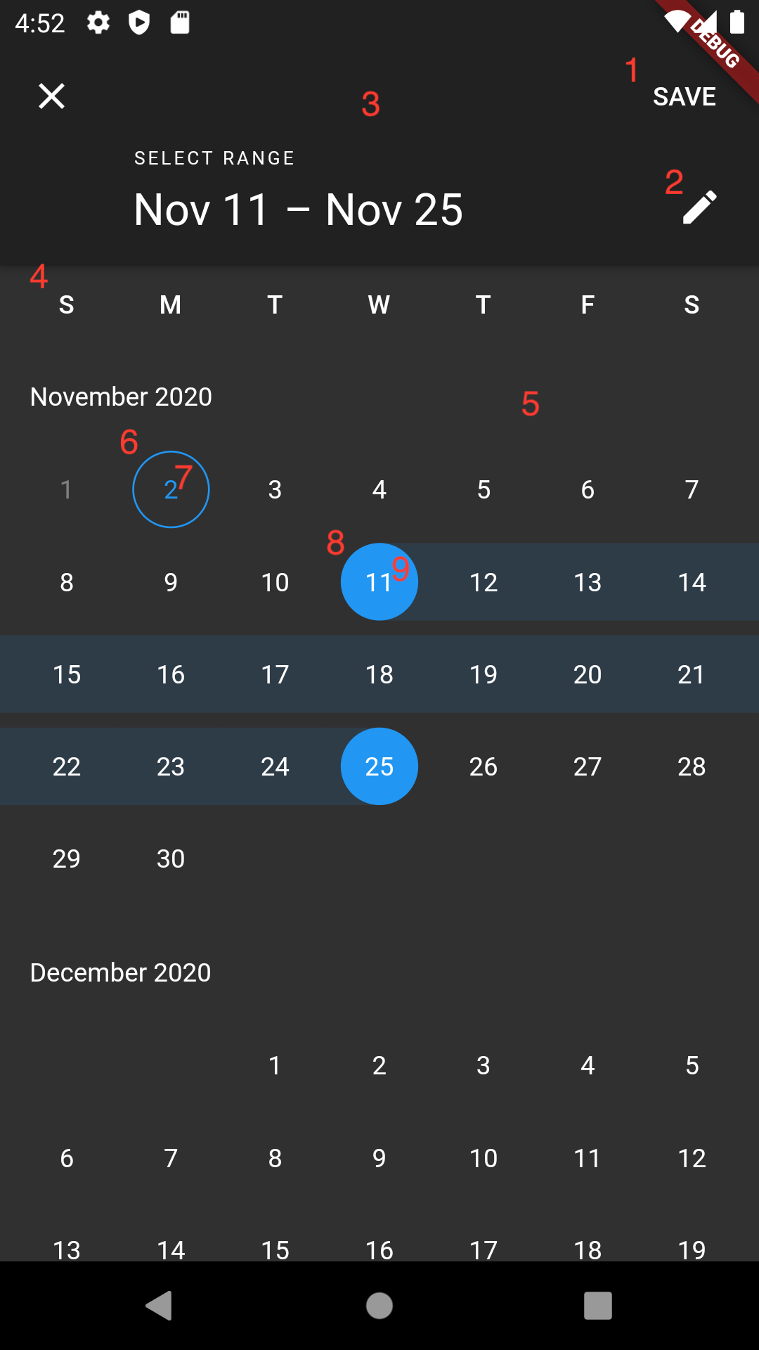
Screenshot
