0

I am looking for advice how to implement the following layout using bootstrap 4: enter image description here

I have seen a lot of examples on stackoverflow with the similar idea, but can't find how to make only center panel scrollable. I need something similar to this: https://www.codeply.com/go/woeJ9JxCQn But, the problem with this layout is that the whole page are scrollable, I need to make the center panel always equals to the window height and make the content inside it scrollable, so the scroll appears like on the mockup. Can somebody suggest the solution?

Ivan Dubynets
  • 342
  • 1
  • 3
  • 12
  • Do you have any code that demonstrates what you've tried? – Carol Skelly Nov 09 '20 at 13:56
  • Do you have any code that demonstrates what you've tried, and what wasn't working with it? Once you edit the question to show what you've attempted, I will be able to explain how to solve it. I answered the [question based on the example](https://stackoverflow.com/questions/48996084/create-a-responsive-navbar-sidebar-drawer-in-bootstrap-4/48996139#48996139) you referenced – Carol Skelly Nov 09 '20 at 14:20
  • hi @Zim, thank you for response. This is an example of what I tried: https://www.codeply.com/p/gQyDt4yClz. But it is not something I am looking for. The whole page has scroll, I need to make only center panel scrollable – Ivan Dubynets Nov 09 '20 at 18:50

2 Answers2

1

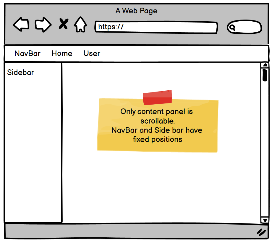
There are several approaches you could take. One way is to make the navbar sticky instead of fixed. Then remove the body padding and set the appropriate heights and overflow on the sidebar, and content area.

https://codeply.com/p/uKyx1izF6Q

<div class="container-fluid sticky-top bg-dark shadow">
    <div class="row collapse show no-gutters d-flex h-100 position-relative">
        <div class="col-3 px-0 w-sidebar navbar-collapse collapse d-none d-md-flex">
            <!-- spacer col -->
            <a href="#" class="navbar-brand">Brand</a>
        </div>
        <div class="col px-3 px-md-0 py-3">
            <div class="d-flex">
                <!-- toggler -->
                <a data-toggle="collapse" href="#" data-target=".collapse" role="button" class="">
                    <i class="fa fa-bars fa-lg"></i>
                </a>
                <a href="#" class="ml-auto text-white"><i class="fa fa-cog"></i></a>
            </div>
        </div>
    </div>
</div>
<div class="container-fluid px-0">
    <div class="row vh-100 collapse show no-gutters d-flex h-100 position-relative align-items-start">
        <div class="col-3 p-0 min-vh-100 text-white w-sidebar navbar-collapse collapse d-none d-md-flex sidebar">
            <!-- fixed sidebar -->
            <div class="navbar-dark bg-dark position-fixed h-100 w-sidebar">
                <h6 class="px-3 pt-3">Fixed Menu</h6>
                <ul class="nav flex-column flex-nowrap text-truncate">
                    <li class="nav-item">
                        <a class="nav-link active" href="#">Active</a>
                    </li>
                    <li class="nav-item">
                        <a class="nav-link" href="#">Link</a>
                    </li>
                    <li class="nav-item">
                        <a class="nav-link" href="#">Link</a>
                    </li>
                    <li class="nav-item">
                        <a class="nav-link" href="#">Link</a>
                    </li>
                    <li class="nav-item">
                        <a class="nav-link" href="#">Link</a>
                    </li>
                    <li class="nav-item">
                        <a class="nav-link" href="#">Link</a>
                    </li>
                </ul>
            </div>
        </div>
        <div class="col p-3 overflow-auto h-100">
            <h3>Content..</h3>
        </div>
    </div>
</div>
Carol Skelly
  • 351,302
  • 90
  • 710
  • 624
  • thank you! overflow does the trick. do we disable overflow for body and enable for some content col. This is the example I came with based on your idea: https://www.codeply.com/p/gQyDt4yClz – Ivan Dubynets Nov 09 '20 at 20:01
0

you can give the side-nav and top-nav a fixed position. and then give the content panel a margin-top (equal to top-nav height) and margin left (equal to side-nav width). then there will be scroll only in the content. don't forget to give the side-bar height 100% or 100vh so it dosn't stretch.