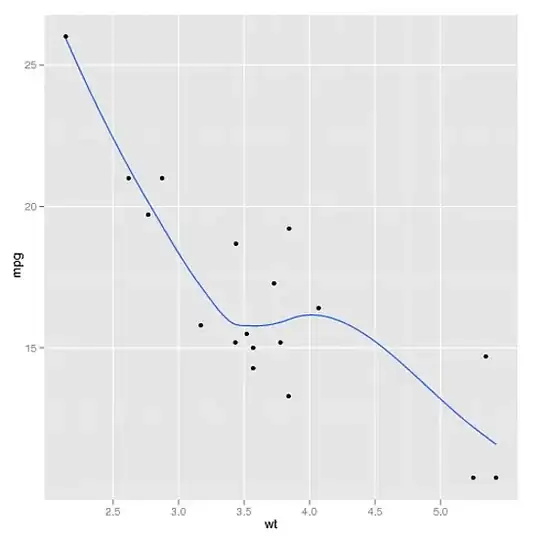
My legend is not showing correctly when I am doing my graph in R using ggplot2. One column of my dataset is represented by a geom_bar and the two others are represented by geom_points (one shape each). The circle and the diamond shape are showing for both 2000 and 2008, the circle being in the diamong for both year. However, the graph works totally fine...
Here is a screenshot:
I have created a simplified version of my dataset:
order_var <- c(1, 4, 3, 5, 6, 2)
alt_name <- c('Agriculture', 'Mining', 'Food products',' Manufacture', 'Chemicals', 'Machinery')
y2000 <- c(20, 40, 50, 80, 30, 70)
y2008 <- c(40, 50, 80, 70, 30, 60)
y2018 <- c(10, 30, 80, 50, 40, 50)
datatest <- data.frame("order_var" = order_var, "alt_name" = alt_name, "y2000" = y2000, "y2008" = y2008, "y2018" = y2018)
And the code for my graph:
datatest %>% ggplot(aes(x = reorder(alt_name, order_var))) +
  geom_bar(stat = "identity", aes(y = `y2018`, fill = "2018"), width = 0.7, col = "black") +
  geom_point(aes(y = `y2008`, col = "2008"), shape = 23, fill = "white", size = 5) +
  geom_point(aes(y = `y2000`, col = "2000"), shape = 19, fill = "black", size = 3) +
  xlab("Industry") +
  ylab("Percentage") +
  theme(legend.position = "top") +
  scale_fill_manual(name = '', values = c("2018" = "#4F81BD"), breaks = c("2018")) +
  scale_colour_manual(name = '', values = c("2008" = "black", "2000" = "orange"))
If you know how to correct this problem, I would be very grateful!!
Thank you :)


