I am new to CSS animations and not quite understanding what's going on. Here is my snippet:
.test-container {
  position: relative;
  height: 200px;
  background-color: pink;
}

.test {
  fill: black;
  position: absolute;
  top: 0;
  transform: scale(0.0075);
  animation: scale 2s ease-out;
  animation-iteration-count: 1;
}

@keyframes scale {
  0% {
    transform: scale(0.0075);
    opacity: 0;
  }
  100% {
    transform: scale(1);
    opacity: 1;
  }
}
<div class="test-container">
<svg class="test" height="2000" width="2000">
<circle cx="1000" cy="1000" r="1000" />
Sorry, your browser does not support inline SVG.
</svg>
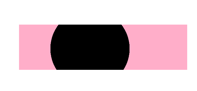
</div>For some reason the snippet doesn't position the circle properly, but that isn't my issue. What I would like for the animation to do is to start after 4 seconds and increase to the max size and then stay at that size (instead of going back to the small size). Also, I would like it if the circle would bound the the container so that it doesn't expand over it like this:
Does anyone know how to achieve this?
I should also point out, that i am using an SVG because when I tried animating with a html circle, it lost it's quality, although that was because I was scaling up rather than down.
The snippet doesn't work as it does on my tests. It's supposed to start like this:

Then after 4 seconds I want it to start getting bigger:

Until it gets to it's maximum size:

The red border is to denote its "container". Imagine there is content above and below; I don't want the circle to ever overlap other content items.
I hope that makes more sense.
Update
Someone said this was answered, but it wasn't. It's not just the forwards state I need.....
I solved this issue myself anyway: