.container {
  display: grid;
  grid-row-gap: 5px;
  grid-template-columns: repeat(auto-fit, minmax(170px, 1fr));
  grid-template-rows: repeat(auto, 200px);
}

#A {
  grid-column-start: 1;
  grid-column-end: 2;
}
<div class=“container”>
<div id=“A”></div>
<div id=“B2></div>
<div id=“B3></div>
<div id=“B4></div>
<div id=“B5></div>
...more dynamic lines
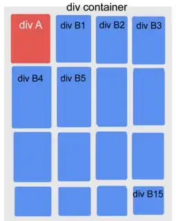
</div>With this schema I get this behavior:

that is great for me. Each row height is adjusted according to the max height of the divs it contains.
Divs B have all regular sizes but div A does not.
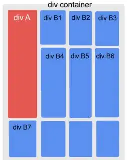
When div A goes taller from client side (some on click expand the box variable heights) I get this:
 Divs B1, B2 and B3 are too long, each content is at top.
So I am asking if is it possible to get something like this:
 First div B 2 rows / 3 cols the same height, B1-B6 a bit taller than if they have not to share the row with div A.
The row starting with div 7 has not enough height to place at right of div A.
Edit:
I am thinking getting div A height (JS), divide it by 170pix (floor) to get how many 3 blue column rows are needed to change grid style.