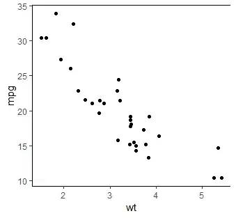
This is my data:
df = pd.DataFrame(myList, index=None, columns=['seconds'])
df['count']= pd.cut(df['seconds'], bins = 30)

Categories (30, interval[float64]): [(0.0871, 0.117] < (0.117, 0.145] < (0.145, 0.174] <
                                     (0.174, 0.202] ... (0.83, 0.858] < (0.858, 0.887] <
                                     (0.887, 0.915] < (0.915, 0.944]]
How do I draw a histogram from this result? (x axis is the floating values, and the y is the total counts of values in each bucket?) I saw a lot of posts using "kind=bar" to draw but I want to know if it is possible to draw this data by using histogram ?
Thanks everyone


