1

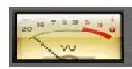
I want to do the following widget on Flutter:

enter image description here

As you can see, it's pretty hard. One idea would be to use .png for the buttons cutted by the circle, but I don't think this would look good on high resolutions.

My idea, currently, is to use a Stack so I can place the buttons where they neeed to be. Then I can put a blank circle on the center to erase the buttons. However this is still not good, because then the widget could only be placed on places with blank background.

Should I stick with the Stack approach?

I started with something like this:

    Container(
            width: 200,
            height: 150,
            child: Stack(children: <Widget>[
              Column(
                children: [
                  Row(
                    children: [
                      FractionallySizedBox(
                          widthFactor: 0.5,
                          heightFactor: 0.5,
                          child: Container(
                            decoration: BoxDecoration(
                              color: Color(0xFFA93EF0),
                              shape: BoxShape.rectangle,
                            ),
                          )),
                      FractionallySizedBox(
                          widthFactor: 0.5,
                          heightFactor: 0.5,
                          child: Container(
                            decoration: BoxDecoration(
                              color: Color(0xFFA93EF0),
                              shape: BoxShape.rectangle,
                            ),
                          ))
                    ],
                  ),
                  Row(
                    children: [
                      FractionallySizedBox(
                          widthFactor: 0.5,
                          heightFactor: 0.5,
                          child: Container(
                            decoration: BoxDecoration(
                              color: Color(0xFFA93EF0),
                              shape: BoxShape.rectangle,
                            ),
                          )),
                      FractionallySizedBox(
                          widthFactor: 0.5,
                          heightFactor: 0.5,
                          child: Container(
                            decoration: BoxDecoration(
                              color: Color(0xFFA93EF0),
                              shape: BoxShape.rectangle,
                            ),
                          ))
                    ],
                  )
                ],
              )
            ]))

but I get

BoxConstraints forces an infinite width and infinite height.

I don't know why since I placed things inside a Container with fixed size (which is also undesired).

UPDATE:

I tried the answer below, but it requires a colored circle.

Is it possible to draw this by some other method?

enter image description here

Paprika
  • 402
  • 5
  • 18
  • If you have the shape formula, you can implement your CustomPainter (https://api.flutter.dev/flutter/rendering/CustomPainter-class.html). It can draw any shape. If you think it is too much work, you also can use a Transparent image instead. – yellowgray Dec 07 '20 at 16:18

3 Answers3

3

It's not a bad idea to use the Stack widget in this case, just remember to give it a height to prevent some problems inside columns. Here's an example of how you can create it:

//A model of the button to save some lines of code
Widget button(
    {VoidCallback onPressed, double buttonWidth, String buttonText}) {
  return Container(
    width: buttonWidth,
    padding: const EdgeInsets.all(5.0),
    height: 80,
    child: RaisedButton(
      color: Colors.purpleAccent[200],
      shape: RoundedRectangleBorder(
        borderRadius: BorderRadius.circular(20.0),
      ),
      onPressed: onPressed,
      child: Text(buttonText),
    ),
  );
}

@override
Widget build(BuildContext context) {
  double buttonWidth = MediaQuery.of(context).size.width * 0.5; //getting half of the current width for each button

  return Scaffold(
    body: Column(
      mainAxisAlignment: MainAxisAlignment.center,
      children: [
        SizedBox(
          height: 160,
          child: Stack(
            alignment: Alignment.center,
            children: [
              Column(
                children: [

                  //two rows, each one with 2 buttons

                  Row(
                    children: [
                      button(
                        onPressed: () {},
                        buttonWidth: buttonWidth,
                        buttonText: 'button1',
                      ),
                      button(
                        onPressed: () {},
                        buttonWidth: buttonWidth,
                        buttonText: 'button2',
                      ),
                    ],
                  ),
                  Row(
                    children: [
                      button(
                        onPressed: () {},
                        buttonWidth: buttonWidth,
                        buttonText: 'button3',
                      ),
                      button(
                        onPressed: () {},
                        buttonWidth: buttonWidth,
                        buttonText: 'button4',
                      ),
                    ],
                  ),
                ],
              ),
              Container(    //a container to give a white space around the inner widget
                width: 120,
                decoration: BoxDecoration(
                  color: Colors.white,
                  shape: BoxShape.circle,
                ),
                child: Align(
                  child: SizedBox(
                    width: 100,
                    height: 100,
                    child: RaisedButton(
                      color: Colors.red,       //the main button
                      shape: CircleBorder(),
                      onPressed: () {},
                    ),
                  ),
                ),
              ),
            ],
          ),
        ),
      ],
    ),
  );
}

Result:

button

Try
  • 3,109
  • 3
  • 11
  • 15
  • I tied and it kinda works, but the circle is white. What if I have a background with other color? I cannot know the color of the background inside the widget. Can you look at my update? – Paprika Dec 06 '20 at 22:27
  • 1
    you can use the same color of the background like this: Theme.of(context).canvasColor – Mohamed Reda Dec 07 '20 at 07:55
1

You can do it using a custom clipper, that will show anything at the background, it will be like this:

Here you are the code:
class MyApp extends StatelessWidget {
  @override
  Widget build(BuildContext context) {
    return MaterialApp(
      title: 'Flutter Demo',
      debugShowCheckedModeBanner: false,
      theme: ThemeData(
        primarySwatch: Colors.blue,
        canvasColor: Colors.yellow,
        visualDensity: VisualDensity.adaptivePlatformDensity,
      ),
      home: Scaffold(
        body: Center(
          child: Stack(
            children: [
              Column(
                mainAxisAlignment: MainAxisAlignment.center,
                crossAxisAlignment: CrossAxisAlignment.center,
                children: [
                  Row(
                    mainAxisAlignment: MainAxisAlignment.center,
                    crossAxisAlignment: CrossAxisAlignment.center,
                    children: [
                      button(index: 0),
                      button(index: 1),
                    ],
                  ),
                  Row(
                    mainAxisAlignment: MainAxisAlignment.center,
                    crossAxisAlignment: CrossAxisAlignment.center,
                    children: [
                      button(index: 2),
                      button(index: 3),
                    ],
                  ),
                ],
              ),
              Center(
                child: Align(
                  child: SizedBox(
                    width: 100,
                    height: 100,
                    child: RaisedButton(
                      color: Colors.red, //the main button
                      shape: CircleBorder(),
                      onPressed: () {},
                    ),
                  ),
                ),
              ),
            ],
          ),
        ),
      ),
    );
  }
}

Widget button(
    {VoidCallback onPressed,
    double buttonWidth,
    String buttonText,
    int index}) {
  return Center(
    child: ClipPath(
      clipper: MyCustomClipper(index: index),
      child: Padding(
        padding: const EdgeInsets.all(4.0),
        child: Container(
          decoration: BoxDecoration(
            color: Colors.pink,
            borderRadius: BorderRadius.all(
              Radius.circular(10),
            ),
          ),
          width: 150,
          height: 100,
        ),
      ),
    ),
  );
}

class MyCustomClipper extends CustomClipper<Path> {
  int index = 0;

  MyCustomClipper({this.index});

  @override
  Path getClip(Size size) {
    var controlPoint = Offset(50, 50);
    var endPoint = Offset(size.width - 58, size.height);

    var endPoint1 = Offset(0, 53);

    var endPoint2 = Offset(size.width, 58);

    var endPoint3 = Offset(58, 0);

    List listOfPaths = [
      Path()
        ..lineTo(size.width, 0)
        ..lineTo(size.width, 53)
        // ..lineTo(0, size.height)
        ..quadraticBezierTo(size.width / 2 + 20, 58, endPoint.dx, endPoint.dy)
        ..lineTo(0, size.height)
        ..close(),
      Path()
        ..lineTo(size.width, 0)
        ..lineTo(size.width, size.height)
        ..lineTo(58, size.height)
        // ..lineTo(0, size.height)
        ..quadraticBezierTo(
            controlPoint.dx, controlPoint.dy, endPoint1.dx, endPoint1.dy)
        ..lineTo(0, size.height)
        ..lineTo(0, 58)
        ..close(),
      Path()
        ..lineTo(size.width - 58, 0)
        // ..lineTo(size.width, size.wid/2)
        // ..lineTo(0, size.height)
        ..quadraticBezierTo(size.width / 2 + 20, 52, endPoint2.dx, endPoint2.dy)
        ..lineTo(size.width, size.height)
        ..lineTo(0, size.height)
        ..close(),
      Path()
        ..moveTo(size.width, 0)
        ..lineTo(size.width, size.height)
        ..lineTo(0, size.height)
        ..lineTo(0, 58)
        ..quadraticBezierTo(
            controlPoint.dx, controlPoint.dy, endPoint3.dx, endPoint3.dy)
        // ..lineTo(0, 0)
        ..close(),
    ];

    return listOfPaths[index];
  }

  @override
  bool shouldReclip(CustomClipper<Path> oldClipper) => false;
}
Mohamed Reda
  • 1,207
  • 13
  • 21
1

I guess the answer given by @LOfG is already wonderful and addresses your UI requirements very well, but if you still need a variation of it then here is the example of it with the purple color scheme and inner shadow as you updated in the question.

It also implements the onTap event so you can easily bind the function of your choice with ease.

Final Output:

enter image description here

Full Example Code:

import 'package:flutter/material.dart';

class DpadButtons extends StatefulWidget {
  @override
  _DpadButtonsState createState() => _DpadButtonsState();
}

class _DpadButtonsState extends State<DpadButtons> {
  String button = "";

  void _selectedButton(String selectedButton) {
    setState(() {
      button = selectedButton;
    });
  }

  @override
  Widget build(BuildContext context) {
    double heightMain = 100;
    double widthMain = 180;
    return Scaffold(
      appBar: AppBar(title: Text("Dpad Button")),
      body: Container(
        width: double.infinity,
        child: Stack(
          children: [
            Column(
              mainAxisAlignment: MainAxisAlignment.center,
              crossAxisAlignment: CrossAxisAlignment.center,
              children: [
                buildButtonRow(
                  b1: "Button 1",
                  b2: "Button 2",
                  onClick: _selectedButton,
                  width: widthMain,
                  height: heightMain,
                ),
                SizedBox(
                  height: 10,
                ),
                buildButtonRow(
                  b1: "Button 3",
                  b2: "Button 4",
                  onClick: _selectedButton,
                  width: widthMain,
                  height: heightMain,
                ),
                SizedBox(
                  height: 10,
                ),
              ],
            ),
            Center(
              child: Container(
                width: heightMain * 1.5,
                height: heightMain * 1.5,
                decoration: BoxDecoration(
                  color: Colors.white,
                  shape: BoxShape.circle,
                ),
              ),
            ),
            Positioned(
              left: 100,
              top: 200,
              child: Text(
                "You clicked : $button",
                style: TextStyle(
                  fontSize: 20.0,
                  fontWeight: FontWeight.bold,
                ),
              ),
            ),
          ],
        ),
      ),
    );
  }

  Row buildButtonRow(
      {String b1, String b2, Function onClick, double width, double height}) {
    return Row(
      mainAxisAlignment: MainAxisAlignment.center,
      children: [
        InkWell(
          onTap: () {
            onClick(b1);
          },
          child: Container(
            width: width,
            height: height,
            decoration: BoxDecoration(
              color: Colors.purple[900],
              borderRadius: BorderRadius.circular(height * 0.2),
            ),
            child: Container(
              width: width * 0.80,
              height: height * 0.80,
              decoration: BoxDecoration(
                borderRadius: BorderRadius.circular(height * 0.15),
                boxShadow: [
                  BoxShadow(
                    color: Colors.purple[200],
                    spreadRadius: -8,
                    blurRadius: 10.0,
                  ),
                ],
              ),
              child: Center(child: Text(b1)),
            ),
          ),
        ),
        SizedBox(
          width: 10,
        ),
        InkWell(
          onTap: () {
            onClick(b2);
          },
          child: Container(
            width: width,
            height: height,
            decoration: BoxDecoration(
              color: Colors.purple[900],
              borderRadius: BorderRadius.circular(height * 0.2),
            ),
            child: Container(
              width: width * 0.80,
              height: height * 0.80,
              decoration: BoxDecoration(
                borderRadius: BorderRadius.circular(height * 0.15),
                boxShadow: [
                  BoxShadow(
                    color: Colors.purple[200],
                    spreadRadius: -8,
                    blurRadius: 10.0,
                  ),
                ],
              ),
              child: Center(child: Text(b2)),
            ),
          ),
        ),
      ],
    );
  }
}

If you want to create a button of the following shape:

enter image description here

Then I have answered about it here: How to apply glass-like 3D effect on a RoundedRectangleBorder button on Flutter?

enter image description here

Ketan Ramteke
  • 10,183
  • 2
  • 21
  • 41