1

I have images(It will increase in the future) on my pages and I am using display: grid. Now My issue is, I have to show 3 columns in a row and the rest will display the center of the grid.

I am talking about display:grid not display:flex

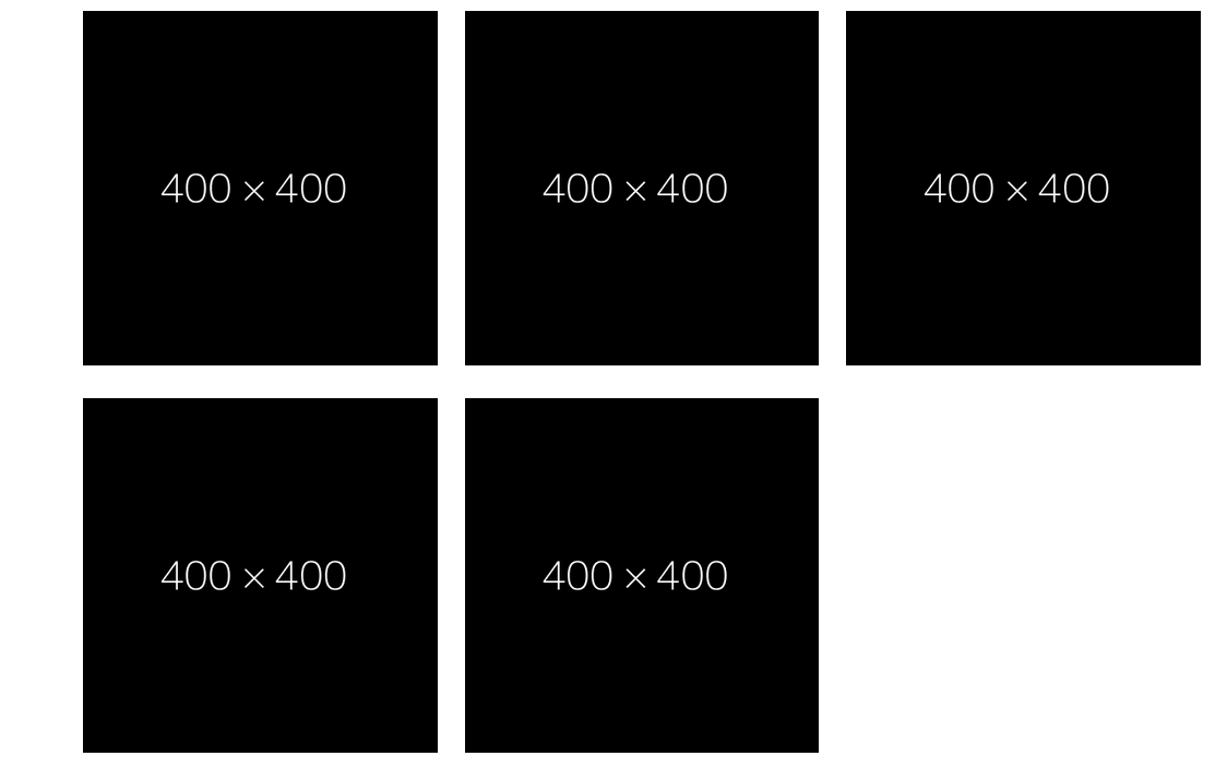
I am getting the output like

enter image description here

My expectation output is this

enter image description here

.gridWrap {
  width: 1024px;
  margin: auto;
}

.gridWrap ul {
  display: grid;
  grid-template-columns: repeat(3, 1fr);
  grid-gap: 25px;
  justify-content: center;
  list-style: none;
  padding-left: 0;
}

.gridWrap ul img {
  width: 100%;
}
<div class="gridWrap">
  <ul>
    <li>
      <a href=""><img src="https://dummyimage.com/400x400/000/fff"></a>
    </li>
    <li>
      <a href=""><img src="https://dummyimage.com/400x400/000/fff"></a>
    </li>
    <li>
      <a href=""><img src="https://dummyimage.com/400x400/000/fff"></a>
    </li>
    <li>
      <a href=""><img src="https://dummyimage.com/400x400/000/fff"></a>
    </li>
    <li>
      <a href=""><img src="https://dummyimage.com/400x400/000/fff"></a>
    </li>
  </ul>
</div>
user9437856
  • 2,360
  • 2
  • 33
  • 92

2 Answers2

0

I would recomend using of bootstraps <div class="row"></display> and then to have those 2 a tags in a div ,in the same block like <div class="col-sm-6"></div>,and then just use some random class on that like class="bottom-pictures",then just use align on that class..im super bad at css but im trying to help :D...

0

I recommend you to use bootstrap So you can use Bootstrap Container to do this stuffs easily. But I have a solution for this using grid-column-start and grid-column-end.

.gridWrap {
  width: 1024px;
  margin: auto;
}

.gridWrap ul {
  display: grid;
  grid-template-columns: auto auto auto auto auto auto auto;
  grid-gap: 25px;
  list-style: none;
  padding-left: 0;
}

.box1 {
  grid-column-start: 1;
  grid-column-end: 3;
}

.box2 {
  grid-column-start: 3;
  grid-column-end: 5;
}

.box3 {
  grid-column-start: 5;
  grid-column-end: 7;
}

.box4 {
  grid-column-start: 2;
  grid-column-end: 4;
}

.box5 {
  grid-column-start: 4;
  grid-column-end: 6;
}

.gridWrap ul img {
  width: 100%;
}
<div class="gridWrap">
  <ul>
    <li class="box1">
      <a href=""><img src="https://dummyimage.com/400x400/000/fff"></a>
    </li>
    <li class="box2">
      <a href=""><img src="https://dummyimage.com/400x400/000/fff"></a>
    </li>
    <li class="box3">
      <a href=""><img src="https://dummyimage.com/400x400/000/fff"></a>
    </li>
    <li class="box4">
      <a href=""><img src="https://dummyimage.com/400x400/000/fff"></a>
    </li>
    <li class="box5">
      <a href=""><img src="https://dummyimage.com/400x400/000/fff"></a>
    </li>
  </ul>
</div>

Hope this will work for you ..

  • Why you use grid-template-columns: auto auto auto auto auto auto auto;? – user9437856 Dec 07 '20 at 13:26
  • The grid-template-columns property specifies the number (and the widths) of columns in a grid layout. value `auto` means The size of the columns is determined by the size of the container and on the size of the content of the items in the column . I divided the grid into 7 parts and allocate specific columns to specific boxes. ref : https://www.w3schools.com/cssref/pr_grid-template-columns.asp – N.Balgopal Patro Dec 07 '20 at 13:58