0

I want to plot this data frame, with dates on the x-axes and values on the y-axes.

f_index=pd.date_range(start='1/1/2020', end='1/12/2020')
f_data=np.arange(0,len(f_index))
df=pd.DataFrame(data=f_data, index=f_index,columns=['Example'])

On the x ticks, I want to show only two dates like 2020,3,2, and 2020,6,8 because are the relevant ones.

So I was thinking about something like that:

x1=(pd.Timestamp(2020,3,2)-f_index[0]).days
x2=(pd.Timestamp(2020,6,8)-f_index[0]).days
xx=[x1,x2]
fig2, ax2= plt.subplots(figsize=(6,4),
                          facecolor='white', dpi=300)
ax2.plot(df.index,df.Example)
#ax2.set_xticks(xx)
#ax2.set_xlabel(xx)
plt.show()

but it doesn't work.

I tried different methods and read different questions, but I did not find one with my specific answer.

This is what can I get at the moment for simplicity I rotated the dates with ax2.tick_params(axis='x',rotation=90) but is not in the code above.

enter image description here

This is what I would like to get

enter image description here

For me is important to understand how dates work because then I want to plot two straight lines in correspondence of the specific dates, something like this.
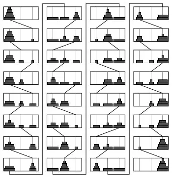
enter image description here

Andrea Ciufo
  • 359
  • 1
  • 3
  • 19
  • 1
    You can use the `xticks` function rather than `set_xticks`. https://matplotlib.org/3.1.1/api/_as_gen/matplotlib.pyplot.xticks.html This lets you pass the list of ticks you want to show and the list of labels you actually want to show. You can use an empty string for the ticks you don't want to label and the actual label for the ones you want to label. – cookesd Dec 10 '20 at 20:08
  • 1
    As cookesd said, this is a special case of modifying the tick labels and omitting some of them. The general approach is explained here: [Modify tick label text](https://stackoverflow.com/questions/11244514/modify-tick-label-text) – Mr. T Dec 11 '20 at 10:04
  • Thanks @cookesd, I don't know why I did not think about `xticks`. It works perfectly. @Mr. T I don't know if the question linked is right for me, and close this question as a duplicate, I would like to hear your opinions, because when I searched and read at least 6 questions, and required at least 1h. I don't have any problem closing as duplicate, but for me was tough to search the proper question-answer (and thanks you for the link :) ). The most suitable answer is this [link](https://stackoverflow.com/a/27440179/6290211) – Andrea Ciufo Dec 11 '20 at 12:03

1 Answers1

2

Your code looks fine:

from matplotlib import pyplot as plt
import datetime

# create dummy data
dates = []
data = []
for i in range(1,24):
    dates.append( datetime.date(2020,12,i) )
    data.append( i )
# open figure + axis
fig, ax = plt.subplots()
# plot data
ax.plot( dates, data)
# rotate x-tick-labels by 90°
ax.tick_params(axis='x',rotation=90)

create this output automatic xticks while adding

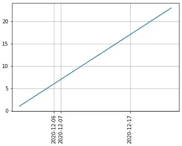
ax.set_xticks( [dates[5],dates[6],dates[16]] )

leads to this graph enter image description here

If you would like to have a grid, you can simply switch it on via the ax.grid() method (you can also say, on which axis; axis='both is default):

ax.grid(True)

major gird

Now, if you want to have minor ticks in between (let's say, you want to display every tick-date), it gets a bit trickier because you need to set a multiplicator of the ticks... in our case the non-equidistant spacing makes this a little non-intuitive, but let's see:

from matplotlib.ticker import AutoMinorLocator
minor_locator = AutoMinorLocator(1)
ax.xaxis.set_minor_locator(minor_locator)
ax.grid(which='minor',linestyle=':')

enter image description here

max
  • 3,915
  • 2
  • 9
  • 25