0

I am currently trying to plot a point graph using ggplot2. The data is of 3 categories, but for each of the categories, there are some selected points I would like to highlight (or make them show differently in the graph). There is no any special characteristics like what I manage to check on the previous examples (eg. last point of the category, point outside range,....).

Attached is the general view of the graph I have got currently, where each category was represented by default shapes.

current_graph

The struggle is, how can I highlight the selected point on the graph, with the same shape used for each of the categories, but with different colors? So each of the point will be the same, just that the selected points are with colors other than black. I have 15 selected points for each of the categories to plot on.

Is this possible to do with ggplot2?

I cannot reach any case similar with mine, but instead some previous examples on manually assigning colors on the plot. I was just trying out to plot the categories with different colors instead of shapes, and use scale_fill_manual to plot the points in 2 different colors (base color and color for selected points), but it doesn't work, 6 colors appeared instead.

> ggplot(gc, aes(x=Clades, y=GC, group=Genes, colour=Genes)) +
+ labs(x = "Clades", y = "GC Content (%)") +
+ ggtitle("GC Content across Clades") +
+ geom_point(size=3)+
+ scale_fill_manual(values=c("18S"="#333BFF", "ITS"="#333BFF", "rbcL"="#333BFF", "18S_C"="#CC6600", "ITS_C"="#CC6600", "rbcL_C"="#CC6600"))

manual_color_plot

If possible, I would still prefer it to be like the first graph, where points are plotted with different shapes and distinct color on the selected points.

Updated:

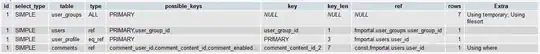
Here is a part of the tab delimited files where I used as input:

Clades  Genes   GC  Selected
A   18S 51.13   Y
A   18S 51.05   
AA  18S 50.35   
AC  18S 49.67   Y
AC  18S 49.65   
C   18S 49.44   
C   18S 50.06   Y
E   18S 50.06   Y
E   18S 50.18   
F   rbcL    41.32   
F   rbcL    38.87   Y
H   rbcL    39.92   Y
I   rbcL    39.29   Y
I   rbcL    37.69   
K   ITS 53.55   
L   ITS 61.3    
L   ITS 60.78   
L   ITS 60.52   
M   ITS 59.97   
O   ITS 61.72   
O   ITS 60.43   Y
R   ITS 50.58   
R   ITS 51.1    

And the desired output:

The selected points were colored yellow. desired_output

Please let me know if any more details is needed. Thanks!

web
  • 105
  • 9
  • 1
    It's easier to help you if you include a simple [reproducible example](https://stackoverflow.com/questions/5963269/how-to-make-a-great-r-reproducible-example) with sample input and desired output that can be used to test and verify possible solutions. You will need a column that indicates whether or not the point should be colored or not. – MrFlick Dec 22 '20 at 06:49
  • First. `scale_fill_manual` sets the colors for the `fill` aes, but you are mapping on the `color`aes. Second. To highlight selected points you could add an indicator variable to your df e.g. something like `indicator = point %in% selected` and map this indicator var on the `color` aes. – stefan Dec 22 '20 at 07:20
  • @MrFlick Thanks for the advice, I have updated the question. – web Dec 22 '20 at 07:54
  • @stefan Sorry I might not be too comfortable with R yet. What do you mean by "mapping on the `color` aes"? – web Dec 22 '20 at 08:07
  • In ggplot2 with "mapping" or "map" one means to "assign" a variable to an aesthetic, i.e. which var to use as "x", "y", "color", "shape", ... From your dataset I would guess that there already is an indicator, i.e. try with adding `aes(...., color=Selected)`. – stefan Dec 22 '20 at 08:13

1 Answers1

0

To achieve your desired result you could map your variable Selected on color and Genes on shape.

As a first step I recoded Selected as I was not sure whether it contains missing or empty strings. If you don't want to have a color legend you could do so by adding guides(color=FALSE).

gc$Selected <- ifelse(gc$Selected %in% "Y", "Y", "N")

library(ggplot2)

ggplot(gc, aes(x=Clades, y=GC, shape=Genes, colour=Selected)) +
  labs(x = "Clades", y = "GC Content (%)", title = "GC Content across Clades") +
  geom_point(size=3) +
  scale_color_manual(values = c(Y = "yellow", N = "black"))

EDIT To the best of my knowledge there is no easy out of the box solution to put the labels of a discrete axis between the grid lines. One option to achieve this, is by converting your categorical Clades to a continuous variable, i.e. a numeric. This will automatically add minor grid lines besides the major grid lines. The major grid lines can then be removed using theme options:

breaks <- unique(as.numeric(factor(gc$Clades)))
labels <- unique(factor(gc$Clades))

ggplot(gc, aes(x=as.numeric(factor(Clades)), y=GC, shape=Genes, colour=Selected)) +
  labs(x = "Clades", y = "GC Content (%)", title = "GC Content across Clades") +
  geom_point(size=3) +
  scale_x_continuous(breaks = breaks, labels = labels) +
  scale_color_manual(values = c(Y = "yellow", N = "black")) +
  theme(panel.grid.major.x = element_blank()) 

DATA

text <- "Clades  Genes   GC  Selected
A   18S 51.13   Y
A   18S 51.05   NA
AA  18S 50.35   NA
AC  18S 49.67   Y
AC  18S 49.65   NA
C   18S 49.44   NA
C   18S 50.06   Y
E   18S 50.06   Y
E   18S 50.18   NA
F   rbcL    41.32   NA
F   rbcL    38.87   Y
H   rbcL    39.92   Y
I   rbcL    39.29   Y
I   rbcL    37.69   NA
K   ITS 53.55   NA
L   ITS 61.3    NA
L   ITS 60.78   NA
L   ITS 60.52   NA
M   ITS 59.97   NA
O   ITS 61.72   NA
O   ITS 60.43   Y
R   ITS 50.58   NA
R   ITS 51.1    NA"

gc <- read.table(text = text, header = TRUE)
stefan
  • 90,330
  • 6
  • 25
  • 51
  • Nothing special. From the data you posted I was not sure whether the empty spaces are actually missing values or empty strings. To avoid any issues this line simply recodes non "Y" values in "Selected" as "N". – stefan Dec 22 '20 at 08:54
  • To avoid confusion: I realized later that I have missed the line explaining on the first step and deleted the comment before I saw the reply. I was asking what does this line emphasizing `gc$Selected <- ifelse(gc$Selected %in% "Y", "Y", "N")`. – web Dec 22 '20 at 09:20
  • Thanks stefan! The solution is perfect! – web Dec 22 '20 at 09:20
  • Btw, is it possible to shift the grid lines so that the plotted points wasn't lying on the lines but between the lines for every column? – web Dec 22 '20 at 09:23
  • Yep. Of course is this possible but a bit of a hack. I just made an edit with the code to achieve that. Best S. – stefan Dec 22 '20 at 09:45