8

I want to display a page of thumbnails. The thumbnails are user uploaded artwork images. Each image has a constrained width, but not a constrained height, this is to show the full image without any cropping.

I want the images to butt up against each other with no gaps in between. The number of columns is not fixed: If I expand or resize the page the images should flow into correct number of columns.

float:left

is ALMOST, what I want. Except when there are tall images in the page I get this gapped look:
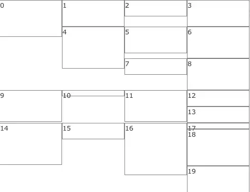
enter image description here

How do I eliminate the gaps?

Douglas B. Staple
  • 10,510
  • 8
  • 31
  • 58
Homan
  • 25,618
  • 22
  • 70
  • 107

2 Answers2

9

Not sure how graceful you need your CSS, but a good option none the less. You could use masonry.js to help that.

http://css-tricks.com/seamless-responsive-photo-grid/

onefastsnail
  • 91
  • 1
  • 5
6

If you want to do this in css only you have to create divs for every column, and float those columns (but it messes up order of images).

Alternatively, you can use jquery plugin like this one.

Litek
  • 4,888
  • 1
  • 24
  • 28
  • thanks. the masonry plugin does what I want. Except that I would have preferred the original order to go left to right down each row. Masonry does this for the first row, but for the 2nd row it seems to arbitrarily fit the next image in order up into the biggest gap it can find. Though generally you stil get the order to be first ones "near" the top, but not necessarily from left to right. – Homan Jul 01 '11 at 17:37
  • A possibility to avoid messing up the images is having a counter, for every fourth image you post it in the certain div. So you have this counter and a while statement going 1,2,3 and 4.... when the number hits 1, you add to div 1, and so on, and when it hits 4, you simply add the number back to 0 :) Problem solved! –  Mar 08 '14 at 21:51