I am trying to figure out how to plot data on weekly basis while having labels on circular axis for months only.
This topic is partly covered here but the data they have there is structurally different.
I have a dataset with number of posts posted per week:
   id week posts   weekdate year month  col fct_month
1:  1    1    26 2001-01-01 2001     1 grey       Jan
2:  2    2    24 2001-01-08 2001     1 grey       Jan
3:  3    3    35 2001-01-15 2001     1 grey       Jan
4:  4    4    35 2001-01-22 2001     1 grey       Jan
5:  5    5    19 2001-01-29 2001     1 grey       Jan
6:  6    6    55 2001-02-05 2001     2 grey       Feb
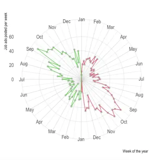
I need to create a circular plot for each year. I can do this with labels for each week:
library(data.table)
library(dplyr)
library(ggplot2)
library(hrbrthemes)

a<-"
id   week posts   weekdate year month  col fct_month
1     1    26 2001-01-01 2001     1 grey       Jan
2     2    24 2001-01-08 2001     1 grey       Jan
3     3    35 2001-01-15 2001     1 grey       Jan
4     4    35 2001-01-22 2001     1 grey       Jan
5     5    19 2001-01-29 2001     1 grey       Jan
6     6    55 2001-02-05 2001     2 grey       Feb
7     7    32 2001-02-12 2001     2 grey       Feb
8     8    31 2001-02-19 2001     2 grey       Feb
9     9    36 2001-02-26 2001     2 grey       Feb
10   10    36 2001-03-05 2001     3 grey       Mar
11   11    24 2001-03-12 2001     3 grey       Mar
12   12    42 2001-03-19 2001     3 grey       Mar
13   13    29 2001-03-26 2001     3 grey       Mar
14   14    57 2001-04-02 2001     4 grey       Apr
15   15    31 2001-04-09 2001     4 grey       Apr
16   16    33 2001-04-16 2001     4 grey       Apr
17   17    17 2001-04-23 2001     4 grey       Apr
18   18    16 2001-04-30 2001     4 grey       Apr
19   19    35 2001-05-07 2001     5 grey       May
20   20    23 2001-05-14 2001     5 grey       May
"
mindf<-fread(a)
ggplot(data=mindf, aes(x=factor(week), y=posts, group = year, color = col)) +
  ylim(0,NA) +
  geom_point(, stat='identity') +
  geom_polygon(fill=NA)+
  coord_polar(start =0) +
  scale_color_identity() +
  xlab('Week of the year')+
  ylab('Job ads posted per week') +
  theme_ipsum()
and the result is:
but when I do it with labeling months it all fails because I guess it becomes grouped by months:
ggplot(mindf, aes(x = fct_month, y = posts,
               group = year, colour = col)) +
  geom_line(size = .5) +
  # geom_polygon(fill=NA)+
  scale_color_identity()+
  # scale_y_discrete(expand = c(0, 1), breaks = NULL) +
  xlim(month.abb) +
  coord_polar() +
  theme_bw() + xlab(NULL) + ylab(NULL)
UPDATE:
If I add
scale_x_date(date_breaks = "1 month", date_labels = "%b")
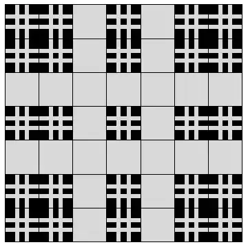
as @stefan suggests below, that results in multiple months with the same name:
Here is the reproducible code for checking that:
library(data.table)
library(dplyr)
library(ggplot2)


a<-" week posts   weekdate year month  col fct_month
    1    26 2001-01-01 2001     1 grey       Jan
    2    24 2001-01-08 2001     1 grey       Jan
    3    35 2001-01-15 2001     1 grey       Jan
    4    35 2001-01-22 2001     1 grey       Jan
    5    19 2001-01-29 2001     1 grey       Jan
    6    55 2001-02-05 2001     2 grey       Feb
    7    32 2001-02-12 2001     2 grey       Feb
    8    31 2001-02-19 2001     2 grey       Feb
    9    36 2001-02-26 2001     2 grey       Feb
   10    36 2001-03-05 2001     3 grey       Mar
    2    34 2002-01-07 2002     1 grey       Jan
    3    34 2002-01-14 2002     1 grey       Jan
    4    27 2002-01-21 2002     1 grey       Jan
    5    27 2002-01-28 2002     1 grey       Jan
    6    25 2002-02-04 2002     2 grey       Feb
    7    36 2002-02-11 2002     2 grey       Feb
    8    34 2002-02-18 2002     2 grey       Feb
    9    41 2002-02-25 2002     2 grey       Feb
   10    34 2002-03-04 2002     3 grey       Mar
   11    34 2002-03-11 2002     3 grey       Mar
"
mindf<-fread(a) %>%
  mutate(weekdate=as.Date(weekdate, format="%Y-%m-%d"))
ggplot(data=mindf, aes(x=weekdate, y=posts, group = year, color = col)) +
  ylim(0,NA) +
  geom_point(stat='identity') +
  geom_polygon(fill=NA, aes(group=year,color=year))+
  coord_polar(start =0) +
  scale_color_identity() +
  xlab('Week of the year')+
  ylab('Job ads posted per week') +
  scale_x_date(date_breaks = "1 month", date_labels = "%b")


