2

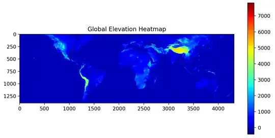
Using NASA's SRTM data, I've generated a global elevation heatmap.

Global Elevation Heatmap

The problem is, however, the continents tend to blend in with the ocean because of the range of elevation values. Is it possible to change the colorbar's scale so that the edges of the continents are more distinct from the ocean? I've tried different cmaps, but they all seem to suffer from the problem.

Here is my code. I'm initializing a giant array (with 0s) to hold global elevation data, and then populating it file by file from the SRTM dataset. Each file is 1 degree latitude by 1 degree longitude.

Another question I had was regarding the map itself. For some reason, the Appalachian Mountains seem to have disappeared entirely.

import os
import numpy as np
from .srtm_map import MapGenerator
from ..utils.hgt_parser import HGTParser
from tqdm import tqdm
import cv2
import matplotlib.pyplot as plt
import richdem as rd

class GlobalMapGenerator():
    def __init__(self):
        self.gen = MapGenerator()
        self.base_dir = "data/elevation/"
        self.hgt_files = os.listdir(self.base_dir)
        self.global_elevation_data = None
    
    def shrink(data, rows, cols):
        return data.reshape(rows, data.shape[0]/rows, cols, data.shape[1]/cols).sum(axis=1).sum(axis=2)

    def GenerateGlobalElevationMap(self, stride):
        res = 1201//stride
        max_N = 59
        max_W = 180
        max_S = 56
        max_E = 179
        
        # N59 --> N00
        # S01 --> S56
        # E000 --> E179
        # W180 --> W001
        
        # Initialize array global elevation
        self.global_elevation_data = np.zeros(( res*(max_S+max_N+1), res*(max_E+max_W+1) ))

        print("Output Image Shape:", self.global_elevation_data.shape)

        for hgt_file in tqdm(self.hgt_files):
            lat_letter = hgt_file[0]
            lon_letter = hgt_file[3]
            lat = int(hgt_file[1:3])
            lon = int(hgt_file[4:7])

            if lat_letter == "S":
                # Shift south down by max_N, but south starts at S01 so we translate up by 1 too
                lat_trans = max_N + lat - 1
            else:
                # Bigger N lat means further up. E.g. N59 is at index 0 and is higher than N00
                lat_trans = max_N - lat
            
            if lon_letter == "E":
                # Shift east right by max_W
                lon_trans = max_W + lon
            else:
                # Bigger W lon means further left. E.g. W180 is at index 0 and is more left than W001
                lon_trans = max_W - lon

            # load in data from file as resized
            data = cv2.resize(HGTParser(os.path.join(self.base_dir, hgt_file)), (res, res))
            
            # generate bounds (x/y --> lon.lat for data from this file for the giant array)
            lat_bounds = [res*lat_trans, res*(lat_trans+1)]
            lon_bounds = [res*lon_trans, res*(lon_trans+1)]
            
            try:
                self.global_elevation_data[ lat_bounds[0]:lat_bounds[1],  lon_bounds[0]:lon_bounds[1] ] = data
            except:
                print("REFERENCE ERROR: " + hgt_file)
                print("lat: ", lat_bounds)
                print("lon: ", lon_bounds)

        # generate figure
        plt.figure(figsize=(20,20))
        plt.imshow(self.global_elevation_data, cmap="rainbow")
        plt.title("Global Elevation Heatmap")
        plt.colorbar()
        plt.show()
        np.save("figures/GlobalElevationMap.npy", self.global_elevation_data)
        plt.savefig("figures/GlobalElevationMap.png")
    
    def GenerateGlobalSlopeMap(self, stride):
        pass
Shrey Joshi
  • 1,066
  • 8
  • 25
  • It is unclear how you created the graph but seemingly water is coded as zero, so no colormap will change that land at or only slightly above sea level will have the same color as water in your graph. However, without information about the library and script that created this graph not much can be said how to overcome this. Masking land/water and color them in two steps with two different colormaps may or may not be possible. – Mr. T Dec 24 '20 at 19:46
  • I understand that small differences in elevation will lead to small differences in color. I'm asking if there is a way to change the colorbar itself so that, say, the color in the range 0-2000 is more "compressed". Ex. the turquoise is at 1000 and green is at 2000. This way, the differences in elevation near 0 will be more apparent to the eye. – Shrey Joshi Dec 24 '20 at 19:55
  • 1
    Perhaps a logarithmic scaling would be best to achieve this. – bicarlsen Dec 24 '20 at 20:02
  • 1
    Without code, it is difficult to give more than general advice. [Matplotlib allows you to generate custom colormaps](https://matplotlib.org/3.2.1/tutorials/colors/colormap-manipulation.html). You could create one with -500 to 1 as black-to-blue, followed by yellow-to-red color ranging from 2 to 9000. Still, depending on your map data, water color may bleed into continents. – Mr. T Dec 24 '20 at 20:09
  • 1
    It seems you do not use map libraries like Cartopy or Basemap, so water masking may not be an option. How does the dataset that you read in encode height for oceans? As zero like landmass zero? If it just omits water, you could prefill your array with a value like -500 and scale the colormap that this value -500 is in the blue range and 0 ends up in the white band. – Mr. T Dec 24 '20 at 20:45
  • The dataset only has files for areas where there is land present, so I suppose I could prefill a negative value. – Shrey Joshi Dec 24 '20 at 20:58
  • 1
    You could try to set an "under" color. `my_cmap=copy.copy(plt.get_cmap('rainbow')); my_cmap.set_under('lightgrey')` and then `plt.imshow(...., cmap=my_cmap, vmin=0.001)`. See e.g. [Reset default matplotlib colormap values after using 'set_under' or 'set_over'](https://stackoverflow.com/questions/42843669/reset-default-matplotlib-colormap-values-after-using-set-under-or-set-over) or [this example](https://matplotlib.org/2.0.2/examples/pylab_examples/image_masked.html) – JohanC Dec 25 '20 at 12:11
  • @Mr.T could you turn your comment into an answer so I can accept? – Shrey Joshi Dec 29 '20 at 00:49
  • 2
    @ShreyJoshi Just post your final code and accept your own answer. If the code is good, I happily upvote it. – Mr. T Dec 29 '20 at 00:55
  • The Appalachian mountains just aren't that very tall – Mad Physicist Jun 21 '22 at 23:53

1 Answers1

2

Use a TwoSlopeNorm (docs) for your norm, like the example here.

From the example:

Sometimes we want to have a different colormap on either side of a conceptual center point, and we want those two colormaps to have different linear scales. An example is a topographic map where the land and ocean have a center at zero, but land typically has a greater elevation range than the water has depth range, and they are often represented by a different colormap.

If you set the midpoint at sea level (0), then you can have two very different scalings based on ocean elevation vs land elevation.

Example code (taken from the example linked above):

import numpy as np
import matplotlib.pyplot as plt
import matplotlib.colors as colors
import matplotlib.cbook as cbook
from matplotlib import cm

dem = cbook.get_sample_data('topobathy.npz', np_load=True)
topo = dem['topo']
longitude = dem['longitude']
latitude = dem['latitude']

fig, ax = plt.subplots()
# make a colormap that has land and ocean clearly delineated and of the
# same length (256 + 256)
colors_undersea = plt.cm.terrain(np.linspace(0, 0.17, 256))
colors_land = plt.cm.terrain(np.linspace(0.25, 1, 256))
all_colors = np.vstack((colors_undersea, colors_land))
terrain_map = colors.LinearSegmentedColormap.from_list(
    'terrain_map', all_colors)

# make the norm:  Note the center is offset so that the land has more
# dynamic range:
divnorm = colors.TwoSlopeNorm(vmin=-500., vcenter=0, vmax=4000)

pcm = ax.pcolormesh(longitude, latitude, topo, rasterized=True, norm=divnorm,
                    cmap=terrain_map, shading='auto')
# Simple geographic plot, set aspect ratio beecause distance between lines of
# longitude depends on latitude.
ax.set_aspect(1 / np.cos(np.deg2rad(49)))
ax.set_title('TwoSlopeNorm(x)')
cb = fig.colorbar(pcm, shrink=0.6)
cb.set_ticks([-500, 0, 1000, 2000, 3000, 4000])
plt.show()

picture of map with colored elevations

See how it scales numbers with this simple usage (from docs):

>>> import matplotlib. Colors as mcolors
>>> offset = mcolors.TwoSlopeNorm(vmin=-4000., vcenter=0., vmax=10000)
>>> data = [-4000., -2000., 0., 2500., 5000., 7500., 10000.]
>>> offset(data)
array([0., 0.25, 0.5, 0.625, 0.75, 0.875, 1.0])
  • Your answer could be improved with additional supporting information. Please [edit] to add further details, such as citations or documentation, so that others can confirm that your answer is correct. You can find more information on how to write good answers [in the help center](/help/how-to-answer). – Community Jun 22 '22 at 03:12
  • While this link may answer the question, it is better to include the essential parts of the answer here and provide the link for reference. Link-only answers can become invalid if the linked page changes. - [From Review](/review/late-answers/32075032) – BrokenBenchmark Jun 25 '22 at 14:56