I have a data frame as:
and I can plot this data as :
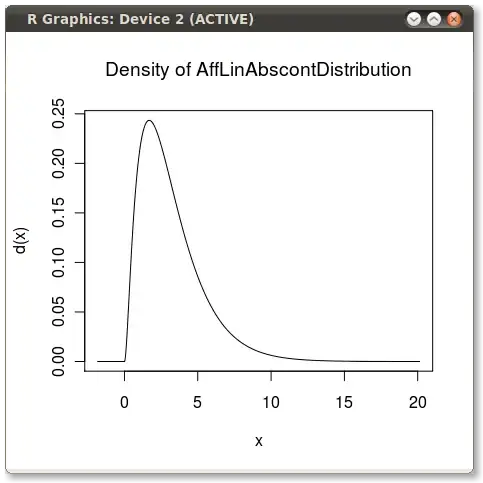
how can I make x axis of this plot like the following plot:
fig, ax1 = plt.subplots(figsize=(15, 5))
ax1.set(xlabel='hours in a week', ylabel='occupancy ratio(0-1)')
ax1.plot(HoursOfWeek.values, color='g')
plt.show()


