0

I'm in interview process with some company.

Task is, to see if there is any relationship between wealth-age and initial funded amount.

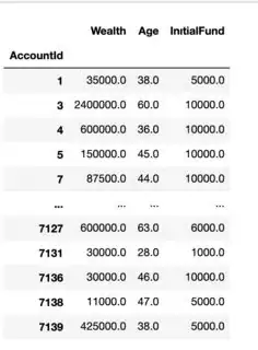
As a task, I'm developing a K-Means clustering algorithm, to get a brief idea about data here is the screenshot

enter image description here

I've created the k-means model, problem is with the task they also sent some data visualization example

enter image description here

I don't know how to plot something like this, I even don't like what kind of plot is this...

How can I use my K-means model prediction to plot something like this?
Shai
  • 111,146
  • 38
  • 238
  • 371
Rutkay Karabulak
  • 107
  • 1
  • 2
  • 12
  • It is a simple scatter plot with marker size reflecting a third variable. [See here for a good explanation of how to scale the marker size.](https://stackoverflow.com/a/47403507/8881141) Not sure what the color represents in your plot, though. – Mr. T Dec 27 '20 at 02:36
  • Seaborn provides a way to directly use a variable to determine the size but makes other things more difficult in return: https://stackoverflow.com/a/42759867/8881141 – Mr. T Dec 27 '20 at 03:03
  • Please include a link to the dataset in your question if on kaggle. – David Erickson Dec 27 '20 at 03:07
  • @DavidErickson Sure here is , https://www.kaggle.com/rutkaykarabulak/notebook589fe5c855 , I've developed my k-means algorithm but when I try to plot it I failed... I wish you cold help me – Rutkay Karabulak Dec 27 '20 at 11:21
  • @RutkayKarabulak from your kaggle, can you please include either the output of your `y_kmeans` dataframe? Plotting can be pretty specific to the actual data, so I can't really help without the actual data. – David Erickson Dec 28 '20 at 04:46

0 Answers0