0

How to make the div take the remaining space when float left is kept as a style. In my case the div takes the remaining space which is at the right side, but the remaining space at left side is unused.

Below is the html content

#main {
  width: 500px;
  height: 800px;
  border: 1px solid #c3c3c3;
  justify-content: space-between;
}

#main div {
  width: 70px;
  float: left;
  margin: 10px;
}
<h1>The justify-content Property</h1>

<p>The "justify-content: center;" aligns the flex items at the center of the container:</p>

<div id="main">
  <div style="background-color:coral;height:100px">1</div>
  <div style="background-color:lightblue;height:100px">2</div>
  <div style="background-color:coral;height:100px">3</div>
  <div style="background-color:lightblue;height:100px">3</div>
  <div style="background-color:coral;height:200px">4</div>
  <div style="background-color:lightblue;height:100px">5</div>
  <div style="background-color:coral;height:400px">6</div>
  <div style="background-color:lightblue;height:100px">7</div>
  <div style="background-color:coral;height:600px">8</div>
  <div style="background-color:lightblue;height:100px">9</div>
  <div style="background-color:coral;height:100px">10</div>
</div>

<p><b>Note:</b> Internet Explorer 10 and earlier versions do not support the justify-content property.</p>
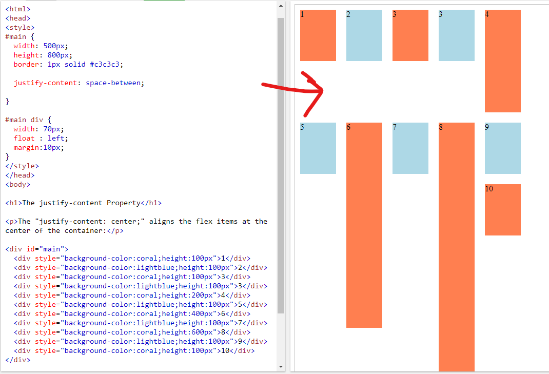
W3schools example

Wais Kamal
  • 5,858
  • 2
  • 17
  • 36
Amith B
  • 327
  • 2
  • 11

1 Answers1

1

You need to add display flex to the #main. Because justify-content works only with display flex. Here is the new CSS:

#main {
    width: 500px;
    height: 800px;
    border: 1px solid #c3c3c3;
    justify-content: space-between;
    display: flex;
    flex-wrap: wrap;
}
DVS
  • 326
  • 1
  • 7
  • Added the flex to #main it is making the space-between work properly, but my problem is that the div's should take the remaining space vertically above it. – Amith B Jan 01 '21 at 09:22
  • You just need to add "min-height" instead of "height". – DVS Jan 01 '21 at 09:26
  • This makes all the div's fill the space, but this makes the smaller div expand to fit the row height. Is there any way to not make the div change it's height and it should not expand and should maintain it's size. – Amith B Jan 01 '21 at 09:50
  • That means you need to display 5th column just below the 1st column? Or please share me the screenshot how you want to display. Thanks. – DVS Jan 01 '21 at 10:04
  • Yes I need the 5,6 ,7 and 8th div to appear just below the 1, 2 , 3 , 3 div's – Amith B Jan 01 '21 at 11:07
  • Then you need to remove display flex from the "#main" and add "column-count: 5" – DVS Jan 01 '21 at 11:29
  • Thank you, this solved my problem. But only thing is, now the div's are ordered vertically, any order works for me, so no issues. – Amith B Jan 01 '21 at 18:54