1

I am familiar with R, but not very much with plotting. I have panel data as follows:

library(plm)
library(dplyr)
data("EmplUK", package="plm")
EmplUK <- EmplUK %>%
group_by(firm, year) %>%
mutate(Vote = sample(c(0,1),1) ,
     Vote_won = ifelse(Vote==1, sample(c(0,1),1),0))

# EDIT: 

EmplUK <- pdata.frame(EmplUK , index=c("firm", "year"), drop.index = FALSE)

# A tibble: 1,031 x 9
# Groups:   firm, year [1,031]
    firm  year sector   emp  wage capital output  Vote Vote_won
   <dbl> <dbl>  <dbl> <dbl> <dbl>   <dbl>  <dbl> <dbl>    <dbl>
 1     1  1977      7  5.04  13.2   0.589   95.7     1        0
 2     1  1978      7  5.60  12.3   0.632   97.4     0        0
 3     1  1979      7  5.01  12.8   0.677   99.6     1        1
 4     1  1980      7  4.72  13.8   0.617  101.      1        1
 5     1  1981      7  4.09  14.3   0.508   99.6     0        0
 6     1  1982      7  3.17  14.9   0.423   98.6     0        0
 7     1  1983      7  2.94  13.8   0.392  100.      0        0
 8     2  1977      7 71.3   14.8  16.9     95.7     1        0
 9     2  1978      7 70.6   14.1  17.2     97.4     1        1
10     2  1979      7 70.9   15.0  17.5     99.6     1        1

toplot <- plm(output ~ wage, data=EmplUK, model="within")

Coefficients:
     Estimate Std. Error t-value   Pr(>|t|)    
wage   -0.707      0.143   -4.94 0.00000095 ***

I would like to evaluate what the best relation between two variables in panel data are (linear, quadratic, polynomial) by visualising the relation between output and wage (and perhaps fitting such linear, quadratic, polynomial). I am however super unfamiliar with plotting.

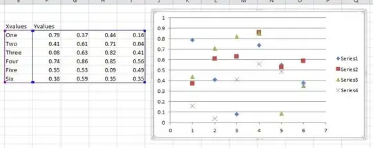
I am looking for something like this (source) (where I get the formula for the fitted line):

enter image description here

I tried starting out as follows:

plot(EmplUK$output,EmplUK$wage,type='l',col='red',main='Linear relationship')

But that gives me this:

enter image description here

In all honesty I have very little idea what I am doing here. Is there anyone who could get me in the right direction?

Tom
  • 2,173
  • 1
  • 17
  • 44

3 Answers3

2

Maybe something like this using ggplot2 :

library(ggplot2)

ggplot(EmplUK, aes(output, wage)) + 
  geom_line(color = 'red') + 
  geom_smooth(size = 2) + 
  ggtitle('Linear relationship') + 
  theme_bw()

enter image description here

Ronak Shah
  • 377,200
  • 20
  • 156
  • 213
  • Thank you very much! That already look as whooole lot better haha. I have a few small questions.. Is there any way to account for the fact that it is panel data (at least from your code I did not immediately see that, but maybe just did not understand it)? Also, is there a way to fit a linear relationship as well (and to extract those relationships?). Sorry for these additional questions, I just have very little idea about how to handle these plots. – Tom Jan 02 '21 at 08:33
  • I see that I forgot to make the data to be panel data. Now when I run the code, I get the error: `geom_smooth() using method = 'gam' and formula 'y ~ s(x, bs = "cs")' Error in self$layout$PANEL == i : comparison of these types is not implemented In addition: Warning message: In [.data.frame(self$layout, self$layout$PANEL == i, ) : Incompatible methods ("Ops.factor", "Ops.pseries") for "=="` – Tom Jan 02 '21 at 08:48
  • `ggplot` works better with dataframes/tibbles, try converting it to one. `ggplot(data.frame(EmplUK), aes(output, wage)) + ....`. To extract the relationship would be difficult from `ggplot` code. It would be better to fit this model separately if you want to work with it. – Ronak Shah Jan 02 '21 at 09:02
  • Did you also see my first comment? The point is that I would like to plot the panel relationship.. Or is this only possible by creating a whole demeaned dataset? – Tom Jan 02 '21 at 09:08
2

plm has a built-in plot method plm:::plot.plm which also shows the fixed effects. For the polynomial analysis you could use the yhat of a loess modell and colorize by firm. So both plots together can give you an idea of the data situation.

EmplUK <- transform(EmplUK, yhat=predict(loess(output ~ wage)))

op <- par(mfrow=c(1, 2), mar=c(4.5, 4, 3, 1))
plot(toplot)  ## from `plm:::plot.plm`
plot(output ~ wage, EmplUK, type="p", pch=20, cex=.5, col=firm, ylim=range(EmplUK$yhat))
invisible(sapply(unique(EmplUK$firm), function(x)
       lines(yhat ~ wage, EmplUK[EmplUK$firm == x, ], col=x, lwd=1)))
par(op)

enter image description here

Of course loess can't use factor variables; on Cross Validated they suggest a Semiparametric Nonlinear Mixed Effects model using the nlme package to apply LOESS on mixed models.

jay.sf
  • 60,139
  • 8
  • 53
  • 110
  • Thank you very much! I actually got the first plot, but I did not really know what to do with it (the second plot looks really helpful though!). Is there some way to make the left plot more readable? Also is there any way to extract a proposed fit from these models? – Tom Jan 02 '21 at 10:58
  • 1
    @Tom I'm afraid not, since `cex=` option won't work, I believe it is only designed for a quck diagnostic glance. But you could try stepwise regression using `step` similar to what I did in a [former answer](https://stackoverflow.com/a/65476628/6574038). In general, however, I would refrain from an overly data-driven approach and use theory to consider e.g. why output should initially fall and then rise again when wages rise. – jay.sf Jan 02 '21 at 11:15
2

I would probably do it with the de-meaned data.

demeaned_data <- EmplUK %>% 
  group_by(firm) %>% 
  mutate(across(c(output, wage), function(x)x-mean(x)))

ggplot(demeaned_data, aes(x=wage, y=output)) + 
  geom_point() + 
  geom_smooth(aes(colour="linear", fill="linear"), 
              method="lm", 
              formula=y ~ x, ) + 
  geom_smooth(aes(colour="quadratic", fill="quadratic"), 
              method="lm", 
              formula=y ~ x + I(x^2)) + 
  geom_smooth(aes(colour="cubic", fill="cubic"), 
              method="lm", 
              formula=y ~ x + I(x^2) + I(x^3)) + 
  scale_fill_brewer(palette="Set1") + 
  scale_colour_brewer(palette="Set1") + 
  theme_classic() + 
  labs(colour="Functional Form", fill="Functional Form")

enter image description here

An alternative would be to estimate the model with OLS and firm dummy variables and then you could get predictions for each firm and plot them separately.

library(ggeffects)
data("EmplUK", package="plm")
EmplUK <- EmplUK %>% mutate(firm = as.factor(firm))
m1 <- lm(output ~ wage + firm, data=EmplUK )
m2 <- lm(output ~ wage + I(wage^2) + firm, data=EmplUK )
m3 <- lm(output ~ wage + I(wage^2) + I(wage^3) + firm, data=EmplUK )

p1 <- ggpredict(m1, terms=c("wage", "firm")) %>% 
  mutate(form="linear") %>% 
  rename("wage" = "x", 
         "firm" = "group", 
         "output" = "predicted")
p2 <- ggpredict(m2, terms=c("wage", "firm")) %>% 
  mutate(form="quadratic") %>% 
  rename("wage" = "x", 
         "firm" = "group", 
         "output" = "predicted")
p3 <- ggpredict(m3, terms=c("wage", "firm")) %>% 
  mutate(form="cubic") %>% 
  rename("wage" = "x", 
         "firm" = "group", 
         "output" = "predicted")

ggplot() + 
  geom_line(data=p1, aes(x=wage, y=output, colour="linear")) + 
  geom_line(data=p2, aes(x=wage, y=output, colour="quadratic")) + 
  geom_line(data=p3, aes(x=wage, y=output, colour="cubic")) + 
  geom_point(data=EmplUK, aes(x=wage, y=output)) + 
  facet_wrap(~firm) + 
  theme_bw() + 
  labs(colour="Functional\nForm")

enter image description here

DaveArmstrong
  • 18,377
  • 2
  • 13
  • 25
  • Wow, this is absolutely amazing. I ended up demeaning the data as well, but I was not sure how to model the other relationships. I am going to have a lot of fun with this! Thank you very much! – Tom Jan 02 '21 at 13:04