1

I have a set of styles that create a slim overlay scrollbar for Chromium/Webkit using -webkit-scrollbar-track (fallbacks in FX don't have this issue), something like:

#wrapper {
  height: 125px;
  display: flex;
}

.slim-scroll {
    flex: 1;
    overflow-y: overlay !important;
    padding-right: calc(8px * 1.5);
}

    .slim-scroll::-webkit-scrollbar-track
    {
    }
        .slim-scroll:hover::-webkit-scrollbar-track { 
            -webkit-box-shadow: inset 0 0 8px rgba(0,0,0,0.3);
            box-shadow: inset 0 0 8px rgba(0,0,0,0.3);
            background: grey; 
        }

    .slim-scroll::-webkit-scrollbar
    {   
        height: 8px;
        width: 8px;
        background: none;
        -webkit-box-shadow: inset 0 0 8px rgba(0,0,0,0.1);
        box-shadow: inset 0 0 8px rgba(0,0,0,0.1);
    }

    .slim-scroll::-webkit-scrollbar-thumb
    {
        background: black;
    }
        .slim-scroll:hover::-webkit-scrollbar-thumb { background: red; }
<div id="wrapper">
  <div class="slim-scroll">
Lorem ipsum dolor sit amet, consectetur adipiscing elit. Nullam tincidunt risus eros, non fermentum quam lacinia eu. In nec nibh ipsum. Nunc sollicitudin lectus sed leo euismod, sed tincidunt nunc eleifend. Nunc sed nunc felis. Nunc dolor metus, luctus in aliquet sit amet, congue sed lacus. Cras pellentesque nisl quis quam vehicula, eget fermentum metus luctus. Vestibulum eget arcu eget nisl volutpat tincidunt. Maecenas pharetra ex ex, sit amet eleifend leo hendrerit ac.

Nulla sed tristique quam. Aliquam quis nisi sit amet mi hendrerit eleifend a feugiat neque. Suspendisse tincidunt auctor dui, quis convallis eros bibendum in. Donec dui ex, sollicitudin quis tristique a, interdum nec nibh. Duis mattis, leo eget consectetur mollis, enim tellus imperdiet ante, eu viverra felis ante scelerisque velit. Integer sit amet tincidunt lectus. Nulla hendrerit lectus est, a mattis augue cursus et. Praesent sit amet nunc lorem. Etiam sollicitudin ut neque a ultrices. Phasellus vel nulla mauris. Donec malesuada porta dui. Praesent mi augue, laoreet nec consectetur nec, tincidunt in erat. Aliquam laoreet vel dolor et mattis. Fusce eu augue ut felis posuere auctor.
  </div>
</div>

However, in the wild this has a weird bug: sometimes, not always, the -webkit-scrollbar-track appears on top of other content.

In this screen shot there are two web components, both with shadow DOM and using the style for the scrollbar, but the one on the left appears correctly, while on the right the -webkit-scrollbar-track and -webkit-scrollbar-thumb are on top of the next panel:

image showing scroll appearing over subsequent content

I can't reproduce this bug in a simple example - I don't know what's different between the two web components (or rather there are a huge number of differences, but I don't know which one is causing this).

Update

Thanks @jolan for the idea that has helped me find the cause: switching from overflow-y: overlay to overflow-y: auto stops the scroll bar appearing on top of other content.

That only gets me part way there - this uses overlay specifically (rather than scroll or auto because I want to keep the horizontal layout of the content the same regardless of parent height, but I also don't want to show a scrollbar when the content isn't scrollable.

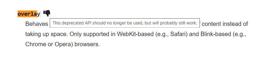
  • Is this a known bug with overlay? Can anyone point me to a blink/webkit issue?

  • Does anyone know why overlay does this and is there any way to resolve it without switching to auto or scroll?

  • Is there a CSS solution that doesn't change the content width depending on vertical height? It would have to work in flex and grid contexts as well as explicit height/width.

Keith
  • 150,284
  • 78
  • 298
  • 434
  • Has debugging yielded any further specification of *"sometimes, not always"*? I haven't been able to reproduce your error and since it is obviously no standard behavior it is near impossible to guess what could possibly fix it. – soimon Jan 14 '21 at 14:52
  • @soimon that's my problem - I go in with CSS browser tools; nothing I do moves the scroll on the left on top without also moving the panel it's in, and nothing I do moves the scroll on the right behind the panel its over. In that screen shot the panel at the bottom is after both controls in the DOM and has its own stacking context (so should be on top anyway), explicit `z-index` does nothing. I think it's something to do with nesting of custom elements, but in testing I can't reproduce this and just nesting on its own doesn't cause it. – Keith Jan 14 '21 at 17:10
  • Hello. Under what circumstances does this happen? When hovering, scrolling, or starting a page? – s.kuznetsov Jan 18 '21 at 05:15
  • @s.kuznetsov When it occurs it's always present, the page loads with the scroll bar appearing over the later/higher `z-index` content. – Keith Jan 18 '21 at 07:28
  • @Keith, why `overflow-y: overlay` as `!important;` ? – s.kuznetsov Jan 18 '21 at 12:04
  • @s.kuznetsov so that it overrides other inherited styles. If someone adds the class `silm-scroll` they want a slim scroll bar, even if other overflow styles applied to that component are ahead it in the cascade. For instance, in the demo above `#wrapper { overflow: hidden }` would ensure no horizontal scroll without needing to know the internals of `slim-scroll`. – Keith Jan 18 '21 at 13:12
  • There is an [answer for `overflow: overlay`](https://stackoverflow.com/questions/8543664/overflow-overlay-doesnt-work-in-firefox) already with a [link to an issue](https://github.com/w3c/csswg-drafts/issues/92) asking for that feature to be standardized. And here is the [issue for `scrollbar-gutters`](https://github.com/w3ctag/design-reviews/issues/520) which would replace `overflow: overlay`. – Rúnar Berg Jan 19 '21 at 02:47

2 Answers2

1

First, can you try to do this without flexbox? Flex still has some issues, especially on special cases like this.

Second I put all css on one div. As that is the div you want the scrollbar on.

Update: This fixes the original problem

Third: replace overflow-y: overlay with overflow-y: auto

Update: second question

overlay is deprecated

  • According to https://developer.mozilla.org/en-US/docs/Web/CSS/overflow this is a depreacted issue. According to https://bugs.webkit.org/show_bug.cgi?id=189811 it was an 'expected failure'.

  • As 'overflow-y: overlay' is deprecated (for at least 7 years if i read it correctly) it hasn't been maintained at all. This means that when -webkit-browsers update, they will not be taking this feature into account. Bugs like this will slowly show op as the browsers are evolving.

  • I would suggest one of next solutions:

    1. There are ways to completely hide the scrollbar (crossbrowser compatible): https://www.w3schools.com/howto/howto_css_hide_scrollbars.asp
    2. I suppose it's possible to style the scrollbar absolutely, but styling scrollbars is !not a crossbrowser solution!
    3. My suggestion: Styling or hiding scrollbars is generally not a good idea. There are very good reasons the 'overflow-y: overlay' feature is deprecated. I would suggest finding a different approach.

Last note: I would like to point out that overflow-y: overlay is a webkit feature. It will also not work cross-browser.

Jolan
  • 364
  • 1
  • 10
  • This style needs to work on components that already use flex layout, most don't have explicit heights - I need the content panel to fill the height of the parent even when it doesn't have content that pushes it to, which means flex, grid or explicit height. The `!important` is really needed in this context - `.slim-scroll` overrides whatever has already been set, so I can have `#listWrapper { overflow: hidden }` and then add `.slim-scroll` to get a vertical scroll only, without that you need to know the style internals of `.slim-scroll` and use `overflow-x: hidden` explicitly. – Keith Jan 18 '21 at 07:41
  • However, this does appear to point in the right direction: replacing `overlay` with `auto` fixes the problem! This appears to be a bug with `overlay` in particular. Unfortunately without the scroll overlaying the content you have to reflow when adding content that causes scroll to appear and potentially get lots of horizontal scrollbars that are the width of the vertical one. – Keith Jan 18 '21 at 07:46
  • I'm not really sure what you mean with the new problem, can you put an example in your question? – Jolan Jan 18 '21 at 16:17
  • I did some research and updated my question as good as I could.. – Jolan Jan 18 '21 at 16:55
  • Hmm, it looks like they held back on deprecating `overlay` because of the same layout issues I described here. `scrollbar-gutter` replaces it and fixes that layout, but is currently behind a flag in Canary, so we're currently in a nasty middle ground where nothing works quite right. _This_ solution isn't cross-browser - I have other solutions for other browsers :) – Keith Jan 18 '21 at 23:03
  • `scrollbar-gutter` is not what I need to match desktop to mobile web UX. Always showing the gutter looks awful. Not only this, but vertically scrollable content of a table causes a mismatch between the header layout and table content, `overflow: overlay` was perfect to handle this without needing to write complex JavaScript to handle this layout mapping. – Dylan Jun 23 '23 at 17:56
0

It looks like styling the scrollbars should be done using the scrollbar-width and scrollbar-color properties, (see CSSWG draft and issues). Currently firefox is the only browser that implements it though. There is another answer that describes the different cross-browser properties.

My I recommendation is to style your scrollbar as you wish in firefox and going from there as that is the behavior that will most likely to be settled on.

I’ve previously done cross browser scrollbar styling using the following:

#wrapper {
  height: 125px;
  display: flex;
}

.slim-scroll {
  --scrollbar-track-color: silver;
  --scrollbar-thumb-color: black;

  flex: 1;
  overflow-y: auto;
  scrollbar-color:
    var(--scrollbar-thumb-color)
    var(--scrollbar-track-color);
  scrollbar-gutter: stable;  /* Only works in chrome with Enable experimental Web Platform features flag enabled  */
  scrollbar-width: thin;
}

.slim-scroll::-webkit-scrollbar {
  background-color: var(--scrollbar-track-color);
  width: 5px;
}

::-webkit-scrollbar-thumb {
  background-color: var(--scrollbar-thumb-color);
}

.slim-scroll:hover {
  --scrollbar-track-color: steelblue;
  --scrollbar-thumb-color: firebrick;
}
<div id="wrapper">
  <div class="slim-scroll">
Lorem ipsum dolor sit amet, consectetur adipiscing elit. Nullam tincidunt risus eros, non fermentum quam lacinia eu. In nec nibh ipsum. Nunc sollicitudin lectus sed leo euismod, sed tincidunt nunc eleifend. Nunc sed nunc felis. Nunc dolor metus, luctus in aliquet sit amet, congue sed lacus. Cras pellentesque nisl quis quam vehicula, eget fermentum metus luctus. Vestibulum eget arcu eget nisl volutpat tincidunt. Maecenas pharetra ex ex, sit amet eleifend leo hendrerit ac.

Nulla sed tristique quam. Aliquam quis nisi sit amet mi hendrerit eleifend a feugiat neque. Suspendisse tincidunt auctor dui, quis convallis eros bibendum in. Donec dui ex, sollicitudin quis tristique a, interdum nec nibh. Duis mattis, leo eget consectetur mollis, enim tellus imperdiet ante, eu viverra felis ante scelerisque velit. Integer sit amet tincidunt lectus. Nulla hendrerit lectus est, a mattis augue cursus et. Praesent sit amet nunc lorem. Etiam sollicitudin ut neque a ultrices. Phasellus vel nulla mauris. Donec malesuada porta dui. Praesent mi augue, laoreet nec consectetur nec, tincidunt in erat. Aliquam laoreet vel dolor et mattis. Fusce eu augue ut felis posuere auctor.
  </div>
</div>

As you can see I’ve removed all the overflow: overlay (as per @Jolan’s answer) as well as the extra padding and box-shadows.

For preventing layout changes when the content grows or shrinks, use scrollbar-gutter and set it to stable (instead of overflow: overlay). Currently (January 2021) this will only work on chrome if you enable the Enable experimental Web Platform features feature flag.

Rúnar Berg
  • 4,229
  • 1
  • 22
  • 38