I have one more question about my website www.springtribe.de .
I have programmed the small responsive dropdown menu for the mobile site - the problem is that the menu doesn't direct me to the third-party websites even though I have put those third-party links into my HTML.
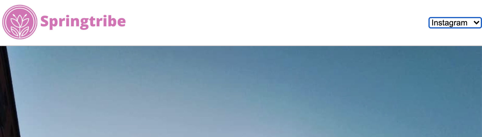
Here are my HTML and CSS for the problem dropdown menu. Any insights on what might have gone wrong appreciated!
HTML + CSS
/* Header */
header {
  position: fixed;
  z-index: 100;
  width: 100%;
  border-bottom: solid 1px #c6c1c1;
  background-color: white;
}

header .content {
  display: flex;
  align-items: center;
  padding: 1.875rem;
}


header .site-logo {
  flex: 1;
  width: 60%
}

header nav ul {
  display: flex;
}

ul {
  list-style-type: none;
  display: flex;
  margin-block-start: 1em;
  margin-block-end: 1em;
  margin-inline-start: 0px;
  margin-inline-end: 0px;
  padding-inline-start: 40px;
}

nav li {
  padding-left: 3.5rem;
}

nav li:last-child {
  display: flex;
}

nav a {
  vertical-align: bottom;
  line-height: 1.6;
  font-size: 1rem;
  color: #de6cb6;
}

nav select {
  display: none;
}

nav .button {
  padding: .1875rem .5rem;
  background-color: #9dc20b;
  line-height: 1.6;
  color: white;
}

a:-webkit-any-link {
  cursor: pointer;
}

header .icon {
  width: 1rem;
  padding-left: .75rem;
  color: #de6cb6
}

header .mobile {
  display: none;
}

@media only screen and (max-width: 1200px) {

  nav li:last-child {
    display: block;
  }

  header .content {
    padding: 1rem 1rem;
  }
}

@media only screen and (max-width: 1000px) {
  header {
    float: none;
  }

  header nav ul {
    display: none;
  }

  header nav select {
    display: inline-block;
    width: 100%;
  }


  header .content {
    padding: .5rem 0;
  }


}
<!-- Header -->
<header>
<div class="content" style="height: 60px;">
<a href="landingde.html" class="site-logo"><img src="./resources/images/cropped_springtribelogo_notagline.png" style="height:60px;"></a>
<nav>
<ul>
<li><a href="impressum.html">Impressum</a></li>
<li><a href="index.html">EN</a></li>
<li><a href="https://www.instagram.com/springtribe.de/?hl=en"><img class="icon" src="./resources/images/instagram (1.png"></a></li>
<li><a href="https://www.linkedin.com/in/florian-zejewski-03653b164/?originalSubdomain=de"><img class="Linkedin" src="./resources/images/Linkedin_saturated_4.png" style="width: 20px; color: #de6cb6; margin-left: 8px;"></a></li>
</ul>
<select>
<option value="/impressum.html/">Impressum</option>
<option value="/index.html/">EN</option>
<option value="https://www.instagram.com/springtribe.de/?hl=en">Instagram</option>
<option value="https://www.linkedin.com/in/florian-zejewski-03653b164/?originalSubdomain=de">Linkedin</option>
</select>
</nav>
</div>
</header>