-1

I have seen other questions where this done with bar charts and column charts but nothing with line charts. How would i make it to where the background for each year is a separate color? Also, how would you have it to where there is no noticeable gap between the facets?

 Month1 <- c(201811,201812,20191,20192,20193,20194,20195,20196,
        20197,20198,20199,201910,201911,201912,20201
        ,20202,20203,20204,20205,20206,20207
        ,20208,20209,202010,202011)
Rate <- 
c(3.2,3.3,3.4,3.1,3.0,3.1,2.9,2.6,2.5,2.3,2.1,1.6,1.7,1.5,1.7,1.1,-0.4,
-19.5,-17.6,-10.5,-9.6,-9.1,-8.6,-8.0,-7.7)

 cesyoy <- data.frame(Month1,Rate)

 #Chart
 library(ggplot2)
 library(dplyr)
 library(lubridate)
 library(scales)
 library(odbc)

##date

linechart<-cesyoy %>% mutate(year = substr(as.character(Month1),1,4),
                         month = substr(as.character(Month1),5,7),
                         date = as.Date(paste(year,month,"1",sep ="-"))) %>%  
 ggplot()+geom_line(aes(x=date,y=Rate),color="red")+
 scale_y_continuous(labels =scales::percent)+
 scale_x_date(date_breaks="1 month", date_labels="%b\n",
           expand = c(0, 0))+
 facet_wrap(.~year,scales = 'free_x',strip.position = 'bottom')+
 theme(panel.grid.major= element_blank(),
    axis.text.x = element_text(angle = 90, size=rel(0.6)),
    panel.spacing = unit(0, "lines"),
    strip.placement = 'outside',
    strip.background = element_blank())+
 ggtitle("Employment 
 Growth (%)")
Tim Wilcox
  • 1,275
  • 2
  • 19
  • 43

2 Answers2

1

You mean like this?

library(dplyr)
library(ggplot2)

cesyoy %>% mutate(year = substr(as.character(Month1),1,4),
                  month = substr(as.character(Month1),5,7),
                  date = as.Date(paste(year,month,"1",sep ="-"))) %>%  
  ggplot()+geom_line(aes(x=date,y=Rate, color = year))+
  scale_y_continuous(labels =scales::percent)+
  scale_x_date(date_breaks="1 month", date_labels="%b\n",
               expand = c(0, 0))+
  facet_wrap(.~year,scales = 'free_x',strip.position = 'bottom')+
  theme(panel.grid.major= element_blank(),
        axis.text.x = element_text(angle = 90, size=rel(0.6)),
        panel.spacing = unit(0, "lines"),
        strip.placement = 'outside',
        strip.background = element_blank())+
  ggtitle("Employment Growth (%)")
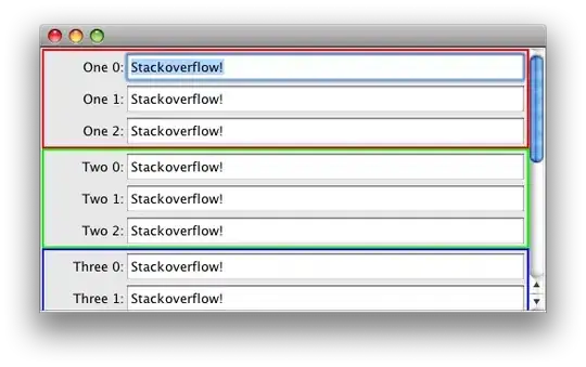
enter image description here

Also do you really needs facets here? Seems fine without them as well.

Ronak Shah
  • 377,200
  • 20
  • 156
  • 213
1

If you want to change background color for each year, you can add a geom_rect and fill by year.

Solving the broken lines across facets problem is rather more involved. Here is a possible solution.

EDIT: see below the first chart for a non-facet solution.

library(dplyr)
library(ggplot2)

cesyoy %>% 
  mutate(year = substr(as.character(Month1),1,4),
         month = substr(as.character(Month1),5,7),
         date = as.Date(paste(year,month,"1",sep ="-"))) %>%  
  ggplot() + 
  geom_line(aes(x = date, y = Rate)) +
  geom_rect(xmin = -Inf, ymin = -Inf, xmax = Inf, ymax = Inf, alpha = 0.1, aes(fill = year)) +
  facet_wrap(~year, scales = "free_x") +
  scale_y_continuous(labels = scales::percent) +
  scale_x_date(date_breaks="1 month", date_labels="%b\n",
               expand = c(0, 0)) + 
  ggtitle("Employment  Growth (%)") +
  theme(panel.grid.major = element_blank(),
        axis.text.x = element_text(angle = 90, size = rel(0.6)),
        panel.spacing = unit(0, "lines"),
        strip.placement = 'outside',
        strip.background = element_blank()) +
  scale_fill_brewer(palette = "Spectral") + 
  guides(fill = FALSE)

enter image description here

Non-facet solution

Create new variables, max_date and min_date, which are the start and end dates for each year. Then use those as the basis for geom_rect.

cesyoy %>% 
  mutate(year = substr(as.character(Month1),1,4),
         month = substr(as.character(Month1),5,7),
         date = as.Date(paste(year, month, "1" , sep ="-"))) %>% 
  group_by(year) %>% 
  mutate(min_date = as.Date(paste(year, "01", "01", sep = "-")), 
         max_date = as.Date(paste(year, "12", "31", sep = "-"))) %>% 
  ungroup() %>% 
  ggplot(aes(date, Rate)) + 
  geom_line() + 
  geom_rect(aes(xmin = min_date, xmax = max_date, fill = year), 
            ymin = -Inf, ymax = Inf, alpha = 0.1) +
  scale_fill_brewer(palette = "Spectral") +
  guides(fill = FALSE)

enter image description here

neilfws
  • 32,751
  • 5
  • 50
  • 63
  • Is there a way to have the y-axis have a tick mark at the left most data point. In this case, it would be 3.2. – Tim Wilcox Jan 13 '21 at 18:27