1

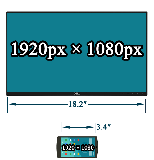
Consider two screens:

  • same resolution
  • same orientation
  • but different physical sizes

Exempla gratia:

enter image description here

How can i target different screen sizes with CSS media queries?

Because, for example:

  • for the one 1920px wide display, it is uncomfortable to read the long lines of text that stretch edge-to-edge, and you'd want some padding, margin, or other spacing to narrow the text
  • but for the other 1920px wide display, you want text to go edge-to-edge

Bonus Chatter

And you can't try to invoke User-Agent strings:

And you can't try to weasel out of the question by talking about orientation, or by musing if the screen supports touch or not, nor can you use the handheld attribute

I'm asking about using CSS to style a page based on the (physical) size of the screen.

Bonus Reading

Ian Boyd
  • 246,734
  • 253
  • 869
  • 1,219

1 Answers1

1

Well a typical media query for this would use min-width or max-width to hide or show things depending on display size. This is dependent on a <meta> tag which tells the browser to use the physical width of the display as the viewport width rather than using the resolution of the display as the viewport width.

For example:

<meta name="viewport" content="width=device-width"/>

and

@media all and (max-width: 600px)
{
    /*Put your mobile styles here*/
}

It's not a perfect solution and doesn't really account for touch interfaces for tablets or other larger mobile displays, but it's a good place to start for building mobile user interfaces.

It's important to emphasize that this is intended for displays in which the content is scaled. I know for fact that most modern mobile devices use scaling (2x/3x on iOS and xhdpi/xxhdpi on Android), but it should also work with Windows scaling, though I'm not 100% sure on that and don't have a way to test it at the moment.

These media queries can accept any CSS unit as well, so you could very well use actual inches if you wish.

@media all and (max-width: 3.5in) { /* ... */ }
Liftoff
  • 24,717
  • 13
  • 66
  • 119
  • The problem is that you're using `max-width: 600px` - a value in **pixels**. That is obviously not going to work for mobile devices. – Ian Boyd Jan 21 '21 at 22:12
  • Yes, but an iPhone X/11/12 for example will report its display width as 414px if you include the above meta tag even though the display's resolution width is actually 1242px. This is because iOS (and Android) uses resolution scaling. – Liftoff Jan 21 '21 at 22:14
  • @IanBoyd The [`px` unit](https://developer.mozilla.org/en-US/docs/Glossary/CSS_pixel) in CSS is not always `1:1` with device pixels, though. – D M Jan 21 '21 at 22:19
  • 1
    @DakotaMethvin That is true. But i didn't want to include the confusing of a user using the *"zoom"* feature of Chrome or Edge. – Ian Boyd Jan 21 '21 at 22:25
  • 1
    And so how do you differentiate a 600px device from a 600px device? Also, the device would only report 600px with `viewport: width=device-width` if the device really **is** 600px wide. A device that is actually 1920px wide, or [3840px wide](https://en.wikipedia.org/wiki/Sony_Xperia_XZ2_Premium) will report it's *"true"* size of 1920px (or 3840px). So how did you know that the 600px wide device is a 4" screen vs a 14" screen? – Ian Boyd Jan 21 '21 at 22:25
  • Not necessarily. Try it for yourself. Open a webpage on an iPhone with the above code. It will show any styles you put in that media query even though the resolution of the phone's display is far higher than 600px. The important factor here is display scaling. That meta tag will make the device report its scaled size, rather than its unscaled size. – Liftoff Jan 21 '21 at 22:32