1

To use on the multiple tables of my Asp.Net Core Code, I wanted a CSS code/style for my tables, which would make all of them have a scroll but with the table header fixed, making sure that all the rows and columns were aligned with each other. Something that for some reason is difficult to find, because I tried several alternatives, and they all worked very badly for me, since the differents codes which I tested completely misaligned the header with the columns below, or the width of the columns never adjusted well to the width of the text, etc.

So, after a while, I came up with this style code:

<style>
    * {
        box-sizing: border-box;
    }

    .wrapper2 {
        height: 30vw;
        overflow-y: scroll;
    }

    .card {
        background-color: #fff;
        border-radius: 10px;
        margin: 10% auto;
        position: relative;
        padding: 34px;
        color: #444;
        cursor: pointer;
        overflow-x: auto;
    }

        .card:before {
            display: block;
            position: absolute;
            background-color: #ccc;
            z-index: -1;
            box-shadow: 0 0 40px #999999;
            transition: box-shadow .2s ease-in-out;
        }

        .card.level-3:hover:before {
            box-shadow: 0 0 80px #999999;
        }

    .table {
        border-collapse: collapse;
        width: 100%;
    }

        .table td {
            overflow: hidden;
            word-break: normal;
            text-align: center;
        }

        .table th {
            text-align: center;
            word-break: normal;
        }

    .tablealign {
        float: right;
        width: 100%;
        height: 100%;
        border-radius: 3px;
        padding-bottom: 50px;
    }

    tbody {
        overflow-y: scroll;
        overflow-x: hidden;
        height: 336px;
        display: block;
    }

    thead {
        display: table;
        width: calc(100% - 17px);
        table-layout: fixed;
    }

    tbody tr {
        table-layout: fixed;
        display: table;
        width: 100%;
    }

    div.c {
        line-height: 1%;
    }
</style>

The rest of the code in the View:

<div class="container">
    <div class="card level-3">
        <h3>Blablabla</h3>

        <div class="tablealign">
            <div></div>
            <table class="table table-sm table-bordered">
                <thead class="thead-dark">
                    <tr>
                        <th>
                            <div>Name of The Person</div>
                        </th>
                        <th>
                            <div>Date of The Thing Cre</div>
                        </th>
                        <th>
                            <div>Name of The Universe</div>
                        </th>
                        <th>
                            <div>A Stuff of 4</div>
                        </th>
                        <th>
                            <div>A Stufff Of</div>
                        </th>
                        <th>
                            <div>Hour At Create</div>
                        </th>
                        <th>
                            <div>Hour At Lifeee</div>
                        </th>
                        <th><div></div></th>
                        <th>
                            <a class="btn btn-sm btn-primary" asp-action="Filtro" asp-route-id="">
                                SEARCH
                            </a>
                        </th>
                        <th><div></div></th>
                    </tr>
                </thead>
                <tbody>
                    @foreach (var item in ViewBag.Modelito)
                    {
                    <tr>
                        <td>
                            @item.Nom
                        </td>
                        <td>
                            @item.Fech
                        </td>
                        <td>
                            @item.NombM
                        </td>
                        <td>
                            @item.Momo
                        </td>
                        <td>
                            @item.RA
                        </td>
                        <td>
                            @item.Ho
                        </td>
                        <td>
                            @item.HourF
                        </td>
                        <td>
                            <a class="btn btn-sm btn-primary" asp-action="Edit" asp-route-id="@item.Id">
                                EDIT
                            </a>
                        </td>
                        <td>
                            <a class="btn btn-sm btn-primary" asp-action="Details" asp-route-id="@item.Id">
                                DETAILS
                            </a>
                        </td>
                        <td>
                            <a class="btn btn-sm btn-danger" asp-action="Delete" asp-route-id="@item.Id">
                                DELETEthis
                            </a>
                        </td>
                    </tr>
                    }
                </tbody>
            </table>
        </div>
    </div>
</div>

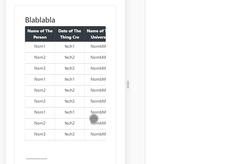
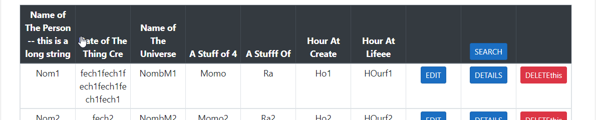
And all this code on the website looks like this: enter image description here enter image description here

Which works just fine, not bad but I would like the width of the header and column text to fit better, in the way you know...the way a tbody normally does with the td/th when It's just a normal table and the text adjusts visually nicely, but then when you ask this thing to have a scroll that doesn't move the head, the CSS code seems to completely lose its mind for reasons outside of my compression.

However, beyond improving this detail, my code generates the following gigantic problem, and that is, the View looks like this on a cellphone...:

enter image description here

Yes, this looks pretty bad.

How can I improve my code, get the table I really want, and also make it look good on a cellphone?? Thanks in advance for reading, I really need help with this.

1 Answers1

1

You can use the style table-responsive with bootstrap.

 <div class="table-responsive-sm tablealign">
     ...

Then change table-layout to auto, and assign the mine-width to .table th. Then change the .table width and srollbar's width. Here is all the style.

    <style>
    * {
        box-sizing: border-box;
    }

    .wrapper2 {
        height: 30vw;
        overflow-y: scroll;
    }

    .card {
        background-color: #fff;
        border-radius: 10px;
        margin: 10% auto;
        position: relative;
        padding: 34px;
        color: #444;
        cursor: pointer;
        overflow-x: auto;
    }

        .card:before {
            display: block;
            position: absolute;
            background-color: #ccc;
            z-index: -1;
            box-shadow: 0 0 40px #999999;
            transition: box-shadow .2s ease-in-out;
        }

        .card.level-3:hover:before {
            box-shadow: 0 0 80px #999999;
        }

    .table {
        border-collapse: collapse;
        width: 95%;
    }

        .table td {
            overflow: hidden;
            word-break: normal;
            text-align: center;
        }

        .table th  {
            text-align: center;
            word-break: normal;
            min-width: 100px;
        }
    .tablealign {
        float: right;
        width: 100%;
        height: 100%;
        border-radius: 3px;
        padding-bottom: 50px;
    }

    tbody {
         overflow-y: auto;
        overflow-x: hidden;
        height: 336px;
        display: block;
    }
    tbody::-webkit-scrollbar {
        width: 0;
    }
    thead {
        display: table;
        width: calc(100% - 17px);
        table-layout: auto;
    }

    tbody tr {
        table-layout: fixed;
        display: table;
        width: 100%;
    }

    div.c {
        line-height: 1%;
    }
    
</style>

enter image description here

enter image description here

Karney.
  • 4,803
  • 2
  • 7
  • 11
  • Well @Karney that didn't quite work. If the text in the header is longer like "Faooo du aaaaaaassorf", the header is not aligned with the columns below, if 'table-layout: auto'; Besides that, if that is not set to auto instead of fixed, "table-responsive-sm" doesn't work. I would like that the columns below to adjust to the length of the header columns, or vice versa if the content of the columns below is wider, and that all rows follow that pattern. – Diego Errázuriz Jan 25 '21 at 11:25
  • Oh, sorry, add the `min-width` in `.table th`, I have edited the answer. It can adjust the width of the column. – Karney. Jan 26 '21 at 02:25
  • Good morning @Karney, your code still doesn't solve the problem, which is the misalignment that occurs between the header of the table, and the rest of the table =/ I think I need a code that can dynamically adjust the width of the header columns, with the body columns, to prevent this from happening. Since as I said I need to repeat this code in multiple tables. Picture of how it looks: http://imgfz.com/i/VlhczPZ.png https://justpaste.it/2g44o – Diego Errázuriz Jan 27 '21 at 12:59
  • @DiegoErrázuriz, I have adjust all the style to adapt to the column. – Karney. Jan 28 '21 at 02:23
  • @DiegoErrázuriz, it is due to the scrollbar's width. – Karney. Jan 28 '21 at 02:48
  • @DiegoErrázuriz, can this help you? – Karney. Jan 29 '21 at 05:05