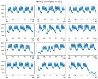
TL;DR Skip to Solution for method 2 to see the optimal solution, or skip to the last example for a solution with a single pandas line plot. In all three examples, weekends are highlighted using just 4-6 lines of code, the rest is for formatting and reproducibility.
Methods and tools
I am aware of two methods to highlight weekends on plots of time series, which can be applied both to single plots and to small multiples by looping over the array of subplots. This answer presents solutions for highlighting weekends but they can be easily adjusted to work for any recurring period of time.
Method 1: highlight based on the dataframe index
This method follows the logic of the code in the question and in the answers in the linked threads. Unfortunately, a problem arises when a weekend day occurs at the end of the month, the index number that is needed to draw the full span of the weekend exceeds the index range which produces an error. This issue is solved in the solution shown further below by computing the time difference between two timestamps and adding it to each timestamp of the DatetimeIndex when looping over them to highlight the weekends.
But two issues remain, i) this method does not work for time series with a frequency of more than a day, and ii) time series based on frequencies less than hourly (like 15 minutes) will require the drawing of many polygons which hurts performance. For these reasons, this method is presented here for the purpose of documentation and I suggest using instead method 2.
Method 2: highlight based on the x-axis units
This method uses the x-axis units, that is the number of days since the time origin (1970-01-01), to identify the weekends independently from the time series data being plotted which makes it much more flexible than method 1. The highlights are drawn for each full weekend day only, making this two times faster than method 1 for the examples presented below (according to a %%timeit test in Jupyter Notebook). This is the method I recommend using.
Tools in matplotlib that can be used to implement both methods
axvspan link demo, link API (used in Solution for method 1)
broken_barh link demo, link API
fill_between link demo, link API (used in Solution for method 2)
BrokenBarHCollection.span_where link demo, link API
To me, it seems that fill_between and BrokenBarHCollection.span_where are essentially the same. Both provide the handy where argument which is used in the solution for method 2 presented further below.
Solutions
Here is a reproducible sample dataset used to illustrate both methods, using a frequency of 6 hours. Note that the dataframe contains data only for one year which makes it possible to select the monthly data simply with df[df.index.month == month] to draw each subplot. You will need to adjust this if you are dealing with a multi-year DatetimeIndex.
Import packages used for all 3 examples and create the dataset for the first 2 examples
import numpy as np                   # v 1.19.2
import pandas as pd                  # v 1.1.3
import matplotlib.pyplot as plt      # v 3.3.2
import matplotlib.dates as mdates  # used only for method 2

# Create sample dataset
rng = np.random.default_rng(seed=1) # random number generator
dti = pd.date_range('2018-01-01 00:00', '2018-12-31 23:59', freq='6H')
consumption = rng.integers(1000, 2000, size=dti.size)
df = pd.DataFrame(dict(consumption=consumption), index=dti)
Solution for method 1: highlight based on the dataframe index
In this solution, the weekends are highlighted using axvspan and the DatetimeIndex of the monthly dataframes df_month. The weekend timestamps are selected with df_month.index[df_month.weekday>=5].to_series() and the problem of exceeding the index range is solved by computing the timedelta from the frequency of the DatetimeIndex and adding it to each timestamp.
Of course, axvspan could also be used in a smarter way than shown here so that each weekend highlight is drawn in a single go, but I believe this would result in a less flexible solution and more code than what is presented in Solution for method 2.
# Draw and format subplots by looping through months and flattened array of axes
fig, axs = plt.subplots(4, 3, figsize=(10, 9), sharey=True)
for month, ax in zip(df.index.month.unique(), axs.flat):
    # Select monthly data and plot it
    df_month = df[df.index.month == month]
    ax.plot(df_month.index, df_month['consumption'])
    ax.set_ylim(0, 2500) # set limit similar to plot shown in question

    # Draw vertical spans for weekends: computing the timedelta and adding it
    # to the date solves the problem of exceeding the df_month.index
    timedelta = pd.to_timedelta(df_month.index.freq)
    weekends = df_month.index[df_month.index.weekday>=5].to_series()
    for date in weekends:
        ax.axvspan(date, date+timedelta, facecolor='k', edgecolor=None, alpha=.1)

    # Format tick labels
    ax.set_xticks(ax.get_xticks())
    tk_labels = [pd.to_datetime(tk, unit='D').strftime('%d') for tk in ax.get_xticks()]
    ax.set_xticklabels(tk_labels, rotation=0, ha='center')

    # Add x labels for months
    ax.set_xlabel(df_month.index[0].month_name().upper(), labelpad=5)
    ax.xaxis.set_label_position('top')

# Add title and edit spaces between subplots
year = df.index[0].year
freq = df_month.index.freqstr
title = f'{year} consumption displayed for each month with a {freq} frequency'
fig.suptitle(title.upper(), y=0.95, fontsize=12)
fig.subplots_adjust(wspace=0.1, hspace=0.5)

fig.text(0.5, 0.99, 'Weekends are highlighted by using the DatetimeIndex',
         ha='center', fontsize=14, weight='semibold');

As you can see, the weekend highlights end where the data ends as illustrated with the month of March. This is of course not noticeable if the DatetimeIndex is used to set the x-axis limits.
Solution for method 2: highlight based on the x-axis units
This solution uses the x-axis limits to compute the range of time covered by the plot in terms of days, which is the unit used for matplotlib dates. A weekends mask is computed and then passed to the where argument of the fill_between plotting function. The True values of the mask are processed as right-exclusive so in this case, Mondays must be included for the highlights to be drawn up to Mondays 00:00. Because plotting these highlights can alter the x-axis limits when weekends occur near the limits, the x-axis limits are set back to the original values after plotting.
Note that with fill_between the y1 and y2 arguments must be given. For some reason using the default y-axis limits leaves a small gap between the plot frame and the tops and bottoms of the weekend highlights. Here, the y limits are set to 0 and 2500 just to create an example similar to the one in the question but the following should be used instead for general cases: ax.set_ylim(*ax.get_ylim()).
# Draw and format subplots by looping through months and flattened array of axes
fig, axs = plt.subplots(4, 3, figsize=(10, 9), sharey=True)
for month, ax in zip(df.index.month.unique(), axs.flat):
    # Select monthly data and plot it
    df_month = df[df.index.month == month]
    ax.plot(df_month.index, df_month['consumption'])
    ax.set_ylim(0, 2500) # set limit like plot shown in question, or use next line
#     ax.set_ylim(*ax.get_ylim())

    # Highlight weekends based on the x-axis units, regardless of the DatetimeIndex
    xmin, xmax = ax.get_xlim()
    days = np.arange(np.floor(xmin), np.ceil(xmax)+2)
    weekends = [(dt.weekday()>=5)|(dt.weekday()==0) for dt in mdates.num2date(days)]
    ax.fill_between(days, *ax.get_ylim(), where=weekends, facecolor='k', alpha=.1)
    ax.set_xlim(xmin, xmax) # set limits back to default values

    # Create appropriate ticks with matplotlib date tick locator and formatter
    tick_loc = mdates.MonthLocator(bymonthday=np.arange(1, 31, step=5))
    ax.xaxis.set_major_locator(tick_loc)
    tick_fmt = mdates.DateFormatter('%d')
    ax.xaxis.set_major_formatter(tick_fmt)

    # Add x labels for months
    ax.set_xlabel(df_month.index[0].month_name().upper(), labelpad=5)
    ax.xaxis.set_label_position('top')

# Add title and edit spaces between subplots
year = df.index[0].year
freq = df_month.index.freqstr
title = f'{year} consumption displayed for each month with a {freq} frequency'
fig.suptitle(title.upper(), y=0.95, fontsize=12)
fig.subplots_adjust(wspace=0.1, hspace=0.5)
fig.text(0.5, 0.99, 'Weekends are highlighted by using the x-axis units',
         ha='center', fontsize=14, weight='semibold');

As you can see, the weekends are always highlighted to the full extent, regardless of where the data starts and ends.
Additional example of a solution for method 2 with a monthly time series and a pandas plot
This plot may not make much sense but it serves to illustrate the flexibility of method 2 and how to make it compatible with a pandas line plot. Note that the sample dataset uses a month start frequency so that the default ticks are aligned with the data points.
# Create sample dataset with a month start frequency
rng = np.random.default_rng(seed=1) # random number generator
dti = pd.date_range('2018-01-01 00:00', '2018-06-30 23:59', freq='MS')
consumption = rng.integers(1000, 2000, size=dti.size)
df = pd.DataFrame(dict(consumption=consumption), index=dti)

# Draw pandas plot: x_compat=True converts the pandas x-axis units to matplotlib
# date units
ax = df.plot(x_compat=True, figsize=(10, 4), legend=None)
ax.set_ylim(0, 2500) # set limit similar to plot shown in question, or use next line
# ax.set_ylim(*ax.get_ylim())

# Highlight weekends based on the x-axis units, regardless of the DatetimeIndex
xmin, xmax = ax.get_xlim()
days = np.arange(np.floor(xmin), np.ceil(xmax)+2)
weekends = [(dt.weekday()>=5)|(dt.weekday()==0) for dt in mdates.num2date(days)]
ax.fill_between(days, *ax.get_ylim(), where=weekends, facecolor='k', alpha=.1)
ax.set_xlim(xmin, xmax) # set limits back to default values

# Additional formatting
ax.figure.autofmt_xdate(rotation=0, ha='center')
ax.set_title('2018 consumption by month'.upper(), pad=15, fontsize=12)

ax.figure.text(0.5, 1.05, 'Weekends are highlighted by using the x-axis units',
               ha='center', fontsize=14, weight='semibold');

You can find more examples of this solution in the answers I have posted here and here.
References: this answer by Nipun Batra, this answer by BenB, matplotlib.dates


