I'm working on an SVG gauge meter here I want to divide the semi-circle into parts when the range slider move on active stroke fill with gradient color. And want to add one more black color running track when the meter needle moves. I had tried using stroke-dasharray but after adding this all colors are coming at a time meter is not working properly.
- I want to divide the semi-circle into parts when the range slider move on active stroke fill with gradient color
- And I want to add one more black color running track when the meter needle moves.
My code here
/* set radius for all circles */
var r = 400;
var circles = document.querySelectorAll('.circle');
var total_circles = circles.length;
for (var i = 0; i < total_circles; i++) {
  circles[i].setAttribute('r', r);
}
/* set meter's wrapper dimension */
var meter_dimension = (r * 2) + 100;
var wrapper = document.querySelector('#wrapper');
wrapper.style.width = meter_dimension + 'px';
wrapper.style.height = meter_dimension + 'px';
/* add strokes to circles  */
var cf = 2 * Math.PI * r;
var semi_cf = cf / 2;
var semi_cf_1by3 = semi_cf / 3;
var semi_cf_2by3 = semi_cf_1by3 * 2;

document.querySelector('#outline_curves').setAttribute('stroke-dasharray', semi_cf + ',' + cf);
document.querySelector('#high').setAttribute('stroke-dasharray', semi_cf + ',' + cf);
document.querySelector('#avg').setAttribute('stroke-dasharray', semi_cf_2by3 + ',' + cf);
document.querySelector('#low').setAttribute('stroke-dasharray', semi_cf_1by3 + ',' + cf);
document.querySelector('#outline_ends').setAttribute('stroke-dasharray', 2 + ',' + (semi_cf - 2));
document.querySelector('#mask').setAttribute('stroke-dasharray', semi_cf + ',' + cf);
/*bind range slider event*/
var slider = document.querySelector('#slider');
var lbl = document.querySelector("#lbl");
var mask = document.querySelector('#mask');
var meter_needle = document.querySelector('#meter_needle');

function range_change_event() {
  var percent = slider.value
  var meter_value = semi_cf - ((percent * semi_cf) / 100);
  mask.setAttribute('stroke-dasharray', meter_value + ',' + cf);
  meter_needle.style.transform = 'rotate(' + (450 - ((percent * 180) / 100)) + 'deg)';
  lbl.textContent = percent + '%';
}
slider.addEventListener('input', range_change_event);
#wrapper {
position: relative;
margin: auto;
}
#meter {
width: 100%;
height: 100%;
transform: rotate(180deg);
}
.circle {
fill: none;
}
.outline,
#mask {
stroke: #F1F1F1;
stroke-width: 65;
}
.range {
stroke-width: 60;
}
#slider,
#lbl {
position: absolute;
}
#slider {
position: absolute;
transform: rotate(180deg);
cursor: pointer;
left: 0;
margin: auto;
right: 0;
top: 58%;
width: 94%;
}
#lbl {
background-color: #4B4C51;
border-radius: 2px;
color: white;
font-family: 'courier new';
font-size: 15pt;
font-weight: bold;
padding: 4px 4px 2px 4px;
right: -48px;
top: 57%;
}
#meter_needle {
height: 40%;
left: 0;
margin: auto;
position: absolute;
right: 0;
top: 10%;
transform-origin: bottom center;
/*orientation fix*/
transform: rotate(450deg);
width: 5px;
background-color: red;
}<script src="https://cdnjs.cloudflare.com/ajax/libs/jquery/3.3.1/jquery.min.js"></script>
<body>
<div id="wrapper">
<svg id="meter">
<circle id="outline_curves" class="circle outline" cx="50%" cy="50%">
</circle>
<circle id="high" class="circle range" cx="50%" cy="50%" stroke="#FDE47F">
</circle>
<circle id="avg" class="circle range" cx="50%" cy="50%" stroke="#7CCCE5">
</circle>
<circle id="low" class="circle range" cx="50%" cy="50%" stroke="#E04644">
</circle>
<circle id="mask" class="circle" cx="50%" cy="50%" >
</circle>
<circle id="outline_ends" class="circle outline" cx="50%" cy="50%">
</circle>
</svg>
<svg version="1.1" id="meter_needle" xmlns="http://www.w3.org/2000/svg" xmlns:xlink="http://www.w3.org/1999/xlink" x="0px" y="0px" width="16.721px" height="93.834px" viewBox="0 0 16.721 93.834" enable-background="new 0 0 16.721 93.834" xml:space="preserve">
<path fill="#464646" d="M13.886,84.243L2.83,83.875c0,0,3.648-70.77,3.956-74.981C7.104,4.562,7.832,0,8.528,0
c0.695,0,1.752,4.268,2.053,8.894C10.883,13.521,13.886,84.243,13.886,84.243z"/>
<path fill="#464646" d="M16.721,85.475c0,4.615-3.743,8.359-8.36,8.359S0,90.09,0,85.475c0-4.62,3.743-8.363,8.36-8.363
S16.721,80.855,16.721,85.475z"/>
<circle fill="#EEEEEE" cx="8.426" cy="85.471" r="2.691"/>
</svg>
<input id="slider" type="range" min="25" max="100" step="25" value="0" />
<label id="lbl" id="value" for="">0%</label>
</div>
<script src="script.js"></script>
</body>Can anyone suggest to me how to achieve this output. Any help will be appreciate.
<script src="https://cdnjs.cloudflare.com/ajax/libs/jquery/3.2.1/jquery.min.js"></script>

<svg version="1.1" id="Layer_1" xmlns="http://www.w3.org/2000/svg" xmlns:xlink="http://www.w3.org/1999/xlink" x="0px" y="0px" width="65px" height="51.333px" viewBox="0 0 65 51.333" enable-background="new 0 0 65 51.333" xml:space="preserve">
<g>
    <defs>
        <rect id="SVGID_1_" x="-157.417" y="-176.417" width="648" height="864"/>
    </defs>
    <clipPath id="SVGID_2_">
        <use xlink:href="#SVGID_1_"  overflow="visible"/>
    </clipPath>
    <g clip-path="url(#SVGID_2_)">
        <defs>
            <rect id="SVGID_3_" x="-157.417" y="-176.417" width="648" height="864"/>
        </defs>
        <clipPath id="SVGID_4_">
            <use xlink:href="#SVGID_3_"  overflow="visible"/>
        </clipPath>
    </g>
    <g clip-path="url(#SVGID_2_)">
        <defs>
            <rect id="SVGID_5_" x="-157.417" y="-176.417" width="648" height="864"/>
        </defs>
        <clipPath id="SVGID_6_">
            <use xlink:href="#SVGID_5_"  overflow="visible"/>
        </clipPath>
    </g>
    <g clip-path="url(#SVGID_2_)">
        <defs>
            <rect id="SVGID_7_" x="-157.417" y="-176.417" width="648" height="864"/>
        </defs>
        <clipPath id="SVGID_8_">
            <use xlink:href="#SVGID_7_"  overflow="visible"/>
        </clipPath>
        <path clip-path="url(#SVGID_8_)" fill="#FFFFFF" d="M19.527,44.274c-1.653,5.015-7.059,7.738-12.071,6.085
            c-5.015-1.654-7.739-7.058-6.087-12.071c1.652-5.015,7.058-7.739,12.072-6.084C18.456,33.855,21.179,39.26,19.527,44.274"/>
        <path clip-path="url(#SVGID_8_)" fill="#58595B" d="M19.514,44.289c-1.652,5.013-7.056,7.736-12.066,6.083
            c-5.014-1.653-7.736-7.056-6.084-12.067c1.652-5.013,7.055-7.736,12.068-6.083C18.443,33.875,21.166,39.277,19.514,44.289"/>
        <path clip-path="url(#SVGID_8_)" fill="#FFFFFF" d="M17.318,43.564c-1.253,3.801-5.35,5.865-9.15,4.612
            c-3.797-1.253-5.863-5.35-4.609-9.148c1.254-3.8,5.349-5.865,9.148-4.612C16.506,35.67,18.57,39.766,17.318,43.564"/>
        <path clip-path="url(#SVGID_8_)" fill="#58595B" d="M19.266,34.944c2.242,3.113,2.33,7.115,0.57,10.255l45.249-43.24L9.721,31.148
            C13.256,30.475,17.023,31.828,19.266,34.944"/>
        <defs>
            <filter id="Adobe_OpacityMaskFilter" filterUnits="userSpaceOnUse" x="6.52" y="-11.184" width="62.369" height="60.661">
                <feFlood  style="flood-color:white;flood-opacity:1" result="back"/>
                <feBlend  in="SourceGraphic" in2="back" mode="normal"/>
            </filter>
        </defs>
        <mask maskUnits="userSpaceOnUse" x="6.52" y="-11.184" width="62.369" height="60.661" id="SVGID_9_">
            <g filter="url(#Adobe_OpacityMaskFilter)">
                <g enable-background="new    ">
                    <g enable-background="new    ">
                        <g>
                            <defs>
                                <path id="SVGID_10_" d="M17.516,29.352c2.243,0.335,3.028,2.134,3.028,2.134L57.891,6.807L17.516,29.352z"/>
                            </defs>
                            <clipPath id="SVGID_11_" clip-path="url(#SVGID_8_)">
                                <use xlink:href="#SVGID_10_"  overflow="visible"/>
                            </clipPath>
                            <defs>

                                    <filter id="Adobe_OpacityMaskFilter_1_" filterUnits="userSpaceOnUse" x="6.52" y="-11.184" width="62.369" height="60.661">
                                    <feFlood  style="flood-color:white;flood-opacity:1" result="back"/>
                                    <feBlend  in="SourceGraphic" in2="back" mode="normal"/>
                                </filter>
                            </defs>
                            <mask maskUnits="userSpaceOnUse" x="6.52" y="-11.184" width="62.369" height="60.661" id="SVGID_9_">
                                <g filter="url(#Adobe_OpacityMaskFilter_1_)">
                                    <g enable-background="new    ">
                                    </g>
                                </g>
                            </mask>

                                <linearGradient id="SVGID_12_" gradientUnits="userSpaceOnUse" x1="-236.1787" y1="699.8169" x2="-235.1792" y2="699.8169" gradientTransform="matrix(36.5072 -22.3825 22.3825 36.5072 -7021.3823 -30804.627)">
                                <stop  offset="0" style="stop-color:#FFFFFF"/>
                                <stop  offset="0.0466" style="stop-color:#D5D7D8"/>
                                <stop  offset="0.0983" style="stop-color:#B1B3B6"/>
                                <stop  offset="0.1557" style="stop-color:#929497"/>
                                <stop  offset="0.2174" style="stop-color:#797A7D"/>
                                <stop  offset="0.2847" style="stop-color:#626366"/>
                                <stop  offset="0.3595" style="stop-color:#4E4E50"/>
                                <stop  offset="0.445" style="stop-color:#3B3B3C"/>
                                <stop  offset="0.5476" style="stop-color:#202021"/>
                                <stop  offset="0.6848" style="stop-color:#080809"/>
                                <stop  offset="1" style="stop-color:#000000"/>
                            </linearGradient>
                            <polygon clip-path="url(#SVGID_11_)" mask="url(#SVGID_9_)" fill="url(#SVGID_12_)" points="28.547,49.477 68.889,24.744
                                46.861,-11.184 6.52,13.549                          "/>
                        </g>
                    </g>
                </g>
            </g>
        </mask>
        <g opacity="0.8" clip-path="url(#SVGID_8_)">
            <g>
                <defs>
                    <rect id="SVGID_13_" x="6.52" y="-11.184" width="62.369" height="60.661"/>
                </defs>
                <clipPath id="SVGID_14_">
                    <use xlink:href="#SVGID_13_"  overflow="visible"/>
                </clipPath>
                <g clip-path="url(#SVGID_14_)">
                    <defs>
                        <path id="SVGID_15_" d="M17.516,29.352c2.243,0.335,3.028,2.134,3.028,2.134L57.891,6.807L17.516,29.352z"/>
                    </defs>
                    <clipPath id="SVGID_16_">
                        <use xlink:href="#SVGID_15_"  overflow="visible"/>
                    </clipPath>

                        <linearGradient id="SVGID_17_" gradientUnits="userSpaceOnUse" x1="-236.1787" y1="699.8169" x2="-235.1792" y2="699.8169" gradientTransform="matrix(36.5072 -22.3825 22.3825 36.5072 -7021.3823 -30804.627)">
                        <stop  offset="0" style="stop-color:#FFFFFF"/>
                        <stop  offset="0.1467" style="stop-color:#FFFFFF"/>
                        <stop  offset="1" style="stop-color:#FFFFFF"/>
                    </linearGradient>
                    <polygon clip-path="url(#SVGID_16_)" fill="url(#SVGID_17_)" points="28.547,49.477 68.889,24.744 46.861,-11.184 6.52,13.549
                                            "/>
                </g>
            </g>
        </g>
        <path clip-path="url(#SVGID_8_)" fill="#58595B" d="M12.709,42.044c-0.412,1.254-1.765,1.936-3.02,1.523
            c-1.253-0.414-1.934-1.765-1.52-3.019c0.412-1.253,1.764-1.936,3.017-1.521C12.44,39.441,13.121,40.792,12.709,42.044"/>
    </g>
</g>
</svg>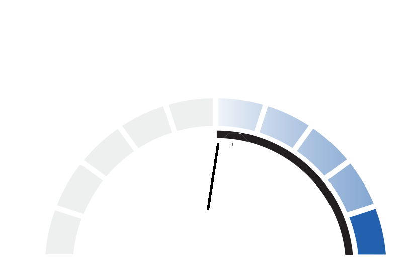
