0

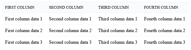
I would like to create a responsive HTML table that wraps columns below itself if the width of the table overflows the container. It should look like this:

Default table design

And when it's wrapped it schould look like this:

enter image description here

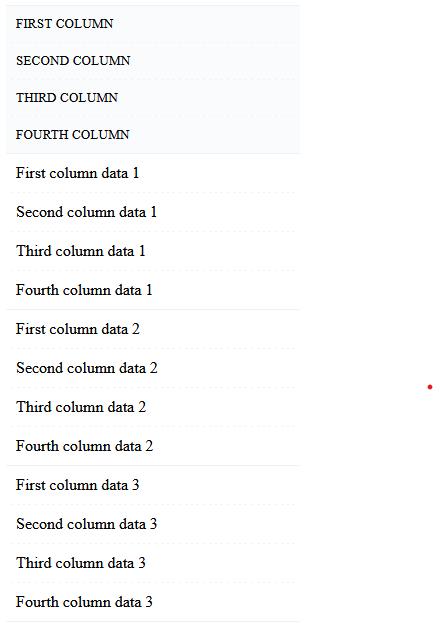
What is the optimal solution to this problem and can it be solved without using javascript?

The table in the default appearance is here:

table {
    width: 100%;
    border-spacing: 0;
    border-collapse: collapse;
}

table th,
table td {
    border-top: 1px solid #edf2f9;
    border-bottom: 1px solid #edf2f9;
    padding: 10px;
    text-align: left;
}

table th {
    background: #f9fbfd;
    font-size: 10pt;
    text-transform: uppercase;
    font-weight: 400;
}
<table>
  <thead>
    <tr>
      <th>First column</th>
      <th>Second column</th>
      <th>Third column</th>
      <th>Fourth column</th>
    </tr>
  </thead>
  <tbody>
    <tr>
      <td>First column data 1</td>
      <td>Second column data 1</td>
      <td>Third column data 1</td>
      <td>Fourth column data 1</td>
    </tr>
    <tr>
      <td>First column data 2</td>
      <td>Second column data 2</td>
      <td>Third column data 2</td>
      <td>Fourth column data 2</td>
    </tr>
    <tr>
      <td>First column data 3</td>
      <td>Second column data 3</td>
      <td>Third column data 3</td>
      <td>Fourth column data 3</td>
    </tr>
  </tbody>
</table>
Earlgray
  • 647
  • 1
  • 8
  • 31

1 Answers1

1

Without scripting, there is only one way out - media queries and set the "display: flex" and "flex-direction: column" properties for the table rows.

table {
  width: 100%;
  border-spacing: 0;
  border-collapse: collapse;
}

table th,
table td {
  border-top: 1px solid #edf2f9;
  border-bottom: 1px solid #edf2f9;
  padding: 10px;
  text-align: left;
}

table th {
  background: #f9fbfd;
  font-size: 10pt;
  text-transform: uppercase;
  font-weight: 400;
}

@media (max-width: 800px) {
  tr {
    display: flex;
    flex-flow: column nowrap;
  }
}
<table>
  <thead>
    <tr>
      <th>First column</th>
      <th>Second column</th>
      <th>Third column</th>
      <th>Fourth column</th>
    </tr>
  </thead>
  <tbody>
    <tr>
      <td>First column data 1</td>
      <td>Second column data 1</td>
      <td>Third column data 1</td>
      <td>Fourth column data 1</td>
    </tr>
    <tr>
      <td>First column data 2</td>
      <td>Second column data 2</td>
      <td>Third column data 2</td>
      <td>Fourth column data 2</td>
    </tr>
    <tr>
      <td>First column data 3</td>
      <td>Second column data 3</td>
      <td>Third column data 3</td>
      <td>Fourth column data 3</td>
    </tr>
  </tbody>
</table>

This method is not 100% correct and does not completely solve the issue, but there are no other options yet.

UModeL
  • 1,217
  • 1
  • 10
  • 15