12

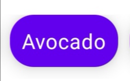
I have the following composable function to build a Chip:

@Composable
fun CategoryChip(
  category: String,
  isSelected: Boolean = false,
  onSelectedCategoryChanged: (String) -> Unit,
  onExecuteSearch: () -> Unit
) {
  Surface(
    modifier = Modifier.padding(end = 8.dp, bottom = 8.dp),
    elevation = 8.dp,
    shape = RoundedCornerShape(16.dp),
    color = when {
      isSelected -> colorResource(R.color.teal_200)
      else -> colorResource(R.color.purple_500)
    }
  ) {
    Row(modifier = Modifier
      .toggleable(
        value = isSelected,
        onValueChange = {
          onSelectedCategoryChanged(category)
          onExecuteSearch()
        }
      )) {
      Text(
        text = category,
        style = MaterialTheme.typography.body2,
        color = Color.White,
        modifier = Modifier.padding(8.dp)
      )
    }
  }
}

This creates the following chip:

enter image description here

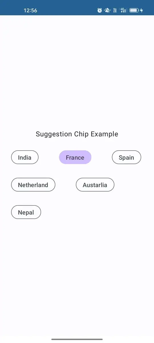
But what I am trying to achieve is the following:

enter image description here

Is it possible to create a shape like that with Jetpack Compose?

Gabriele Mariotti
  • 320,139
  • 94
  • 887
  • 841
Praveen P.
  • 976
  • 2
  • 11
  • 23

7 Answers7

23

Starting with M2 1.2.0-alpha02 you can use the Chip or FilterChip composable:

Chip(
    onClick = { /* Do something! */ },
    border = BorderStroke(
         ChipDefaults.OutlinedBorderSize,
         Color.Red
    ),
    colors = ChipDefaults.chipColors(
        backgroundColor = Color.White,
        contentColor = Color.Red
    ),
    leadingIcon = {
        Icon(
            Icons.Filled.Settings,
            contentDescription = "Localized description"
        )
    }
) {
    Text("Change settings")
}

enter image description here

With M3 (androidx.compose.material3) you can use one of these options:

Something like:

AssistChip(
    onClick = { /* Do something! */ },
    label = { Text("Assist Chip") },
    leadingIcon = {
        Icon(
            Icons.Filled.Settings,
            contentDescription = "Localized description",
            Modifier.size(AssistChipDefaults.IconSize)
        )
    }
)

enter image description here

Gabriele Mariotti
  • 320,139
  • 94
  • 887
  • 841
  • 1
    In Material Design 3 there are multiple types of Chip compostables e.g. AssistChip, SuggestionChip.... https://developer.android.com/reference/kotlin/androidx/compose/material3/package-summary – Igor Oct 14 '22 at 10:44
10

Yes, all you have to do is add a border to your surface.

Surface(
    modifier = Modifier.padding(end = 8.dp, bottom = 8.dp),
    elevation = 8.dp,
    shape = RoundedCornerShape(16.dp),
    border = BorderStroke(
        width = 1.dp,
        color = when {
            isSelected -> colorResource(R.color.teal_200)
            else -> colorResource(R.color.purple_500)
        }
     )
)
Code Poet
  • 6,222
  • 2
  • 29
  • 50
  • Don't forget to add content ` Surface(...) { Text("Some Example") }` to your surface :-) – kuzdu Oct 05 '21 at 15:30
  • I'm doing a similar thing. However, when I add a borderstroke, the corners are not rounded. I end up with a rounded chip and a rectangle border around the chip. – petestmart Nov 17 '21 at 21:38
5

Building on Code Poet's answer i wanted to show how to do a Material Chip with background color:

@Composable
fun buildChip(label: String, icon: ImageVector? = null) {
    Box(modifier = Modifier.padding(8.dp)) {
        Surface(
            elevation = 1.dp,
            shape = MaterialTheme.shapes.small,
            color = Color.LightGray
        ) {
            Row(verticalAlignment = Alignment.CenterVertically) {
                if (icon != null) Icon(
                    icon,
                    modifier = Modifier
                        .fillMaxHeight()
                        .padding(horizontal = 4.dp)
                )
                Text(
                    label,
                    modifier = Modifier.padding(8.dp),
                    style = MaterialTheme.typography.button.copy(color = Color.DarkGray)
                )
            }
        }
    }
}
Rody Davis
  • 1,825
  • 13
  • 20
3

Simply use ChipDefaults.outlinedBorder and Defaults.outlinedChipColors():

Chip(
    onClick = {},
    border = ChipDefaults.outlinedBorder,
    colors = ChipDefaults.outlinedChipColors(),
) {
    Text(
        text = "Trends",
    )
}
Roberto Leinardi
  • 10,641
  • 6
  • 65
  • 69
1

compose version 1.2.1 , kotlinCompilerExtensionVersion 1.3.1 Also add accompanist Flow library

implementation "com.google.accompanist:accompanist-flowlayout:0.26.4-beta"

We will use SuggestionChip composable function to create chips.

@Composable
fun SuggestionChipLayout() {

    val chips by remember { mutableStateOf(listOf("India", "France", "Spain","Netherland","Austarlia","Nepal")) }
    var chipState by remember { mutableStateOf("") }

    Column(
        modifier = Modifier.fillMaxSize(),
        horizontalAlignment = Alignment.CenterHorizontally,
        verticalArrangement = Arrangement.Center
    ) {
        Text(text = "Suggestion Chip Example")
        Spacer(modifier = Modifier.height(20.dp))
        FlowRow(
            modifier = Modifier
                .fillMaxWidth()
                .padding(horizontal = 10.dp),
            mainAxisSpacing = 16.dp,
            crossAxisSpacing = 16.dp,
        ) {
            chips.forEach {
                SuggestionChipEachRow(chip = it, it == chipState) { chip ->
                    chipState = chip
                }
            }
        }
    }

}

@OptIn(ExperimentalMaterial3Api::class)
@Composable
fun SuggestionChipEachRow(
    chip: String,
    selected: Boolean,
    onChipState: (String) -> Unit
) {

    SuggestionChip(onClick = {
        if (!selected)
            onChipState(chip)
        else
            onChipState("")
    }, label = {
        Text(text = chip)
    },
        border = SuggestionChipDefaults.suggestionChipBorder(
            borderWidth = 1.dp,
            borderColor = if (selected) Color.Transparent else PurpleGrey40
        ),
        modifier = Modifier.padding(horizontal = 16.dp),
        colors = SuggestionChipDefaults.suggestionChipColors(
            containerColor = if (selected) Purple80 else Color.Transparent
        ),
        shape = RoundedCornerShape(16.dp)
    )

}
Jayant Kumar
  • 775
  • 5
  • 12
0

Filter Chips: In filter chip we can select multiple items at a time

compose version 1.2.1 , kotlinCompilerExtensionVersion 1.3.1 Also add accompanist Flow library

implementation "com.google.accompanist:accompanist-flowlayout:0.26.4-beta"

we will use FilterChip composable function to create Filter Chip

@SuppressLint("MutableCollectionMutableState")
@Composable
fun FilterChipLayout() {

    val originalChips by remember {
        mutableStateOf(
            listOf(
                "chip1",
                "chip2",
                "chip3",
                "chip4",
                "chip5"
            )
        )
    }
    val temp: Set<Int> = emptySet()


    Column(
        modifier = Modifier.fillMaxSize(),
        horizontalAlignment = Alignment.CenterHorizontally,
        verticalArrangement = Arrangement.Center
    ) {
        Text(text = "Filter Chip Example")
        Spacer(modifier = Modifier.height(20.dp))
        FilterChipEachRow(chipList = originalChips, tempList = temp)

    }
}


@OptIn(ExperimentalMaterial3Api::class)
@Composable
fun FilterChipEachRow(
    chipList: List<String>,
    tempList: Set<Int>
) {
    var multipleChecked by rememberSaveable { mutableStateOf(tempList) }

    FlowRow(
        modifier = Modifier
            .fillMaxWidth()
            .padding(horizontal = 10.dp),
        mainAxisSpacing = 16.dp,
        crossAxisSpacing = 16.dp,
    ) {
        chipList.forEachIndexed { index, s ->

            FilterChip(selected = multipleChecked.contains(index), onClick = {
                multipleChecked = if (multipleChecked.contains(index))
                    multipleChecked.minus(index)
                else
                    multipleChecked.plus(index)

            }, label = {
                Text(text = s)
            },
                border = FilterChipDefaults.filterChipBorder(
                    borderColor = if (!multipleChecked.contains(index)) PurpleGrey40 else Color.Transparent,
                    borderWidth = if (multipleChecked.contains(index)) 0.dp else 2.dp
                ),
                shape = RoundedCornerShape(8.dp),
                leadingIcon = {
                    (if (multipleChecked.contains(index)) Icons.Default.Check else null)?.let {
                        Icon(
                            it,
                            contentDescription = ""
                        )
                    }
                }
            )

        }
    }

}
Jayant Kumar
  • 775
  • 5
  • 12
0

This is just a quick code for applying a border on AssistChip on MD3 using AssistChipDefaults.assistChipBorder

You can even use different states for instance on border color or border width when the AssistChip is selected.

//states if selected
    val spacing = LocalSpacing.current
val chipBorderColor = if (isSelected)
        MaterialTheme.colorScheme.primary
    else
        MaterialTheme.colorScheme.onSurface

val chipBorderWidth = if (isSelected)
    spacing.spaceDoubleDp
else
    spacing.spaceSingleDp

Then apply these on the AssistChip

AssistChip(
            onClick = onClickChip,
            label = { Text(text = "text") },
            shape = RoundedCornerShape(spacing.spaceSmall),
            modifier = modifier,
            border = AssistChipDefaults.assistChipBorder(
                    borderColor = chipBorderColor,
                    borderWidth = chipBorderWidth
            )

    )
Tonnie
  • 4,865
  • 3
  • 34
  • 50