12

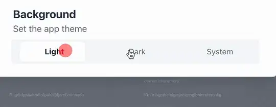
I want to create the following effect:

typefully-effect

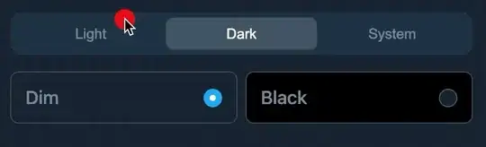
Currently, I have this weird effect:

weird animation

I am using Transition from @headlessui/react.

My code looks like:

<Transition
    show={app.theme !== 'light'}
    enter="transition ease duration-700 transform"
    enterFrom="opacity-0 -translate-y-full"
    enterTo="opacity-100 translate-y-0"
    leave="transition ease duration-1000 transform"
    leaveFrom="opacity-100 translate-y-0"
    leaveTo="opacity-0 -translate-y-full"
>

How do I achieve it?

oguz ismail
  • 1
  • 16
  • 47
  • 69
deadcoder0904
  • 7,232
  • 12
  • 66
  • 163

4 Answers4

5

I solved it. It doesn't show the animation on Codesandbox as Tailwind animations don't work on Codesandbox (it is their bug) but the code is tested locally & it works fine.

{theme.type !== "light" && theme.color !== null && (
    <div
        className={`mt-4 mx-2 flex items-center space-x-2 transition-all ease-out duration-700 h-10 ${
            isDarkTheme ? "opacity-100" : "opacity-0"
        }`}
    >
        <label className="flex items-center justify-between w-1/2 h-full px-4 py-6 text-lg font-medium leading-4 text-gray-400 border-2 border-gray-800 bg-gray-800 rounded-md cursor-pointer">
            <span>Dim</span>
            <input
                type="radio"
                name="darkOption"
                className="w-4 h-4"
                value="dim"
                checked={theme.color === "dim"}
                onChange={() => {
                    updateTheme({
                        color: "dim",
                    })
                }}
            />
        </label>
        <label className="flex items-center justify-between w-1/2 h-full px-4 py-6 text-lg font-medium leading-4 text-gray-400 border-2 border-gray-800 rounded-md cursor-pointer bg-black">
            <span>Lights Out</span>
            <input
                type="radio"
                name="darkOption"
                className="w-4 h-4"
                value="lights-out"
                checked={theme.color === "lights-out"}
                onChange={() => {
                    updateTheme({
                        color: "lights-out",
                    })
                }}
            />
        </label>
    </div>
)}

Codesandbox → https://codesandbox.io/s/headless-ui-theme-animated-cbft1

deadcoder0904
  • 7,232
  • 12
  • 66
  • 163
  • 3
    Actually, you did not solve your original question with the slide animation. Its just opacity. – Daniel Eberl Dec 12 '21 at 22:09
  • @DanielSzy can you post the solution then? unless i use opacity, it will overlap anyways so i don't know what's the problem. in any case, would love your solution :) – deadcoder0904 Dec 13 '21 at 04:05
  • 1
    It took me a while to figure things out, I found this library and example for my usecase: https://www.framer.com/docs/examples/#shared-layout-animations :) – Daniel Eberl Dec 14 '21 at 21:11
  • oh nice, that's a great one. i'll update the answer if i use it in that way :) – deadcoder0904 Dec 15 '21 at 14:39
5

This is how I created a similar animation for a disclosure panel:

<Transition
    enter="transition ease duration-500 transform"
    enterFrom="opacity-0 -translate-y-12"
    enterTo="opacity-100 translate-y-0"
    leave="transition ease duration-300 transform"
    leaveFrom="opacity-100 translate-y-0"
    leaveTo="opacity-0 -translate-y-12"
 >
Aditya
  • 76
  • 1
  • 5
5

I know this is some time ago but i managed to do something like the wanted behavior. I wrapped a Disclosure.Panel element in Transition:

<Transition
    className="transition-all duration-500 overflow-hidden"
    enterFrom="transform scale-95 opacity-0 max-h-0"
    enterTo="transform scale-100 opacity-100 max-h-96"
    leaveFrom="transform scale-100 opacity-100 max-h-96"
    leaveTo="transform scale-95 opacity-0 max-h-0"
>

If your content is taller than max-h-96 (height: 24rem; /* 384px */). You will have to customise the tailwind config to include a higher max-h.

You can also use max-h-['number'px] like so:

<Transition
    className="transition-all duration-500 overflow-hidden"
    enterFrom="transform scale-95 opacity-0 max-h-0"
    enterTo="transform scale-100 opacity-100 max-h-[1000px]"
    leaveFrom="transform scale-100 opacity-100 max-h-[1000px]"
    leaveTo="transform scale-95 opacity-0 max-h-0"
>

Show the animation, horrible quality

TaT_Rasmus_J
  • 51
  • 1
  • 2
1

This is my solution for an animation similar to Bootstrap Accordion:

<>
  <Disclosure.Button className="flex w-full justify-between rounded-lg bg-purple-100 px-4 py-2 text-left text-sm font-medium text-purple-900 hover:bg-purple-200 focus:outline-none focus-visible:ring focus-visible:ring-purple-500 focus-visible:ring-opacity-75">
    <span>What is your refund policy?</span>
    <i
      className={`${
        open
          ? "rotate-180 transition-transform ease-linear"
          : "transition-transform ease-linear"
      } mi-chevron-up icon-small ml-2 my-auto text-purple-500`}
    />
  </Disclosure.Button>
  <Transition
    className="overflow-hidden"
    enter="transition-all ease-in-out duration-[900ms] delay-[200ms]"
    enterFrom="transform  max-h-0"
    enterTo="transform  max-h-[1000px]"
    leave="transition-all ease-in-out duration-[600ms]"
    leaveFrom="transform  max-h-[1000px]"
    leaveTo="transform  max-h-0"
  >
    <Disclosure.Panel className="px-4 pt-4 pb-2 text-sm text-gray-500">
      If you're unhappy with your purchase for any reason, email
      us within 90 days and we'll refund you in full, no questions
      asked.
    </Disclosure.Panel>
  </Transition>
</>
marcofriso
  • 119
  • 1
  • 5