I am new to R studio. In general, I know how to generate a plot based on ggplot commands. I am wondering if it is possible to generate an EKMA diagram to show relationships between NOx, VOC and O3 from my observations by using ggplot.
My input file contains 3 columns (i.e. VOC, NOx and O3) and 1900 rows/column.
Hourly NOx: 9.88 12.58 16.58 19.86 17.54 10.66 8.36 6.42 6.37 6.60 5.19 4.48 4.55 4.43 4.66 4.08 3.57 3.34 3.67
Hourly O3: 29.26 24.64 19.11 13.93 13.90 19.34 21.69 23.75 24.11 25.70 29.73 33.07 36.82 38.75 40.63 40.55 41.67 42.93 43.73
Hourly VOC: 119.57 245.59 253.63 259.13 275.98 277.01 269.21 253.86 239.78 234.09 224.97 225.47 221.39 217.65 217.38 215.43 214.73 215.44 218.37
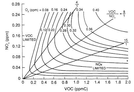
The following EKMA diagram is the diagram that I would like to generate (please follow the link. I am not allowed to post a photo over here). VOC is x axis, NOx is y axis and curve lines are O3 levels. EKMA Diagram
[1]: https://i.stack.imgur.com/mih0B.gif
Any suggestions are welcome and appreciated.
