I would like to use flexbox to display a series of images with a small caption. Each pair of image/text is contained in a div.
Each div should have a maximum height of at most 30vh. And the images should be scaled to fit in their respective div.
Well, it doesn't work. The image overflows its container.
This question is exceedingly common, and I will append a comprehensive list of related questions below.
I think the correct css for the desired layout should be this:
.container {
  display: flex;
  flex-direction: column;
  align-items: center;
  max-height: 30vh;
}
img {
  object-fit: contain;
}
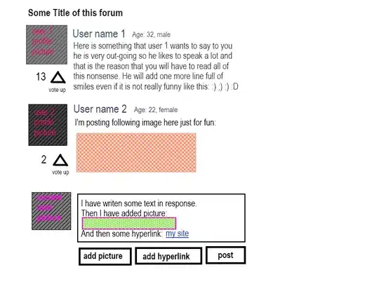
For some reason, the image does not adhere to the object-fit setting. Here is a screenshot that documents the problem:
Here is a minimal reproducible example on jsfiddle: https://jsfiddle.net/17a8sj9o/9/
I've also tried setting max-height: 100%;. But this works only for some of the images. If you edit the jsfiddle, you'll see this:

Experimenting with max-height makes me think that this problem is some strange interplay between the flexbox layout and the image height.
There are many related questions, they invariably advocate a mixture of height, max-height and object-fit.
I've searched extensively but couldn't find a solution that solves my problem.
Here is a selection of related questions:
- Contain an image within a div? uses max-height and max-width, with absolute px measures
- Make an image width 100% of parent div, but not bigger than its own width uses max-width with a percentage
- Img's max-height not respecting parent's dimensions uses a combination of max-height and attributes for positioning. Another answer mentions object-fit
