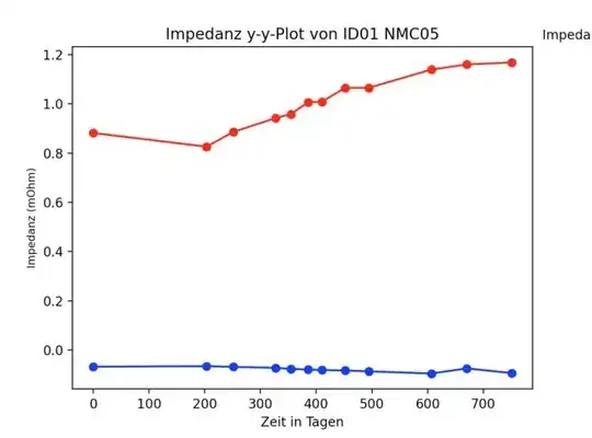
I have the same problem as the person in this post:
My matplotlib.pyplot legend is being cut off
namely that my legend gets cut off at the side of the figure when I use plt.show().

The post above handles that problem using this code plt.savefig(bbox_inches = 'tight')
My problem is that it only works for the saved figure. Is there a simple way to adjust the axes of the plot like that for the method plt.show() as well? I searched but could not find an answer that does not require tedious trial and error rescaling.
Edit: My code here for reference. I did not include it at first because there are various variables at play that might be confusing.
def xhertz_plot(xhertz_df, nmc_nr, EIS_nr, id_nr, temp, SoC, hertz):
    y = 3
    ax = plt.gca()
    xhertz = xhertz_df.T.to_numpy()

    ax.plot(xhertz[y], xhertz[0], c = 'red', label = 'Realteil')
    ax.plot(xhertz[y], xhertz[1], c = 'blue', label = 'Imaginärteil')
    ax.scatter(xhertz[y], xhertz[0], c ='red')
    ax.scatter(xhertz[y], xhertz[1], c ='blue')

    ax.set_ylabel('Impedanz (m$\Omega$)', fontsize = 'small')
    ax.set_xlabel('Zeit in Tagen')

    handles, labels = ax.get_legend_handles_labels()

    ax.legend(loc = 'upper left', frameon = False, bbox_to_anchor = (1, 1.08),
              title = 'Impedanz EIS{EIS_nr}:'.format(nmc_nr = nmc_nr, EIS_nr = EIS_nr),
              fontsize = 'small',
              )

    plt.title('Impedanz Plot von ID{id_nr} NMC{nmc_nr} bei {x} Hertz'.format(id_nr = id_nr, temp = temp, SoC = SoC, nmc_nr = nmc_nr, x=hertz))
    plt.savefig('Impedanz Plot von ID{id_nr} NMC{nmc_nr} bei {x} Hertz'.format(id_nr = id_nr, temp = temp, SoC = SoC, nmc_nr = nmc_nr, x=hertz),
                bbox_inches = 'tight', dpi = 600)

    plt.show()