3
import os
import pandas as pd
import matplotlib.pyplot as plt

from sklearn.pipeline import Pipeline
from sklearn.linear_model import LinearRegression
from sklearn.preprocessing import PolynomialFeatures

csv_path = os.path.join('', 'graph.csv')
graph = pd.read_csv(csv_path)

y = graph['y'].copy()
x = graph.drop('y', axis=1)

pipeline = Pipeline([('pf', PolynomialFeatures(2)), ('clf', LinearRegression())])
pipeline.fit(x, y)

predict = [[16], [20], [30]]

plt.plot(x, y, '.', color='blue')
plt.plot(x, pipeline.predict(x), '-', color='black')
plt.plot(predict, pipeline.predict(predict), 'o', color='red')
plt.show()

My graph.csv:

x,y
1,1
2,2
3,3
4,4
5,5
6,5.5
7,6
8,6.25
9,6.4
10,6.6
11,6.8

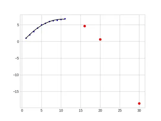
The result produced:

enter image description here

It clearly is producing wrong predictions; with each x, y should increase.

What am I missing? I tried changing degrees, but it doesn't get much better. When I use degree of 4 for example, y increases very very rapidly.
iacob
  • 20,084
  • 6
  • 92
  • 119
good_evening
  • 21,085
  • 65
  • 193
  • 298

4 Answers4

7

with each x, y should increase.

There is indeed a positive linear trend to your data, and if you fit a linear regressor (i.e. a polynomial of degree 1) to it that is what you would see in the prediction outside the sample data:

enter image description here

But you have modelled a quadratic regressor, and as such it is fitting a quadratic curve to these points as best as possible. Your model is learning the slight 'bend' in your data as the stationary point in the curve, and hence it will decrease as you extend to the right:

enter image description here

If you think this behaviour is obviously wrong, then you must have some assumptions about the distribution of the data. If so, you should use these to drive your model choice.

I tried changing degrees, but it doesn't get much better. When I use degree of 4 for example, y increases very very rapidly.

You could choose a polynomial of higher degree, if you think a quadratic is not flexible enough to map the underlying trend of your data. But behaviour for polynomials can be highly divergent beyond the extrema of your data:

Cubic Quartic quintic
Cubic Quartic Quintic

As you see, the more complicated the polynomial, the more flexibility it has to model the exact trend of your particular sample of data-points, but the less generalisable it is beyond the range of your data.

This is known as overfitting.

There are many strategies for avoiding this e.g:

  • collecting more data
  • adding noise to your data
  • adding regularization terms
  • choosing a simpler model

and the simplest method in this case would be the latter - if you suspect your data follows a linear trend, fit a linear model to it.

iacob
  • 20,084
  • 6
  • 92
  • 119
6

@iacob provided a very good answer which I will only extend.

If you are certain that with each x, y should increase, then perhaps your datapoints follow a logarithmic scaling pattern. Adapting your code for that yields this curve:

Log Scale fitting

Here is the code snippet if that corresponds to what you are looking for:

import os
import numpy as np
import pandas as pd
import matplotlib.pyplot as plt

from sklearn.pipeline import Pipeline
from sklearn.linear_model import LinearRegression
from sklearn.preprocessing import PolynomialFeatures

csv_path = os.path.join('', 'graph.csv')
graph = pd.read_csv(csv_path)

y = graph['y'].copy()
x = graph.drop('y', axis=1)

x_log = np.log(x)

pipeline = Pipeline([('pf', PolynomialFeatures(1)), ('clf', LinearRegression())])
pipeline.fit(x_log, y)

predict = np.log([[16], [20], [30]])

plt.plot(np.exp(x_log), y, '.', color='blue')
plt.plot(np.exp(x_log), pipeline.predict(x_log), '-', color='black')
plt.plot(np.exp(predict), pipeline.predict(predict), 'o', color='red')
plt.show()

Notice that we are merely doing polynomial regression (here linear regression is sufficient) on the logarithm of the x datapoints ( x_log).

Manuel Faysse
  • 573
  • 3
  • 9
2

What am I missing?

Perhaps the PolynomialFeatures transformation is not doing what you expect it to do? It's typically used for generating feature interactions, not approximating the polynomial function per se.

When I run your code, then the fitted pipeline corresponds to the following equation:

y = 1.36105 * x - 0.0656177 * x^2 - 0.370606

The predictive model is dominated by the x^2 term, which is associated with a negative coefficient.

user1808924
  • 4,563
  • 2
  • 17
  • 20
1

This is a great example of overfitting. Your regressor is trying too hard to fit but x and y are following a linear trend so might want to fit a linear equation(degree=1). Or you can even try introducing some bias using Lasso or Ridge regularization but only if you want to fit a curve of degree 2 or higher

YD_
  • 79
  • 4