
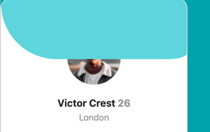
I am trying to recreate the profile card on the top. The picture on the bottom with the face covered is mine. I am trying to make the profile card look like the picture on the top. I am having trouble trying to make the white half-circle fit the circular image. The code I am working with is the .card-header. I was experimenting with border-radius but that did not do as I expected. Does anyone have any thoughts?
@import url('https://fonts.googleapis.com/css2?family=Kumbh+Sans&display=swap');

body {
  background-color: hsl(185, 75%, 39%);
}

.card-header {
  height: 110px;
  position: absolute;
  width: 100%;
  background-color: hsl(184, 63%, 64%);
  border-style: none;
  border-radius: 0 0 10% 100%;
}

.card-body {
  padding: 0;
}

img {
  margin: auto;
  display: block;
  border-radius: 50%;
  margin-top: 60px;
}
<!DOCTYPE html>
<html lang="en">
<head>
<meta charset="UTF-8">
<meta name="viewport" content="width=device-width, initial-scale=1.0">
<!--Bootstrap CSS-->
<link rel="stylesheet" href="https://cdn.jsdelivr.net/npm/bootstrap@4.5.3/dist/css/bootstrap.min.css"
integrity="sha384-TX8t27EcRE3e/ihU7zmQxVncDAy5uIKz4rEkgIXeMed4M0jlfIDPvg6uqKI2xXr2" crossorigin="anonymous">
<link rel="stylesheet" href="style/main.css">
<link rel="icon" type="image/png" sizes="32x32" href="./images/favicon-32x32.png">
<title>Frontend Mentor | Profile card component</title>
</head>
<body>
<div class="card proifleCard" style="width: 21rem; border-radius: 20px; overflow: hidden;">
<div class="card-header"></div>
<div class="card-body">
<img src="images/image-victor.jpg" alt="profile pic of Victor">
<p class="card-text name">Victor Crest<span class="grey"> 26</span></p>
<p class="card-text grey city">London</p>
<div class="card-footer">
<ol class="list d-flex justify-content-center">
<ul>
<strong class="stats">80K</strong>
<p class="grey small">Followers</p>
</ul>
<ul>
<strong class="stats">803K</strong>
<p class="grey small">Likes</p>
</ul>
<ul>
<strong class="stats">1.4K</strong>
<p class="grey small">Photos</p>
</ul>
</ol>
</div>
</div>
</div>
</body>
</html>