0

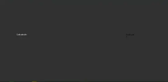
I want to have a page that run the linear gradient background animation when page load

So it will start from this

enter image description here

then slowly animate to this and stop

enter image description here

however my animation didnt end as I expect , it fly away at the end

Below is what I try so far

body,
html {
  margin: 0;
  padding: 0;
}

.login-bg {
  min-height: 100vh;
  animation: Animation;
  background: linear-gradient(106deg, #313131 50%, white 50.1%);
  animation-duration: 3s;
  animation-iteration-count: 1;
  animation-timing-function: ease-in-out;
  background-size: 200% 200%;
}

@keyframes Animation {
  0% {
    background-position: 0% 50%
  }
  50% {
    background-position: 100% 50%
  }
  100% {
    background-position: 50% 0%
  }
}

#wrapper {
  display: flex;
}

#left {
  flex: 0 0 65%;
  color: white;
  margin-left: 10%;
  margin-top: 20%;
}

#right {
  flex: 1;
  margin-right: 20%;
  margin-top: 20%;
}
<div class="login-bg">
  <div id="wrapper">
    <div id="left">Left side div</div>
    <div id="right">Right side div</div>
  </div>
</div>

tacoshy
  • 10,642
  • 5
  • 17
  • 34
B.Cos
  • 418
  • 1
  • 13
  • 27

1 Answers1

2

Add the following:

animation-fill-mode: forwards;

body, html {
         margin: 0;
         padding: 0;
         }
         .login-bg {
         min-height: 100vh;
         animation: Animation ;
         background: linear-gradient(106deg,#313131 50%,white 50.1%);
         animation-duration: 3s;
         animation-iteration-count: 1;
         animation-timing-function: ease-in-out;
         animation-fill-mode: forwards;
         background-size: 200% 200%;
         }
         @keyframes Animation {
         0%{background-position:0% 50%}
         50%{background-position:100% 50%}
         100%{background-position:50% 0%}
         }
         #wrapper {
         display: flex;
         }
         #left {
         flex: 0 0 65%;
         color: white;
         margin-left: 10%;
         margin-top: 20%;
         }
         #right {
         flex: 1;
         margin-right: 20%;
         margin-top: 20%;
         }
<div class="login-bg">
         <div id="wrapper">
            <div id="left" >Left side div</div>
            <div id="right">Right side div</div>
         </div>
      </div>

EDIT:

Stop at middle: you have to define the ending point of the animation, like this:

 @keyframes Animation {
       0%{background-position:0% 50%}
       100%{background-position:50% 50%}
     }

body, html {
         margin: 0;
         padding: 0;
         }
         .login-bg {
         min-height: 100vh;
         animation: Animation ;
         background: linear-gradient(106deg,#313131 50%,white 50.1%);
         animation-duration: 3s;
         animation-iteration-count: 1;
         animation-timing-function: ease-in-out;
         animation-fill-mode: forwards;
         background-size: 200% 200%;
         }
         @keyframes Animation {
           0%{background-position:0% 50%}
           100%{background-position:50% 50%}
         }
         #wrapper {
         display: flex;
         }
         #left {
         flex: 0 0 65%;
         color: white;
         margin-left: 10%;
         margin-top: 20%;
         }
         #right {
         flex: 1;
         margin-right: 20%;
         margin-top: 20%;
         }
<div class="login-bg">
         <div id="wrapper">
            <div id="left" >Left side div</div>
            <div id="right">Right side div</div>
         </div>
      </div>
dominagy
  • 141
  • 6