I want to make my page fit to screen height, and have scrollable content inside of it, but I have encountered a problem where I can't exactly do it due to the framework I'm using (Nuxt & Buefy) generates element that I can't control.
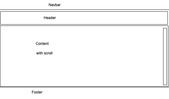
This is how I want the page to look like
    html,
    body {
      height: 100%;
      margin: 0
    }
    .navbar {
      height: 65px;
      background: #dd7777
    }
    .box {
      display: flex;
      flex-flow: column;
      height: 100%;
    }

    .box .row {
      border: 1px dotted grey;
    }

    .box .row.header {
      flex: 0 1 auto;
    }

    .box .row.content {
      display: flex;
      flex-flow: column;
      flex: 1 1 auto;
      overflow-y: auto;
    }

    .box .row.footer {
      flex: 0 1 40px;
    }
<div class="auto-generated-top-elemennt">
<div class="navbar">
Something
</div>
<div class="main-content">
<div class="box">
<div class="row header">
<p><b>header</b>
<br />
<br />(sized to content)</p>
</div>
<div class="row content">
<p>
<b>content</b> (fills remaining space)
</p>
<p>
<b>content</b> (fills remaining space)
</p>
<p>
<b>content</b> (fills remaining space)
</p>
<p>
<b>content</b> (fills remaining space)
</p>
<p>
<b>content</b> (fills remaining space)
</p>
<p>
<b>content</b> (fills remaining space)
</p>
<p>
<b>content</b> (fills remaining space)
</p>
<p>
<b>content</b> (fills remaining space)
</p>
</div>
<div class="row footer">
<p><b>footer</b> (fixed height)</p>
</div>
</div>
</div>
</div>How I want it to look like is similar to this solution but somehow it doesn't work well..