How can I make a div 100% height align with two other divs as column in flexbox?
How can I make a div 100% height align with two other divs as column in flexbox?
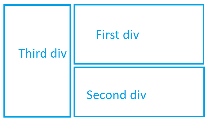
You should post your code here too & tell your problem as there're several ways to do so. One way to do so it to use a main flexbox with flex-direction=row & 2 flex-items: The first one 'First-div' as th2 2nd one another flexbox with flex-direction=column. Here's a code. Hope it helps
<!DOCTYPE html>
<html>
<head>
<style>
.flex-container {
    display: -webkit-flex;
    display: flex;
    -webkit-flex-direction: row;
    flex-direction: row;
    width: 400px;
    height: 250px;
}
.flex-container2 {
    display: -webkit-flex;
    display: flex;
    -webkit-flex-direction: column;
    flex-direction: column;
    width: 400px;
    height: 250px;
}
.flex-item-cont{
    background-color: cornflowerblue;
    width: 100px;
    height: 100px;
    margin: 0px;
}
.flex-item1 {
    background-color: red;
    width: 100px;
    height: 200px;
    margin: 0px;
}
.flex-item2 {
    background-color: blue;
    width: 100px;
    height: 100px;
    margin: 0px;
}
.flex-item3 {
    background-color: green;
    width: 100px;
    height: 100px;
    margin: 0px;
}
</style>
</head>
<body>

<div class="flex-container">
  <div class="flex-item1">Third Div</div>
  <div class="flex-item-cont">
    <div class="flex-container2">
      <div class="flex-item2">First Div</div>
      <div class="flex-item3">Second Div</div>
    </div>
  </div>
</div>

</body>
</html>
Hope, it helps.
Following code done with flex, it will auto size the sub box
<style>
    .box-main {
        display: flex;
        justify-contents: space-between;
    }

    .box1 {
        height: 100vh;
        background-color: red;
        width: 40%;
    }

    .box2 {
        width: 60%;
        height: 100vh;
        display: flex;
        justify-content: space-evenly;
        flex-direction: column;
    }

    .subbox1 {
        background-color: blue;
        flex: 1;
    }

    .subbox2 {
        background-color: green;
        flex: 1;
    }
</style>
    <div class="box-main">
        <div class="box1">
            Third Div
        </div>
        <div class="box2">
            <div class="subbox1">
                First Div
            </div>
            <div class="subbox2">
                Second Div
            </div>
        </div>
    </div>