I was wondering if there is a solution for Exposed drop-down menu for jetpack compose? I couldn't find a proper solution for this component inside jetpack compose. Any help?
I was wondering if there is a solution for Exposed drop-down menu for jetpack compose? I couldn't find a proper solution for this component inside jetpack compose. Any help?
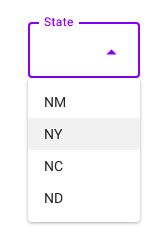
The M2 (starting from the version 1.1.0-alpha06) and M3 have the implementation of ExposedDropdownMenu based on ExposedDropdownMenuBox with TextField and DropdownMenu inside.
Something like:
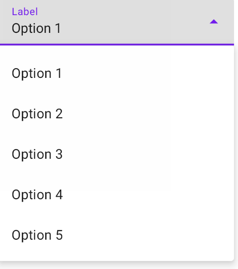
    val options = listOf("Option 1", "Option 2", "Option 3", "Option 4", "Option 5")
    var expanded by remember { mutableStateOf(false) }
    var selectedOptionText by remember { mutableStateOf(options[0]) }

    ExposedDropdownMenuBox(
        expanded = expanded,
        onExpandedChange = {
            expanded = !expanded
        }
    ) {
        TextField(
            readOnly = true,
            value = selectedOptionText,
            onValueChange = { },
            label = { Text("Label") },
            trailingIcon = {
                ExposedDropdownMenuDefaults.TrailingIcon(
                    expanded = expanded
                )
            },
            colors = ExposedDropdownMenuDefaults.textFieldColors()
        )
        ExposedDropdownMenu(
            expanded = expanded,
            onDismissRequest = {
                expanded = false
            }
        ) {
            options.forEach { selectionOption ->
                DropdownMenuItem(
                    onClick = {
                        selectedOptionText = selectionOption
                        expanded = false
                    }
                ){
                    Text(text = selectionOption)
                }
            }
        }
    }
If you are using M3 (androidx.compose.material3) you have also to pass the menuAnchor modifier to the TextField:
ExposedDropdownMenuBox(
    expanded = expanded,
    onExpandedChange = { expanded = !expanded },
) {
   TextField(
        //...
        modifier = Modifier.menuAnchor()
    )
    ExposedDropdownMenu(){ /*..  */ }
}
Also in M3 in the DropdownMenuItem you have to move the content in the text parameter:
DropdownMenuItem(
    text = { Text(text = selectionOption) },
    onClick = {
        selectedOptionText = selectionOption
        expanded = false
    }
)
With the M2 version 1.0.x there isn't a built-in component.
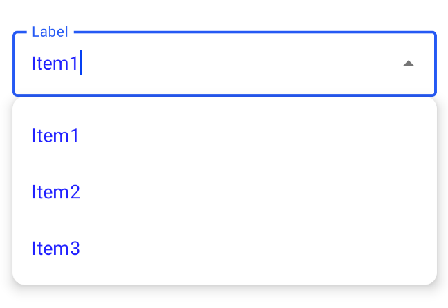
You can use a OutlinedTextField + DropdownMenu. It is important to wrap the them in a Box. In this way the TextField will be used as the 'anchor'.
It is just a basic (very basic) implementation:
var expanded by remember { mutableStateOf(false) }
val suggestions = listOf("Item1","Item2","Item3")
var selectedText by remember { mutableStateOf("") }

var textfieldSize by remember { mutableStateOf(Size.Zero)}

val icon = if (expanded)
    Icons.Filled.ArrowDropUp //it requires androidx.compose.material:material-icons-extended
else
    Icons.Filled.ArrowDropDown


Box() {
    OutlinedTextField(
        value = selectedText,
        onValueChange = { selectedText = it },
        modifier = Modifier
            .fillMaxWidth()
            .onGloballyPositioned { coordinates ->
                //This value is used to assign to the DropDown the same width
                textfieldSize = coordinates.size.toSize()
            },
        label = {Text("Label")},
        trailingIcon = {
            Icon(icon,"contentDescription",
                 Modifier.clickable { expanded = !expanded })
        }
    )
    DropdownMenu(
        expanded = expanded,
        onDismissRequest = { expanded = false },
        modifier = Modifier
            .width(with(LocalDensity.current){textfieldSize.width.toDp()})
    ) {
        suggestions.forEach { label ->
            DropdownMenuItem(onClick = {
                selectedText = label
            }) {
                Text(text = label)
            }
        }
    }
}

This is what I did to get the width the same as the text field: Copying and modifying Gabriele's answer.
var expanded by remember { mutableStateOf(false) }
val suggestions = listOf("Item1","Item2","Item3")
var selectedText by remember { mutableStateOf("") }

var dropDownWidth by remember { mutableStateOf(0) }

val icon = if (expanded)
    Icons.Filled.....
else
    Icons.Filled.ArrowDropDown


Column() {
    OutlinedTextField(
        value = selectedText,
        onValueChange = { selectedText = it },
        modifier = Modifier.fillMaxWidth()
            .onSizeChanged {
                dropDownWidth = it.width
            },
        label = {Text("Label")},
        trailingIcon = {
            Icon(icon,"contentDescription", Modifier.clickable { expanded = !expanded })
        }
    )
    DropdownMenu(
        expanded = expanded,
        onDismissRequest = { expanded = false },
        modifier = Modifier
                .width(with(LocalDensity.current){dropDownWidth.toDp()})
    ) {
        suggestions.forEach { label ->
            DropdownMenuItem(onClick = {
                selectedText = label
            }) {
                Text(text = label)
            }
        }
    }
}
Here's my version.
I achieved this without using a TextField (so no keyboard).
There's a "regular" and an "outlined" version.
import androidx.compose.animation.core.animateFloatAsState
import androidx.compose.foundation.background
import androidx.compose.foundation.border
import androidx.compose.foundation.clickable
import androidx.compose.foundation.layout.*
import androidx.compose.foundation.shape.ZeroCornerSize
import androidx.compose.material.*
import androidx.compose.material.icons.Icons
import androidx.compose.material.icons.filled.ArrowDropDown
import androidx.compose.runtime.*
import androidx.compose.ui.Alignment
import androidx.compose.ui.Modifier
import androidx.compose.ui.draw.clip
import androidx.compose.ui.draw.drawBehind
import androidx.compose.ui.draw.rotate
import androidx.compose.ui.geometry.Offset
import androidx.compose.ui.geometry.Size
import androidx.compose.ui.graphics.Color
import androidx.compose.ui.graphics.Shape
import androidx.compose.ui.layout.onGloballyPositioned
import androidx.compose.ui.platform.LocalDensity
import androidx.compose.ui.platform.LocalFocusManager
import androidx.compose.ui.unit.Dp
import androidx.compose.ui.unit.dp
import androidx.compose.ui.unit.toSize
import kotlinx.coroutines.delay
import kotlinx.coroutines.launch


// ExposedDropDownMenu will be added in Jetpack Compose 1.1.0.
// This is a reimplementation while waiting.
// See https://stackoverflow.com/questions/67111020/exposed-drop-down-menu-for-jetpack-compose/6904285

@Composable
fun SimpleExposedDropDownMenu(
    values: List<String>,
    selectedIndex: Int,
    onChange: (Int) -> Unit,
    label: @Composable () -> Unit,
    modifier: Modifier = modifier,
    backgroundColor: Color = MaterialTheme.colors.onSurface.copy(alpha = TextFieldDefaults.BackgroundOpacity),
    shape: Shape = MaterialTheme.shapes.small.copy(bottomEnd = ZeroCornerSize, bottomStart = ZeroCornerSize)
) {
    SimpleExposedDropDownMenuImpl(
        values = values,
        selectedIndex = selectedIndex,
        onChange = onChange,
        label = label,
        modifier = modifier,
        backgroundColor = backgroundColor,
        shape = shape,
        decorator = { color, width, content ->
            Box(
                Modifier
                    .drawBehind {
                        val strokeWidth = width.value * density
                        val y = size.height - strokeWidth / 2
                        drawLine(
                            color,
                            Offset(0f, y),
                            Offset(size.width, y),
                            strokeWidth
                        )
                    }
            ) {
                content()
            }
        }
    )
}

@Composable
fun SimpleOutlinedExposedDropDownMenu(
    values: List<String>,
    selectedIndex: Int,
    onChange: (Int) -> Unit,
    label: @Composable () -> Unit,
    modifier: Modifier = modifier,
    backgroundColor: Color = MaterialTheme.colors.onSurface.copy(alpha = TextFieldDefaults.BackgroundOpacity),
    shape: Shape = MaterialTheme.shapes.small
) {
    SimpleExposedDropDownMenuImpl(
        values = values,
        selectedIndex = selectedIndex,
        onChange = onChange,
        label = label,
        modifier = modifier,
        backgroundColor = backgroundColor,
        shape = shape,
        decorator = { color, width, content ->
            Box(
                Modifier
                    .border(width, color, shape)
            ) {
                content()
            }
        }
    )
}

@Composable
private fun SimpleExposedDropDownMenuImpl(
    values: List<String>,
    selectedIndex: Int,
    onChange: (Int) -> Unit,
    label: @Composable () -> Unit,
    modifier: Modifier,
    backgroundColor: Color,
    shape: Shape,
    decorator: @Composable (Color, Dp, @Composable () -> Unit) -> Unit
) {
    var expanded by remember { mutableStateOf(false) }
    var textfieldSize by remember { mutableStateOf(Size.Zero) }

    val indicatorColor =
        if (expanded) MaterialTheme.colors.primary.copy(alpha = ContentAlpha.high)
        else MaterialTheme.colors.onSurface.copy(alpha = TextFieldDefaults.UnfocusedIndicatorLineOpacity)
    val indicatorWidth = (if (expanded) 2 else 1).dp
    val labelColor =
        if (expanded) MaterialTheme.colors.primary.copy(alpha = ContentAlpha.high)
        else MaterialTheme.colors.onSurface.copy(ContentAlpha.medium)
    val trailingIconColor = MaterialTheme.colors.onSurface.copy(alpha = TextFieldDefaults.IconOpacity)

    val rotation: Float by animateFloatAsState(if (expanded) 180f else 0f)

    val focusManager = LocalFocusManager.current

    Column(modifier = modifier.width(IntrinsicSize.Min)) {
        decorator(indicatorColor, indicatorWidth) {
            Box(
                Modifier
                    .fillMaxWidth()
                    .background(color = backgroundColor, shape = shape)
                    .onGloballyPositioned { textfieldSize = it.size.toSize() }
                    .clip(shape)
                    .clickable {
                        expanded = !expanded
                        focusManager.clearFocus()
                    }
                    .padding(start = 16.dp, end = 12.dp, top = 7.dp, bottom = 10.dp)
            ) {
                Column(Modifier.padding(end = 32.dp)) {
                    ProvideTextStyle(value = MaterialTheme.typography.caption.copy(color = labelColor)) {
                        label()
                    }
                    Text(
                        text = values[selectedIndex],
                        modifier = Modifier.padding(top = 1.dp)
                    )
                }
                Icon(
                    imageVector = Icons.Filled.ArrowDropDown,
                    contentDescription = "Change",
                    tint = trailingIconColor,
                    modifier = Modifier
                        .align(Alignment.CenterEnd)
                        .padding(top = 4.dp)
                        .rotate(rotation)
                )

            }
        }

        DropdownMenu(
            expanded = expanded,
            onDismissRequest = { expanded = false },
            modifier = Modifier
                .width(with(LocalDensity.current) { textfieldSize.width.toDp() })
        ) {
            values.forEachIndexed { i, v ->
                val scope = rememberCoroutineScope()
                DropdownMenuItem(
                    onClick = {
                        onChange(i)
                        scope.launch {
                            delay(150)
                            expanded = false
                        }
                    }
                ) {
                    Text(v)
                }
            }
        }
    }
}
If you are using material3 and a newer version of compose (this is working for v1.3.1), the DropdownMenuItem has changed slightly. Text must now be a property (rather than an @Composable).
You will still need to opt in to the experimental api, @OptIn(ExperimentalMaterial3Api::class).
This example is in the androidx.compose.material3 documentation.
import androidx.compose.material3.DropdownMenuItem
import androidx.compose.material3.ExposedDropdownMenuBox
import androidx.compose.material3.Text
import androidx.compose.material3.TextField
import androidx.compose.runtime.mutableStateOf
import androidx.compose.runtime.remember

val options = listOf("Option 1", "Option 2", "Option 3", "Option 4", "Option 5")
var expanded by remember { mutableStateOf(false) }
var selectedOptionText by remember { mutableStateOf(options[0]) }
// We want to react on tap/press on TextField to show menu
ExposedDropdownMenuBox(
    expanded = expanded,
    onExpandedChange = { expanded = !expanded },
) {
    TextField(
        // The `menuAnchor` modifier must be passed to the text field for correctness.
        modifier = Modifier.menuAnchor(),
        readOnly = true,
        value = selectedOptionText,
        onValueChange = {},
        label = { Text("Label") },
        trailingIcon = { ExposedDropdownMenuDefaults.TrailingIcon(expanded = expanded) },
        colors = ExposedDropdownMenuDefaults.textFieldColors(),
    )
    ExposedDropdownMenu(
        expanded = expanded,
        onDismissRequest = { expanded = false },
    ) {
        options.forEach { selectionOption ->
            DropdownMenuItem(
                text = { Text(selectionOption) },
                onClick = {
                    selectedOptionText = selectionOption
                    expanded = false
                },
                contentPadding = ExposedDropdownMenuDefaults.ItemContentPadding,
            )
        }
    }
}
Doing this the 'old way', I had the following errors on the Text(text = selectionOption) line:
No value passed for parameter 'text'Type mismatch: inferred type is () -> Unit but MutableInteractionSource was expected@Composable invocations can only happen from the context of a @Composable function
A few modifications to @Gabriele Mariotti answer A user can select an outline text field and select from an option. Option will be disappear once user select any option.
    @Composable
fun DropDownMenu(optionList: List<String>,label:String,) {
    var expanded by remember { mutableStateOf(false) }

    var selectedText by remember { mutableStateOf("") }

    var textfieldSize by remember { mutableStateOf(Size.Zero) }

    val icon = if (expanded)
        Icons.Filled.KeyboardArrowUp
    else
        Icons.Filled.KeyboardArrowDown


    Column() {
        OutlinedTextField(
            value = selectedText,
            onValueChange = { selectedText = it },
            enabled = false,
            modifier = Modifier
                .fillMaxWidth()
                .onGloballyPositioned { coordinates ->
                    //This value is used to assign to the DropDown the same width
                    textfieldSize = coordinates.size.toSize()
                }
                .clickable { expanded = !expanded },
            label = { Text(label) },
            trailingIcon = {
                Icon(icon, "Drop Down Icon",
                    Modifier.clickable { expanded = !expanded })
            }
        )
        DropdownMenu(
            expanded = expanded,
            onDismissRequest = { expanded = false },
            modifier = Modifier
                .width(with(LocalDensity.current) { textfieldSize.width.toDp() })
        ) {
            optionList.forEach { label ->
                DropdownMenuItem(onClick = {
                    selectedText = label
                    expanded = !expanded
                }) {
                    Text(text = label)
                }
            }
        }
    }
}
In addition to what has been written here, I case could be useful to someone and for my personal memo note for next usages, I've realized this drop-down menu function component using BasicTextField for no decoration and no default padding, no arrow icon, with item selected text aligned to right (.End) , filling max text width (.fillMaxWidth()) with single line in list.
data class DropDownMenuParameter(
        var options: List<String>,
        var expanded: Boolean,
        var selectedOptionText: String,
        var backgroundColor: Color
    )


@ExperimentalMaterialApi
@Composable
fun DropDownMenuComponent(params: DropDownMenuParameter) {
    var expanded by remember { mutableStateOf(params.expanded) }


    ExposedDropdownMenuBox(
        expanded = expanded,
        onExpandedChange = {
            expanded = !expanded
        }
    ) {
        BasicTextField(
            modifier = Modifier
                .background(params.backgroundColor)
                .fillMaxWidth(),
            readOnly = true,
            value = params.selectedOptionText,
            onValueChange = { },
            textStyle = TextStyle(
                color = Color.White,
                textAlign = TextAlign.End,
                fontSize = 16.sp,
            ),
            singleLine = true

        )
        ExposedDropdownMenu(
            modifier = Modifier
                .background(params.backgroundColor),
            expanded = expanded,
            onDismissRequest = {
                expanded = false
            }
        ) {
            params.options.forEach { selectionOption ->
                DropdownMenuItem(
                    modifier = Modifier
                        .background(params.backgroundColor),
                    onClick = {
                        params.selectedOptionText = selectionOption
                        expanded = false
                    },

                    ) {
                    Text(
                        text = selectionOption,
                        color = Color.White,
                    )

                }
            }
        }
    }

}
My usage :
@OptIn(ExperimentalAnimationApi::class, ExperimentalMaterialApi::class)
@Composable
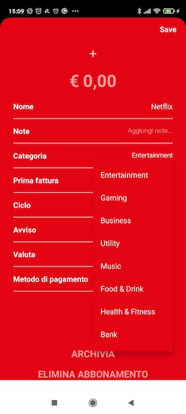
fun SubscribeSubscriptionDetails(selectedSubscription : Subscription){
val categoryOptions = listOf("Entertainment", "Gaming", "Business", "Utility", "Music", "Food & Drink", "Health & Fitness", "Bank", "Transport", "Education", "Insurance", "News")
val categoryExpanded by rememberSaveable { mutableStateOf(false) }
val categorySelectedOptionText
by rememberSaveable { mutableStateOf(selectedSubscription.category) }
val categoryDropDownMenuPar by remember {
mutableStateOf(
DropDownMenuParameter(
options = categoryOptions,
expanded = categoryExpanded,
selectedOptionText = categorySelectedOptionText,
backgroundColor = serviceColorDecoded
)
)
}
// ....
Row { // categoria
Text(
modifier = Modifier
.padding(textMargin_24, 0.dp, 0.dp, 0.dp)
.weight(0.5f),
text = "Categoria",
fontWeight = FontWeight.Bold,
color = Color.White,
textAlign = TextAlign.Left,
fontSize = 16.sp,
)
Row(
modifier = Modifier
.padding(0.dp, 0.dp, 24.dp, 0.dp)
.weight(0.5f),
horizontalArrangement = Arrangement.End
){
DropDownMenuComponent(categoryDropDownMenuPar)
}
}
// .....
}
to retrieve the value after selection : categoryDropDownMenuPar.selectedOptionText