I'm trying to do something like this:
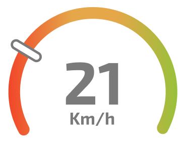
It's not a full or semi circle, and the edges have a little radius. Also need to contain some point to show the current position in percentage. Can someone give me a light on how to put together something close to the 3 ideas below?
.circle {
   display: flex;
   width: 200px;
   height: 100px;
   border-top-left-radius: 200px;
   border-top-right-radius: 200px;
   border: 10px solid gray;
   border-bottom: 0;
}

.circle>.text {
   font-size: 50px;
   margin: auto;
}

.circle.gradient {
   margin-top: 30px;
   border-image-slice: 1;
   border-width: 10px;
   border-bottom: 0;
   border-image-source: linear-gradient(to left, #6ECE34, #E6A749, #E5A749, #F71C1C);
}

.line {
   position: relative;
   margin-top: 30px;
   width: 220px;
   height: 10px;
   border-radius: 5px;
   background: linear-gradient(to left, #6ECE34, #E6A749, #E5A749, #F71C1C);
}

.line>.point {
   position: absolute;
   top: -3px;
   left: 21%;
   width: 8px;
   height: 16px;
   border-radius: 5px;
   border: 1px solid black;
   background: #FFF;
}
<!-- Just semi circle -->
<div class="circle">
<div class="text">
21
</div>
</div>
<!-- With gradient border -->
<div class="circle gradient"></div>
<!-- Maybe strech in Y -->
<div class="line">
<!-- Relative point -->
<div class="point"></div>
</div>