Im working on a page utilizing django that has a navbar plus a 3x3 grid that fills the rest of the page. My issue is when I add the bootstrap style-sheet (above my custom style-sheet) i get some white space on the right and the left of both the grid and the navbar. I assume this can be overridden by a custom style-sheet but as im learning I cant figure it out. Following advice from other posts I have messed around a lot with trying to override box-sizing (which changes nothing) and margins (which sticks everything to one side or the other but wont stretch to both sides). I assume something is constraining the size of .container but I don't know. I have used inspect element to try to isolate the problem but no luck. I have also tried putting the stylesheet in just the pages that need it but then the navbar is messed up on those pages. I have also tried using 'width: 100vw;', this gets things to the right size but still has white space on the side.
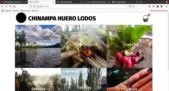
What I want:
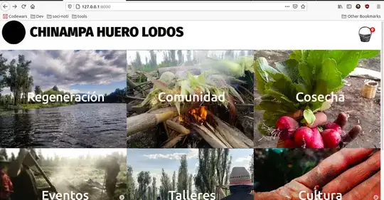
What I get with the bootstrap stylesheet:
Here the css that works when I exclude the bootstrap stylesheet.
    /* Master styles*/
body {
    margin: 0px;
  font-family: 'Fira Sans', sans-serif;
}

.container {
    display: grid;
    grid-template-columns: 1fr;
}


/* Nav styles*/

#cart-icon{
    width:50px;
    display: inline-block;
    margin-left: 15px;
}

#cart-total{
    display: block;
    position: absolute;
    top: 10px;
    right: 20px;
    text-align: center;
    color:#fff;
    background-color: red;
    width: 18px;
    height: 18px;
    border-radius: 50%;
    font-size: 14px;
}


.nav-wrapper {
    display: flex;
    justify-content: space-between;
    padding: 0px;
}

.right-side a {
    display: flex;
    margin-top: 20px;
    margin-right: 20px;
    font-size: 2em;
    text-transform: uppercase;
    text-decoration: none;
    color: black;
}

.left-side {
    display: flex;

}
.right-side {
    position: relative;
}

.nav-wrapper > .right-side > div {
    align-items: right;
    margin-top: 10px;
    margin-right: 10px;
    margin-left: 20px;
    font-size: 10em;
    text-transform: uppercase;
    text-decoration: none;
}

.nav-wrapper > .left-side > div {
    margin-top: 12px;
    margin-right: 20px;
    margin-left: 10px;
    font-size: 3em;
    text-transform: uppercase;
    text-decoration: none;
}

.nav-link-wrapper {
    height: 22px;
    border-bottom: 1px solid transparent;
    transition: border-bottom 0.5s;
}

.nav-link-wrapper a {
    color: #8a8a8a;
    transition: color 0.5s;
    text-decoration: none;
}

}

.nav-link-wrapper a:hover {
    color: solid black;
}


.active-nav-link a {
    color: black !important;
}
/* Portfolio styles*/

.portfolio-items-wrapper {
    display: grid;
    grid-template-columns: 1fr 1fr 1fr;
}

.portfolio-item-wrapper {
    position: relative;
}

.portfolio-img-background {
    height: 350px;
    width: 100%;
    background-size: cover;
    background-position: center;
    background-repeat: no-repeat;
}

.img-text-wrapper {
  position: absolute;
  top: 0;
  display: flex;
  flex-direction: column;
  justify-content: center;
  align-items: center;
  height: 100%;
  text-align: center;
  padding-left: 100px;
  padding-right: 100px;
}

.logo-wrapper img {
    width: 110%;
    margin-bottom: -40px;
}

.img-text-wrapper .subtitle {
    transition: 1s;
    font-weight: 400;
    padding-bottom: 5px;
    color: transparent;
}

.img-text-wrapper:hover .subtitle {
    font-weight: 400;
    color: white;
}

.img-darken {
    transition: 1s;
    filter: brightness(20%);
}

/* Products styles (store) */

.box-element{
    box-shadow:hsl(0, 0%, 80%) 0 0 16px;
    background-color: #fff;
    border-radius: 4px;
    padding: 10px;
}

.col-lg-4, .col-lg-6, .col-lg-8, .col-lg-12{
    margin-top: 10px;
}

.btn{
    border-radius: 0;
}

.row-image{
    width: 100px;
}

.form-field{
    width:250px;
    display: inline-block;
    padding: 5px;
}

.cart-row{
    display: flex;
    align-items: flex-stretch;
    padding-bottom: 10px;
    margin-bottom: 10px;
    border-bottom: 1px solid #ececec;

}

.quantity{
    display: inline-block;
    font-weight: 700;
    padding-right:10px;

}

.chg-quantity{
    width: 12px;
    cursor: pointer;
    display: block;
    margin-top: 5px;
    transition:.1s;
}

.chg-quantity:hover{
    opacity: .6;
}


.hidden{
    display: none!important;
}

/* About styles */
.two-column-wrapper {
    display: grid;
    grid-template-columns: 1fr 1fr;
}

.profile-image-wrapper img {
    width: 100%;
}

.profile-content-wrapper {
    padding: 30px;
}

.web_by {
    text-align: right;
}

.web_by a {
    text-decoration: none;
    color: black;
}
Here is the django base html. Adding that first stylesheet is what breaks it.
 <!DOCTYPE html>
{% load static %}
<html lang="en" dir="ltr">
  <head>
    <meta charset="utf-8">
    <title>Huero Lodo</title>
    <link rel="stylesheet" href="https://stackpath.bootstrapcdn.com/bootstrap/4.4.1/css/bootstrap.min.css" integrity="sha384-Vkoo8x4CGsO3+Hhxv8T/Q5PaXtkKtu6ug5TOeNV6gBiFeWPGFN9MuhOf23Q9Ifjh" crossorigin="anonymous">
    <link href="https://fonts.googleapis.com/css2?family=Fira+Sans:wght@900&display=swap" rel="stylesheet">
    <link rel="stylesheet" href="{% static 'styles.css'%}">
  </head>
  <body>
    {% include 'navbar.html' %}
    <p></p>
    {% block content %}
    block content gets placed here
    {% endblock %}
    <script src="https://code.jquery.com/jquery-3.4.1.slim.min.js" integrity="sha384-J6qa4849blE2+poT4WnyKhv5vZF5SrPo0iEjwBvKU7imGFAV0wwj1yYfoRSJoZ+n" crossorigin="anonymous"></script>

    <script src="https://cdn.jsdelivr.net/npm/popper.js@1.16.0/dist/umd/popper.min.js" integrity="sha384-Q6E9RHvbIyZFJoft+2mJbHaEWldlvI9IOYy5n3zV9zzTtmI3UksdQRVvoxMfooAo" crossorigin="anonymous"></script>

    <script src="https://stackpath.bootstrapcdn.com/bootstrap/4.4.1/js/bootstrap.min.js" integrity="sha384-wfSDF2E50Y2D1uUdj0O3uMBJnjuUD4Ih7YwaYd1iqfktj0Uod8GCExl3Og8ifwB6" crossorigin="anonymous"></script>
  </body>
</html>
Here is the index.html for reference
    {% extends 'base.html' %}
{% load static %}
{% block content %}
<!DOCTYPE html>
<html lang="en">
<head>
  <meta charset="UTF-8">
  <meta name="viewport" content="width=device-width, initial-scale=1.0">
   <link href="https://fonts.googleapis.com/css2?family=Fira+Sans:wght@900&display=swap" rel="stylesheet">
  <link rel="stylesheet" href="{% static 'styles.css'%}">
</head>
<body>
    <div class="container">
        <div class="content-wrapper">
            <div class="portfolio-items-wrapper">
                <div class="portfolio-item-wrapper">
                    <div class="portfolio-img-background" style="background-image:url({% static 'images/por1.png'%})"></div>

                    <div class="img-text-wrapper">
                        <div class="logo-wrapper">
                            <img src="{% static 'images/logos/regen.png'%}" alt="Regeneración">
                        </div>
                        <div class="subtitle">Regenerando nuestro futuro.</div>
                    </div>
                </div>

                <div class="portfolio-item-wrapper">
                    <div class="portfolio-img-background" style="background-image:url({% static 'images/por2.png'%})"></div>

                    <div class="img-text-wrapper">
                        <div class="logo-wrapper">
                            <img src="{% static 'images/logos/comun.png'%}" alt="Comunidad">
                        </div>
                        <div class="subtitle">Juntes podemos hacer mas.</div>
                    </div>
                </div>

                <div class="portfolio-item-wrapper">
                    <div class="portfolio-img-background" style="background-image:url({% static 'images/por3.png'%})"></div>

                    <div class="img-text-wrapper">
                        <div class="logo-wrapper">
                            <a href="/products"><img src="{% static 'images/logos/cosech.png'%}" alt="Cosecha"></a>
                        </div>
                        <div class="subtitle">Nuestro puestito. Entregamos!</div>
                    </div>
                </div>

                <div class="portfolio-item-wrapper">
                    <div class="portfolio-img-background" style="background-image:url({% static 'images/por4.png'%})"></div>

                    <div class="img-text-wrapper">
                        <div class="logo-wrapper">
                            <img src="{% static 'images/logos/events.png'%}" alt="Eventos">
                        </div>
                        <div class="subtitle">Unate!</div>
                    </div>
                </div>

                <div class="portfolio-item-wrapper">
                    <div class="portfolio-img-background" style="background-image:url({% static 'images/por5.png'%})"></div>

                    <div class="img-text-wrapper">
                        <div class="logo-wrapper">
                            <img src="{% static 'images/logos/taller.png'%}" alt="Talleres">
                        </div>
                        <div class="subtitle">Enseñar, aprender, ayudar.</div>
                    </div>
                </div>

                <div class="portfolio-item-wrapper">
                    <div class="portfolio-img-background" style="background-image:url({% static 'images/por6.png'%})"></div>

                    <div class="img-text-wrapper">
                        <div class="logo-wrapper">
                            <img src="{% static 'images/logos/cultu.png'%}" alt="Cultura">
                        </div>
                        <div class="subtitle">La que nos guia.</div>
                    </div>
                </div>

                    </div>
                </div>
            </div>
        </div>
    <div class="web_by">
      <p>
      Web por <a href = "mailto: axolotl_rebelde@riseup.net" alt="axolotl_rebelde@riseup.net">Axolotl Rebelde</a>
      <p>
    </div>
    </div>
</body>

<script>
    const portfolioItems = document.querySelectorAll('.portfolio-item-wrapper')

    portfolioItems.forEach(portfolioItem => {
        portfolioItem.addEventListener('mouseover', () => {
            portfolioItem.childNodes[1].classList.add('img-darken');
        })

        portfolioItem.addEventListener('mouseout', () => {
            portfolioItem.childNodes[1].classList.remove('img-darken');

        })

    })
</script>
</html>

{% endblock %}
Thanks for any and all advice. Tell me if I can make the question better.