Hello Learned Friends,
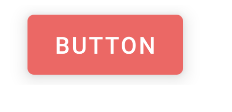
I am using Material Design Theme but I need to overried its statePressed so that when the button is clicked it changes color (highlighted for a moment) as demonstrated below.

For this I have a drawable which I set on the buttons as follows
<selector xmlns:android="http://schemas.android.com/apk/res/android">

<item android:state_pressed="false">
    <shape>
        <solid android:color="@color/primaryColor" />
        <stroke android:color="@color/primaryDarkColor" android:width="@dimen/stroke_width"/>
        <corners android:radius="@dimen/corner_radius" />

    </shape>

</item>


<item android:state_pressed="true">
    <shape>
        <solid android:color="@color/secondaryColor" />
        <stroke android:color="@color/secondaryLightColor" android:width="@dimen/stroke_width" />
        <corners android:radius="@dimen/corner_radius" />

    </shape>

</item>
I also got a ThemeOverlay to override the state pressed
    <style name="ThemeOverlay.Red.UnitedStates" parent="">
<item name="android:colorPressedHighlight">@color/secondaryColor</item>
    </style>
Unfortunately when I click the buttons the highlight doesn't happen.
What could I be missing?
This is Material Theme XML
 <style name="AppTheme" parent="Theme.MaterialComponents.DayNight.DarkActionBar">
    <!-- Customize your theme here. -->
    <item name="colorPrimary">@color/primaryColor</item>
    <item name="colorPrimaryVariant">@color/primaryLightColor</item>
    <item name="colorPrimaryDark">@color/primaryDarkColor</item>