I'm having a problem with the main baner image on my website.test website click here use right click inspect element then check the "toggle device toolbar" or use ctrl+shift+m ....
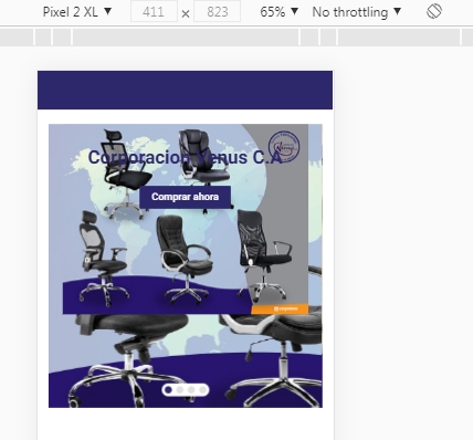
as you will see the main image is repeating itself in mobile mode:
the code:
html:
<div class="block-slideshow__slide-image block-slideshow__slide-image--desktop image" style="background-image: url('images/slides/slide-1-full.jpg')"></div>
                                        <div class="block-slideshow__slide-image block-slideshow__slide-image--mobile image" style="background-image: url('images/slides/slide-1-mobile.jpg')"></div>
tried using css adding this class .image and using this
.image{
    background-size: cover;
background-repeat:no-repeat;
}
but did not worked, the image looks ugly and blurry... all i want and need is my image is to look like the first image (stretched), but without repeating itself in the background....

if i remove "background-size: cover;" the stretched image appears in the center( this is what i want since i need that small image centered with a white background surrounding it, any factible approach for it?

edit: as i stated above i used this solution:
but what i want and need is the image to look centered and small since occuppying and using background: cover looks very ugly and i dont know how to make the image fit correctly in the mobile screen without looking blurry and ugly!
how can i solve this? thank you!