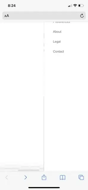
I have a slide out menu on my site. On Chrome, Edge, and Firefox mobile, it looks like this:
On Safari, the top of the menu is cut off by the URL bar. As you can see, the "Home" and "X" are cut off. Why does this happen in Safari and how can I prevent it?
Here is the HTML and CSS of the menu
'meta name="viewport" content="width=device-width, initial-scale=1.0, maximum-scale=1.0, user-scalable=0"'

<div id="slideOutMenu">
    <span>X</span>
    <span>Home</span>
    <span>Preferences</span>
    <span>About</span>
    <span>Legal</span>
    <span>Contact</span>
</div>

#slideOutMenu {
    right: 0 !important;
    transform: translate3d(0px, 0px, 0px) !important;
    transition: transform .381s ease-in-out 0s !important;
    width: 221px;
    height: 100%;
    position: fixed;
    bottom: 0;
    left: auto;
    z-index: 200;
    background: #3f3f3f;
    box-shadow: -1px 0 1px rgba(0,0,0,0.29034);
    z-index: 1111;
    overflow-y: auto;
    min-height: 100vh;
}

