0

I'm trying to create a stacked column chart using R.

I have a dataframe that looks like this:

Data df:

structure(list(Period = c("1971-1989", "1990-1999", "2000-2009", 
"2010-2019", "2020-2029"), Cold = c(-1.02, -0.3, -0.13, 0, 0.09
), Heat = c(6.08, -0.4, -0.1, 0, 0.17)), class = "data.frame", row.names = c(NA, 
-5L))

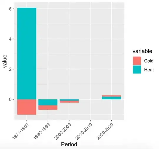
Period is chr, the others are num. I want to produce a stacked column chart that looks like this: (I made this using Excel)

enter image description here

I tried using ggplot:

ggplot(df, aes(fill=cold, y=heat, x=Period)) + 
  geom_bar(position="stack", stat="identity")

But I couldn't get a stacked plot like I wanted.

Any help would be much appreciated.
ATpoint
  • 603
  • 5
  • 17
Eleka
  • 3
  • 1
  • 3
    Possible duplicate: https://stackoverflow.com/questions/13734368/ggplot2-and-a-stacked-bar-chart-with-negative-values – MrFlick May 23 '21 at 08:59

1 Answers1

2

First transform the wide data.frame to long form, then use basically what you did before:

df <- structure(list(Period = c("1971-1989", "1990-1999", "2000-2009", 
"2010-2019", "2020-2029"), Cold = c(-1.02, -0.3, -0.13, 0, 0.09
), Heat = c(6.08, -0.4, -0.1, 0, 0.17)), class = "data.frame", row.names = c(NA, 
-5L))

library(magrittr)
library(ggplot2)
library(reshape2)

df %>%
  reshape2::melt() %>%
  ggplot(aes(x=Period, y=value, fill=variable)) +
  geom_bar(position="stack", stat="identity") +
  guides(x = guide_axis(angle = 45)) # rotate x-axis label by 45°

enter image description here

From here you can now modify axis and labels as desired.

ATpoint
  • 603
  • 5
  • 17