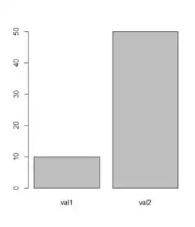
What the simplest way to make a bar plot of the following data frame:
df <- data.frame(val1=10, val2=50)
I want to plot the 10 and 50 on y-axis, and val1 and val2 on x-axis correspondingly.
ggplot asks for aes but since there are no row names and I want to plot column names as x-values it gives an error.
Is there an easy way to do it without modifying the dataframe itself?
