0

I've got this media query that checks if the device is mobile.

@media only screen and (hover: none) and (pointer: coarse) {
  body {
    font-size: 40px;
    color: purple; /*added this for debugging */
  }
  
  #navbar {
    justify-content: center;  
  }
  
  #nav-left {
    display: none;
  }
  
  #nav-right {
    font-size: 0.75em;
  }
  
  #projects {
    grid-template-columns: 400px 400px;
    grid-template-rows: 400px 400px /*400px 400px*/;
  }
  
  .project-wrapper {
    height: auto;
    width: auto;
    pointer-events: none;
    cursor: default;
    text-decoration: none;
  }
  
  .project-tile:hover .project-wrapper {
    animation-name: delay_link;
    animation-fill-mode: forwards;
    animation-duration: 0.7s;
  }
  
  @keyframes delay_link {
    90% {
      pointer-events: none;
    }
    100% {
      pointer-events: auto;
    }
  }
}

It fires when I emulate a mobile device in Chrome DevTools. Notice the text turning purple.

The website emulated on a virtual mobile device in Chrome DevTools

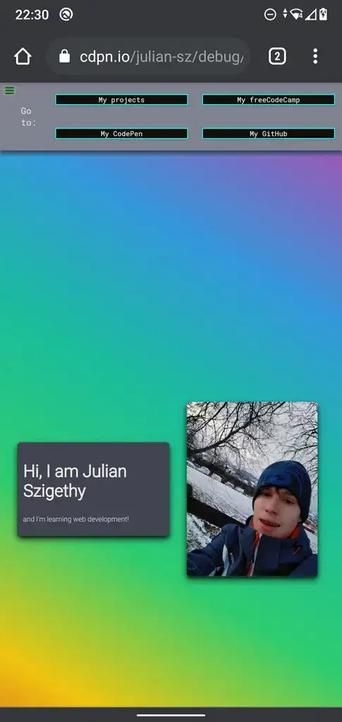
However, if I open the page on my phone it won't work. How comes that the emulated device is different from the actual device?

The website opened on Chrome for Android

My full code: https://codepen.io/julian-sz/pen/vYxOLQx?editors=1101

My full code (debug view): https://cdpn.io/julian-sz/debug/vYxOLQx/dXkqBaPZYZPM

My Chrome version: 91.0.4472.77 (Official build) (64-Bit) (cohort: 91_Win_77)

My Chrome version on Android (Xiaomi Mi A2 Lite): 90.0.4430.210

dasJulian
  • 497
  • 6
  • 21
  • how should that check if you sue a mobile device or not? The standard still is to check by screen-size. Then it comes down to the diffrence between hardware pixels and css-pixels. A reason why that still works flawlessly even up today. – tacoshy Jun 01 '21 at 21:00
  • 1
    I have taken the concept from [here](https://stackoverflow.com/a/42835826/14207819) – dasJulian Jun 01 '21 at 21:15
  • @tacoshy I don't understand why that tells you whether you are on a touch device or not (which is sort of what hover does) - if I have a small viewport on my laptop I don't see the tests you mention telling me correctly that it isn't actually a mobile. – A Haworth Jun 01 '21 at 21:26
  • Which phone and browser are you using? – A Haworth Jun 01 '21 at 21:27
  • no lap top has a width of smaller then 480px in portrait-mode. No smartphone a width larger then 480px in portrait-mode. – tacoshy Jun 01 '21 at 21:29
  • @AHaworth I've included my phone and browser in my question. – dasJulian Jun 02 '21 at 16:26
  • @tacoshy, I guess it depends on what you are really trying to find out - whether the device is touchscreen only, whether it is narrow - neither say whether it's mobile or a phone (e.g. iPads etc or narrow window on a laptop etc). – A Haworth Jun 02 '21 at 16:43

1 Answers1

0

Have you added meta viewport into head?

<head>
<meta name="viewport" content="width=device-width, initial-scale=1">
</head>
bacco2
  • 300
  • 2
  • 9
  • The media query fires on my phone when I add this tag, but now the sizes of all elements have been changed. (only on a mobile device - the page looks normal on my PC) – dasJulian Jun 02 '21 at 16:32