I am building a simple gallery using Javascript and CSS but can't seem to get the image to fit full frame. Here is what it looks like right now:
body {
  margin: 5em;
}
h1 {
  text-align: center;
  font-size: 5em;
}
.gallery {
  display: flex;
  flex-wrap: wrap;
  justify-content: center;
}

.gallery > .image-container {
  flex: 1 1 22%;
  margin: 1em;

  box-shadow: 0.3rem 0.4rem 0.4rem rgba(0, 0, 0, 0.4);
}
<div class="container">
<h1>Gallery</h1>
<div class="gallery">
<div class="image-container">
<input type="checkbox" id="zoomCheck" />
<label for="zoomCheck">
<img
src="https://images.unsplash.com/photo-1543517515-d6ff15a98642?ixlib=rb- 0.3.5&q=80&fm=jpg&crop=entropy&cs=tinysrgb&w=400&fit=max&ixid=eyJhcHBfaWQiOjQ0NDc3fQ&s=493802e93ec426171750ac2291e2867e"
id="F8QDoWjZnsA"
/>
</label>
</div>
<div class="image-container">
<input type="checkbox" id="zoomCheck" />
<label for="zoomCheck">
<img
src="https://images.unsplash.com/photo-1543517515-d6ff15a98642?ixlib=rb-0.3.5&q=80&fm=jpg&crop=entropy&cs=tinysrgb&w=400&fit=max&ixid=eyJhcHBfaWQiOjQ0NDc3fQ&s=493802e93ec426171750ac2291e2867e"
id="F8QDoWjZnsA"
/>
</label>
</div>
</div>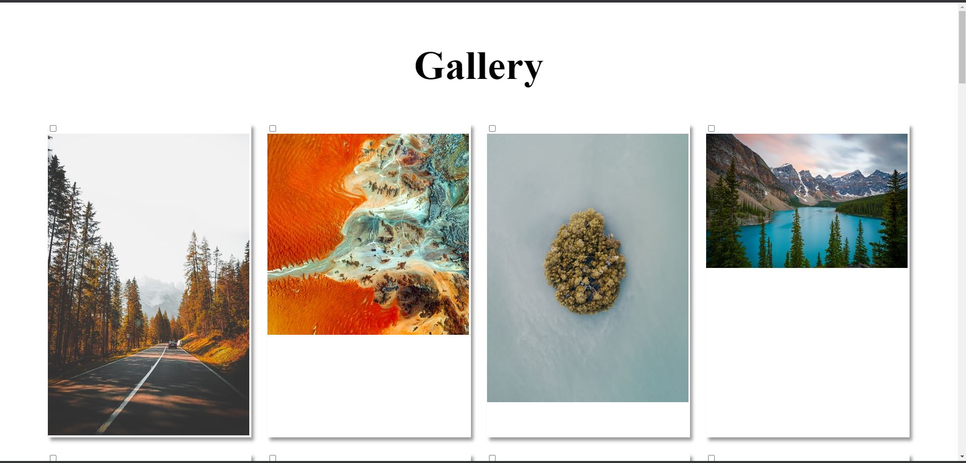
As you can see, there is a white gap on the bottom of some images. I wasn't having this issue until I wrapped all the images in the <div class='image-container'> elements (something I need to eventually allow me to zoom in on the images). How can I make it so my image fills the entire image-container div? Ideally, all pics would look like the first one.