1

I'm trying to fill a div (black area in following screen) with an img. enter image description here
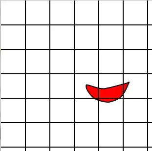
But the scale of image should not change. And when the size of the div changes according to the size of the browser, the image should be displayed by adjusting the width or adjusting the height accordingly. The image changes dynamically, so I never know if it will be tall or long. for example enter image description here enter image description here
Finally, the target is to make the image show as large as possible without changing the scale of the image.

Below is the code I developed.

<div className="asset__item">
  <a className="asset__img">                    
    <img
      alt="item image"
      src="/img/1.jpg"                        
    />                    
  </a>                  
</div>

CSS

.asset__item {
  display: flex;
  flex-direction: row;
  justify-content: center;
  align-items: center;
  position: relative;
  padding: 20px 20px 20px 20px;
  width: 100%;
  border-radius: 16px;
  margin-top: 20px;
  background: #202020;
}
.asset__item img {
  width: auto;
  max-width: 100%;
}

Please let me know how to fix it.

I try not to modify the styles of asset__item as much as possible. But it's ok to add a div there instead.

WStar
  • 187
  • 2
  • 12
  • Does this answer your question? [How do I auto-resize an image to fit a 'div' container?](https://stackoverflow.com/questions/3029422/how-do-i-auto-resize-an-image-to-fit-a-div-container) – JW Geertsma Jun 03 '21 at 11:23
  • Thanks, but that way image smaller than the container won't increase size. – WStar Jun 03 '21 at 11:58

2 Answers2

0

You can try using object-fit : `

img{
   width: auto;
   max-width: 100%;
   object-fit:cover;
}

`

Ossama
  • 75
  • 6
0

I could not find a way to do it using only CSS. So I directly assigned width and height to my image using JavaScript. We should handle 4 different situations:

  1. Album picture and album screen
  2. Album picture and portrait screen
  3. Portrait picture and album screen
  4. Portrait picture and portrait screen

My imgObj contains initial width and height of the image (I got them using react-image-size).
And here is the code:

    const imageObj = useSelector((state) => state.imageHandling.imageObj);

    const [width, setWidth] = useState(0);
    const [height, setHeight] = useState(0);

    const handleImageSize = () => {
        if (imageObj) {
            let w = 0;
            let h = 0;
            const ratio = imageObj.width / imageObj.height;

            const theSameTypes = () => {
                w = window.innerWidth;
                h = window.innerWidth / ratio;
                if (h > window.innerHeight) {
                    h = window.innerHeight;
                    w = h * ratio;
                }
            };

            if (imageObj.width > imageObj.height) {
                if (window.innerWidth > window.innerHeight) {
                    theSameTypes(); //album picture and album screen
                } else {
                    w = window.innerWidth; //album picture and portrait screen
                    h = w / ratio;
                }
            } else {
                if (window.innerWidth > window.innerHeight) {
                    h = window.innerHeight; // portrait picture and album screen
                    w = h * ratio;
                } else {
                    theSameTypes(); // portrait picture and portrait screen
                }
            }
            setWidth(w);
            setHeight(h);
        }
    };

    useEffect(() => {
        window.addEventListener("resize", handleImageSize);
        return () => {
            window.removeEventListener("resize", handleImageSize);
        };
    }, []);

    useEffect(handleImageSize, [imageObj]);
Black Beard
  • 1,130
  • 11
  • 18